The interior design project by nendo for "Athletia", the new Japanese skincare brand of e’quipe

Interior design project carried out by renowned studio nendo for Athletia, a new skincare brand launched by the cosmetic company e’quipe of RMK and SUQQU fame. The studio explains us the development,
The new brand's concept is to support a balanced lifestyle of active and vigorous movement as well as quiet, mind-body serenity. The lineup comprises three product lines: in addition to the basic Tune & Charge, Breathe & Sleep provides conditioning and relaxation and Active & Go focuses on convenience and portability.
Of note is the products’ design, which targets deep in the foundation of the outermost layer of skin based on the idea that, when training the inner muscles, the body is made beautiful from the inside out. Further, in addition to using natural ingredients cultivated by sustainable growers, the brand takes sustainability into consideration by using natural plant essential oils for 90?100 percent of fragrances, using 90 percent or more recycled glass for glass containers, and making plastic containers with biopolyethylene, a raw material made of sugar cane. Three brand values-a balance between movement and stillness, inner beauty, and compassion for the environment-would have to be expressed in Athletia's interior space.


The balance between movement and stillness was expressed in the design of display fixtures of various, layered materials held in delicate balance. Among such fixtures, some are split, and inner beauty is expressed in the use of brand colors or a different material in the cross section of their exposed insides.
Natural materials such as flax seed oil, pine resin, and sawdust compose 94/98 percent of the flooring, and even if discarded as is, they will biodegrade and return to the earth. The base of the floor is partially derived from recycled polyvinyl chloride (PVC) from used agricultural plastic film. Recycled materials from ceramics factory waste make up 43 percent of the tiles used for counters and countertops. Some of the terrazzo feature crushed and reused glass from Athletia's defective glass containers and glass fragments from the production process. Compassion for the environment is thus expressed even in the interior design materials.
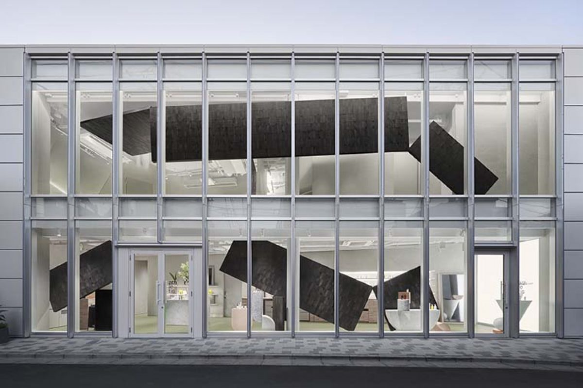
Because the flagship store on Omotesando is a characteristic building with shallow depth and wide-open glass siding, nine wood panels were made to partially block the otherwise unobstructed view of the entire store interior, thereby piquing curiosity. The panels are composed of white birch selectively removed in forest thinning operations, sliced to make the most of their uneven tree rings, and then individually applied by hand. Finally, as with the display fixtures, the panels were installed to graze each other in a curious mid-air balancing act. The intention here was to depict the three brand values again, this time as awareness of the interior, timber from thinning operations, and balance. 


On the first floor are product displays, in-store testers, and a consultation area. Meanwhile, space on the second floor has been allocated for various events and workshops like yoga, pilates, and aromatherapy courses, with private rooms for different types of massage. The material on the underside of the staircase handrail changes along the way to the second floor, communicating to visitors by touch they will soon finish climbing to their destination.
Though unseen, such sleights of hand convey by touch the brand concept of outwardly manifesting what is within. 


Source: Nendo
Photos: Masaya Yoshimura
Read more news related with Nendo published on Infurma
News Infurma:
Online Magazine of the International Habitat Portal. Design, Contract, Interior Design, Furniture, Lighting and Decoration
