La Bien Aparecida, Patron Saint to Cantabria, is the starting point of new restaurant designed by Tarruella Trenchs Studio in Madrid
Chef Paco Quirós, who has more than 33 years of experience working in the Madrid and Santander restaurant scenes, heads this gastronomical project alongside businessmen Carlos Crespo and others. Santander, home to both Quirós and Crespo, is loyally represented in all of their establishments. For this reason it comes as no surprise that their newest project is named “La Virgen de la Bien Aparecida”, the Patron Saint to Cantabria, and acts as the starting point for defining the design of their newest endeavor.

Being entrusted in the design of a new restaurant in the Madrid neighborhood of Salamanca for a team of prestigious restauranteurs is a challenge for Tarruella Trenchs Studio. Especially considering the fact that their previous establishments have been great successes. And they explain us as they carried out:
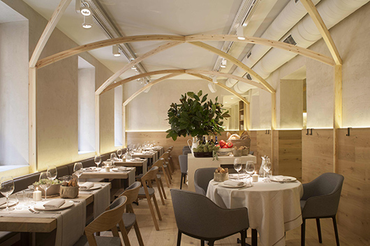
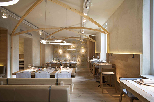
A powerful iconographic image of the virgin, La Bien Aparecida, together with the architectural configuration of the space (small areas separated by large load-bearing walls) led us to propose a space that evokes ecclesiastical elements such as: vaulted arches in the ceiling, long benches, stones altars, confessionals and the crowns of the virgin.
In the same way that the pre-existing architecture and walls of the structure evokes an ecclesiastical sensation, it also reminds us of gastronomical settings, like taverns, where simplicity, austerity and the nature of the materials gives prominence to the food and its abundance.
The gastronomical foundation is based on products of the utmost quality, prepared with contemporary techniques, without loosing the charm of traditional flavors, and generously served and shared in a way that reminds us of food that is hearty and homely.
By working with materials of the highest quality, basic shapes, and with some simple and delicate manipulation of materials and some of the treatments, we were able to define the colors and finishes for the project. One of the most important decisions was to maintain the plastered walls that already existed prior to the reform to strengthen the idea of austerity and simplicity.
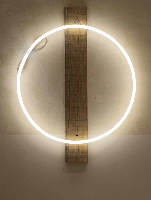
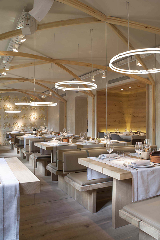
The primary wood used in the project is oak and is very present throughout the restaurant. It can be seen in the floors, the wainscotting and the furniture and it adds warmth and weight to the spaces. The decision to use communal tables support this feeling of a classic tavern. In addition to the wood providing warmth, the use and study of light played a key role in creating a welcoming and natural atmosphere.

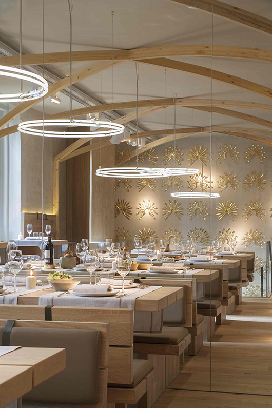


The restaurant is comprised of three floors and is laid out as a split-level where the entrance and reception area is located on the street level and leads either upstairs to the main dining room and bar or downstairs to a more private dining area. The entrance is made up of high ceilings and leads immediately into the reception area which contains one single white stone pedestal. Accompanying the wooden staircase that leads upstairs is a 2-story wall, which extends from the reception area to the upstairs dining room, and is covered in installation sculptures made out of cutlery in the shape of golden crowns.


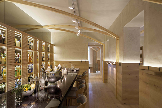
The upstairs area consists of two dining areas, a bar and the restrooms. The bar area consists of a long flat black stone bar where waiters and diners alike share the space creating the nucleus of activity for this space. Behind the bar are shelves where the liquor and wines are on display and are partially hidden behind lattice-like sliding doors that are reminiscent of a confessional.


The restrooms at the end of this floor maintain the same lattice-like sliding doors as seen in the bar in order to separate spaces and are accompanied by a large white stone wash-basin.


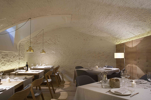
On the lower level is situated a third, and more private dining area, in which the original brick vaulted ceilings were maintained and they extend throughout the entire lower level, which includes the kitchen and the service areas.


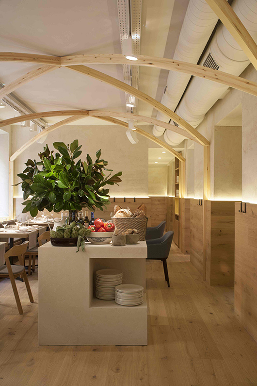
All of the spaces on the top floor combine nicely pine vaulted arches, that extend from the ceiling to the ground, and strategically positioned mirrors that work together to extend the limits of the space.
This is especially visible in the communal dining area where the effect of an extended nave is achieved by floor to ceiling mirrors that duplicate the space and the number of arches, and in the bar area where the mirrors nicely connect the pine vaulted arches to create an extended ceiling, and in the restrooms where the white stone wash-basin is amplified.
The formal simplicity of the project has allowed the arrangement of all of the installations to be visible in the ceiling: air-ducts, electric pans, lighting, audio elements, etc.
The project does not try to do anything more than provide support for its true worship: the gastronomy.
Creative Direction: Sandra Tarruella and Ricard Trenchs
Project Responsible: Mariona Guàrdia
Collaborators: Núria Martínez, Bárbara Beserra
Photographs: Meritxell Arjalaguer
Link to the La Bien Aparecida Restaurant website
Link to Tarruella Trenchs Studio website
Information & images by courtesy of Tarruella-Trenchs Studio
Read more news related Tarruella-Trenchs Studio published at Infurma
News Infurma:
Online Magazine of the International Habitat Portal. Design, Contract, Interior Design, Furniture, Lighting and Decoration
