White and Walnut beauty at Rotterdam’s Erasmus University Medical Training Centre
News Infurma28/06/2013
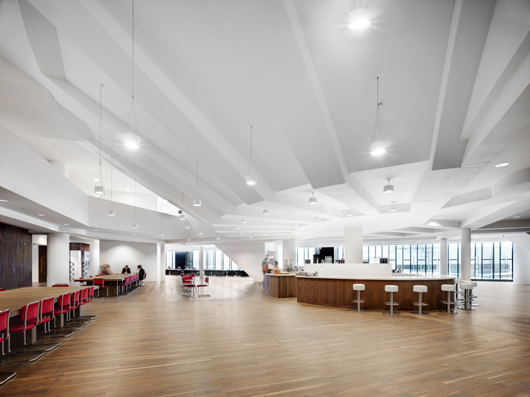
An array of FSC-certified American walnut walls, floors and furniture adds a chic quality to the bright new Education Centre at the heart of Rotterdam’s Erasmus University Medical Training Centre. Designed by Rotterdam office of architects Claus en Kaan. 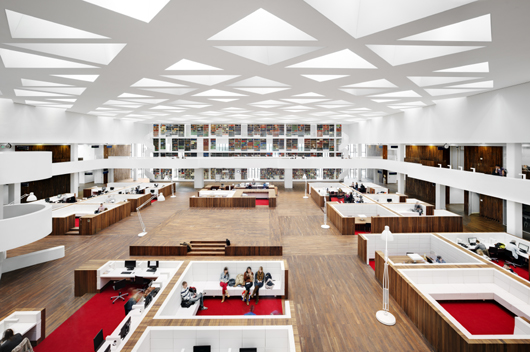 On the American walnut floor, alongside the glass wall, leather Chesterfield armchairs invite you to sit and enjoy the view of the Museum Park. An oval espresso bar, also walnut-panelled, is close by. Right behind this luxurious hangout, a magnificent hall drenched in daylight with even more walnut furniture, opens out in front of you. You feel as if you are in the lobby of an upmarket five star hotel. But no, it’s the brand-new Education Centre of the Erasmus University Medical Centre. By bathing this building in daylight and giving it a magnificent aesthetic appeal, the Rotterdam office of architects practice Claus en Kaan are encouraging students to treat the building with care and take pride in their university.
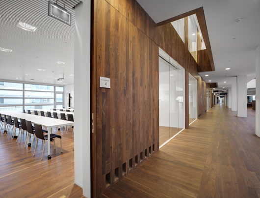
 “Walnut has a timeless quality…” American walnut provides great warmth in contrast to the white concrete and glass. “Walnut has the timeless quality which we believe is in keeping with the medical world”, explains Dikkie Scipio. “We regard it as the third hue of a three-colour pallet, in addition to white and glass.” Wim van der Plas, Director of the bespoke joinery firm Van der Plas Meubel en Project in Hertogenbosch, was responsible for the wood used. His company installed all the wooden walls, most of which are located around the central hall and form the outer walls of all the study and seminar rooms on the bottom two floors, alternating with glass partitions. This was an extremely fiddly job to implement because all the boards had to be exactly in line with the floorboards. Van der Plas explains “There was only one way to do it: by joining forces with flooring supplier Finesse Parket to buy a single batch of wood. Wood is like good wine: each harvest is slightly different. Because everything now comes from a single batch, the floor and walls are of exactly the same timber.” A challenging installation process Both the walls and the floors were clad in strips 1200mm long, 100mm wide and 12 mm thick with a top ply (5 mm thick) of American walnut (oil finished) and a bottom layer made up of triplex. The decision was made to use tongue-and-groove joints in which the flooring strips are nailed blind (on the tongue) to the fixing battens beneath it. One amazing thing about the project's installation is that the architects wanted the walnut strips on the walls to line up with the strips on the flooring. Van der Plas commented proudly, “We managed to join the walls to the floor board by board so the floor looks as if it is curling up into the wall.” However, many complications had to be overcome to achieve this. This was particularly true for the wooden parapets around the light wells that were created in the gallery on the first floor to bring daylight into the ground floor. These parapets are 15 cm thick and had to fit exactly on to the wall boards involving a great deal of calculation work. Similar challenges arose with the units that were fitted into the wooden walls to access the hidden cables, ducts and shafts. Each unit was fitted with internal hinges and very narrow frames to cause only minimal disruption to the rhythm of the wooden floor strips. Furthermore the architects insisted on having 5mm narrow gaps to divide the wall into panels. This fine detail creates a stronger sense of scale. “We detailed each of the wooden walls (1,500 m2) down to the last millimetre”, comments Van der Plas, “But when you see the great result, it was definitely worth the trouble”.
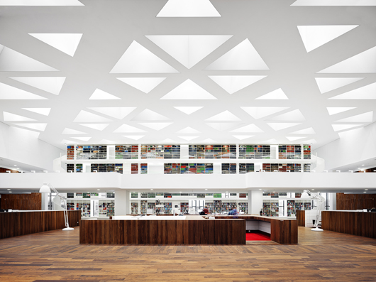
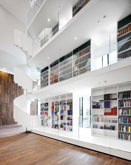
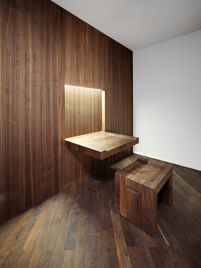
  Unique pieces Bespoke furniture was designed by Claus en Kaan and manufactured by 13 Speciaal. Solid American walnut was used to make large rectangular reading tables which fit together seamlessly and can be set out in different patterns. Also made of solid wood is a fantastic fold-out table on which graduates sign their graduation certificate, it even has a recessed pen tray and a matching stout stool. American walnut veneer was used in all the other furniture. The showpieces are three specially designed lecterns in the refurbished lecture theatres and a pair of slender tables with aerodynamic tops. Study islands Study islands are installed in three rows in the central hall; each is the size of a small room and has a unique layout. The floor level and wall height vary, to create various degrees of privacy. The island with the lowest floor and highest wall provides the most peaceful workplace. A raised floor and low walls allow contact with the people around. Two islands without walls were given a unique function: one is purely a podium, while the other is the counter of the library. The partition walls of all the study islands are clad in walnut veneer. A first-class student facility One of the main features of the Education Centre is the monumental bookcase in the Medical Library which stands at the far end of the hall flanked by two pristine white spiral staircases. Spanning 35 m long by 11 m high: it can store 2 km of books! It stands along the wall where the hall is at its widest and includes openings at regular intervals to let the daylight through. This bookcase, the study islands, wooden furniture and wooden walls work together to make the hall a pleasant environment for students to study privately or linger with friends. The result achieved by Claus en Kaan Architecten in both the master plan and the finer interior details reflects their great understanding of the human interaction with the space.
 Author Hilde de Haan is an architectural critic who wrote this article for Het Houtblad a Dutch magazine. This article was first published in March 2013 PROJECT DATA Location: Dr. Molewaterplein 50, Rotterdam Client: Erasmus University Medical Centre Rotterdam (erasmusmc. nl) Design: Claus en Kaan Architecten Rotterdam (clausenkaan.nl); Kees Kaan, Vincent Panhuysen, Dikkie Scipio Design adviser: Aronsohn Raadgevende Ingenieurs Rotterdam (aronsohn.nl) Main contractor: J.P. van Eesteren Barendrecht (jpvaneesteren.nl) Bespoke joinery walls & doors: Van der Plas Meubel en Project ‘s-Hertogenbosch (www.vanderplas.biz); Solidwood furniture: 13Speciaal, Rotterdam, Parquet flooring: Finesse Parket Rosmalen (finesseparketvloeren.nl) Bespoke joinery (study islands): Retera Veldhoven (retera.nl) Coffeebar: Roverdi, Berkel en Rodenrijs (roverdi.nl) Gross floor area: 34,000 m2 Construction period: November 2010 - August 2012 Cost of construction: €52 million, excl. VAT
  Photography credit: Bart Gosselin Source: American Hardwood Export Council Read more news related AHEC published at Infurma For more information on American hardwood species and case studies, visit www.americanhardwood.org.
 On the American walnut floor, alongside the glass wall, leather Chesterfield armchairs invite you to sit and enjoy the view of the Museum Park. An oval espresso bar, also walnut-panelled, is close by. Right behind this luxurious hangout, a magnificent hall drenched in daylight with even more walnut furniture, opens out in front of you. You feel as if you are in the lobby of an upmarket five star hotel. But no, it’s the brand-new Education Centre of the Erasmus University Medical Centre. By bathing this building in daylight and giving it a magnificent aesthetic appeal, the Rotterdam office of architects practice Claus en Kaan are encouraging students to treat the building with care and take pride in their university.
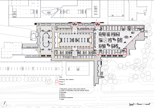
Master plan The Erasmus MC is a large complex which first bore its name in 2002. It contains many different elements. Its most eye-catching feature is the white tower of the Medical Faculty, which was designed in 1965-68 by the Delft office of OD 205, right next to the Dijkzigt Hospital (built between 1952-61). Subsequently the Sophia Children’s Hospital was built and the old Dijkzigt Hospital was renovated. In 2002, the Executive Board decided to undertake a complete refurbishment with particular focus on the educational facilities. Claus en Kaan Architecten won the architectural competition which was held in 2003 to prepare a master plan. They were also awarded the architectural contract and put in charge of the interior design and project management. Original architecture Dikkie Scipio from Claus en Kaan explained how she and her colleagues Kees Kaan and Vincent Panhuysen approached this project. “Like most architects nowadays, we do a lot of work on existing buildings. We have now adjusted our working methods accordingly. You shouldn’t act too quickly as it’s important to understand the essence of the old building first. This gives you guidelines on how to proceed.” When Claus en Kaan Architecten started planning the project in 2003, the area where the Education Centre now stands was a large, triangular square. This was the heart of the Medical Faculty at the time: an outdoor space on top of a car park, with a pond, benches and flower arrangements. The square was the access point to the different medical specialities, each of which formed its own little bastion, with its own classrooms, student rooms and library. Scipio went on to explain, “In organisational terms, the former layout was not at all practical; Claus en Kaan Architecten won the competition by removing this fragmentation. Our view was that a student is a student, irrespective of his or her medical speciality. We therefore proposed making seminar rooms, study areas and libraries completely communal. But the crux of the design was that we wanted to respect OD 205’s original architecture. That was why we retained the square. It remained one large space, but now under a glass roof. In this way, it’s still an open meeting place that brings all the students together.” As a result of Claus en Kaan’s clever solution, the central hall (maximum dimensions 100 x 40 m) is still surrounded by the original building: three levels of classrooms, study areas and lecture theatres. These buildings were stripped down to their concrete skeleton, after which they were re-organised and re-built. On the second level is an elevated open gallery which runs round the entire hall: a magnificent walkway past many classrooms with large glass partitions that bring daylight through to the ground floor. Certain elements of the old building are clearly recognisable. For instance two sturdy white spiral staircases that once stood on the square, covered in a frosted glass jacket are now at the edge of the hall, exposed rather than enveloped.

 “Walnut has a timeless quality…” American walnut provides great warmth in contrast to the white concrete and glass. “Walnut has the timeless quality which we believe is in keeping with the medical world”, explains Dikkie Scipio. “We regard it as the third hue of a three-colour pallet, in addition to white and glass.” Wim van der Plas, Director of the bespoke joinery firm Van der Plas Meubel en Project in Hertogenbosch, was responsible for the wood used. His company installed all the wooden walls, most of which are located around the central hall and form the outer walls of all the study and seminar rooms on the bottom two floors, alternating with glass partitions. This was an extremely fiddly job to implement because all the boards had to be exactly in line with the floorboards. Van der Plas explains “There was only one way to do it: by joining forces with flooring supplier Finesse Parket to buy a single batch of wood. Wood is like good wine: each harvest is slightly different. Because everything now comes from a single batch, the floor and walls are of exactly the same timber.” A challenging installation process Both the walls and the floors were clad in strips 1200mm long, 100mm wide and 12 mm thick with a top ply (5 mm thick) of American walnut (oil finished) and a bottom layer made up of triplex. The decision was made to use tongue-and-groove joints in which the flooring strips are nailed blind (on the tongue) to the fixing battens beneath it. One amazing thing about the project's installation is that the architects wanted the walnut strips on the walls to line up with the strips on the flooring. Van der Plas commented proudly, “We managed to join the walls to the floor board by board so the floor looks as if it is curling up into the wall.” However, many complications had to be overcome to achieve this. This was particularly true for the wooden parapets around the light wells that were created in the gallery on the first floor to bring daylight into the ground floor. These parapets are 15 cm thick and had to fit exactly on to the wall boards involving a great deal of calculation work. Similar challenges arose with the units that were fitted into the wooden walls to access the hidden cables, ducts and shafts. Each unit was fitted with internal hinges and very narrow frames to cause only minimal disruption to the rhythm of the wooden floor strips. Furthermore the architects insisted on having 5mm narrow gaps to divide the wall into panels. This fine detail creates a stronger sense of scale. “We detailed each of the wooden walls (1,500 m2) down to the last millimetre”, comments Van der Plas, “But when you see the great result, it was definitely worth the trouble”.
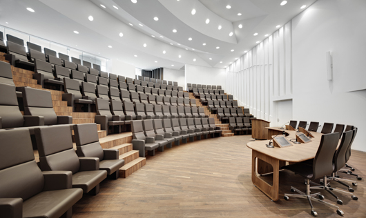
  Unique pieces Bespoke furniture was designed by Claus en Kaan and manufactured by 13 Speciaal. Solid American walnut was used to make large rectangular reading tables which fit together seamlessly and can be set out in different patterns. Also made of solid wood is a fantastic fold-out table on which graduates sign their graduation certificate, it even has a recessed pen tray and a matching stout stool. American walnut veneer was used in all the other furniture. The showpieces are three specially designed lecterns in the refurbished lecture theatres and a pair of slender tables with aerodynamic tops. Study islands Study islands are installed in three rows in the central hall; each is the size of a small room and has a unique layout. The floor level and wall height vary, to create various degrees of privacy. The island with the lowest floor and highest wall provides the most peaceful workplace. A raised floor and low walls allow contact with the people around. Two islands without walls were given a unique function: one is purely a podium, while the other is the counter of the library. The partition walls of all the study islands are clad in walnut veneer. A first-class student facility One of the main features of the Education Centre is the monumental bookcase in the Medical Library which stands at the far end of the hall flanked by two pristine white spiral staircases. Spanning 35 m long by 11 m high: it can store 2 km of books! It stands along the wall where the hall is at its widest and includes openings at regular intervals to let the daylight through. This bookcase, the study islands, wooden furniture and wooden walls work together to make the hall a pleasant environment for students to study privately or linger with friends. The result achieved by Claus en Kaan Architecten in both the master plan and the finer interior details reflects their great understanding of the human interaction with the space.
 Author Hilde de Haan is an architectural critic who wrote this article for Het Houtblad a Dutch magazine. This article was first published in March 2013 PROJECT DATA Location: Dr. Molewaterplein 50, Rotterdam Client: Erasmus University Medical Centre Rotterdam (erasmusmc. nl) Design: Claus en Kaan Architecten Rotterdam (clausenkaan.nl); Kees Kaan, Vincent Panhuysen, Dikkie Scipio Design adviser: Aronsohn Raadgevende Ingenieurs Rotterdam (aronsohn.nl) Main contractor: J.P. van Eesteren Barendrecht (jpvaneesteren.nl) Bespoke joinery walls & doors: Van der Plas Meubel en Project ‘s-Hertogenbosch (www.vanderplas.biz); Solidwood furniture: 13Speciaal, Rotterdam, Parquet flooring: Finesse Parket Rosmalen (finesseparketvloeren.nl) Bespoke joinery (study islands): Retera Veldhoven (retera.nl) Coffeebar: Roverdi, Berkel en Rodenrijs (roverdi.nl) Gross floor area: 34,000 m2 Construction period: November 2010 - August 2012 Cost of construction: €52 million, excl. VAT
  Photography credit: Bart Gosselin Source: American Hardwood Export Council Read more news related AHEC published at Infurma For more information on American hardwood species and case studies, visit www.americanhardwood.org.
News Infurma:
Online Magazine of the International Habitat Portal. Design, Contract, Interior Design, Furniture, Lighting and Decoration
