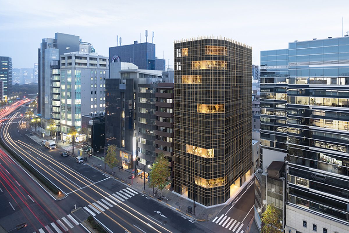
Kojimachi Terrace, the "woven" office building designed by nendo to enjoy the outdoors

An interior and exterior design project for an eleven-story office building located in the Kojimachi neighbourhood in central Tokyo
Typical office buildings are usually built as closed-off blocks with artificial climate control that do not share any real physical connection with their exterior environments. Therefore, in the “Kojimachi Terrace” design, the external elements were taken into account to allow for a more physical experience of the outdoors, like witnessing the changing weather and yearly seasons.
To best incorporate the environment, balconies have been placed sporadically on six out of the building's eleven floors. Assumed to be used as exterior spaces, each terrace can easily transform into a private meeting area by closing the doors and windows concealed around it.
A unique open air garden located on the building's highest levels, incorporates lush greenery infused with natural light and air. This three-story “Sky Forest” allows for a nature-like hideaway for the building's employees, while generating a sense of unity over the different floors. The rest of the building's facade is covered with large glass windows which some of them enabling natural air to enter the building.


Incorporating many terraces and large open windows can result in unsightly rails for prevention from falling as well as numerous pillars to support the window construction. By designing these rails and pillars to appear the same size and wooden finish as the facade, and by weaving this together into a natural looking grid, the visual noise has become integrated and camouflaged within the exterior. This reduces the flat and cold impression, often seen in most office buildings.
Along with the intricate exterior design, the materials used for the interior include raw stone and bronze-coloured stainless steel. The textured finish of the floors and walls were executed manually by a plasterer to achieve an uneven natural appearance.


Similarly to the building's facade, the interior lighting elements were also weaved using rails in the same proportions as the external profiles. The light is directed both to the floor and ceiling, creating a sense of depth and brighting-up the whole space with indirect illuminations. 


The weaving element was also incorporated in a bench placed by the entrance, as well as in the carpet's pattern and the building's logo.
Source: Nendo
Photos: Takumi Ota
Read more news related with Nendo published on Infurma
News Infurma:
Online Magazine of the International Habitat Portal. Design, Contract, Interior Design, Furniture, Lighting and Decoration
