China, a great power in public & contract interior design wakes up. The most outstanding projects of 2017
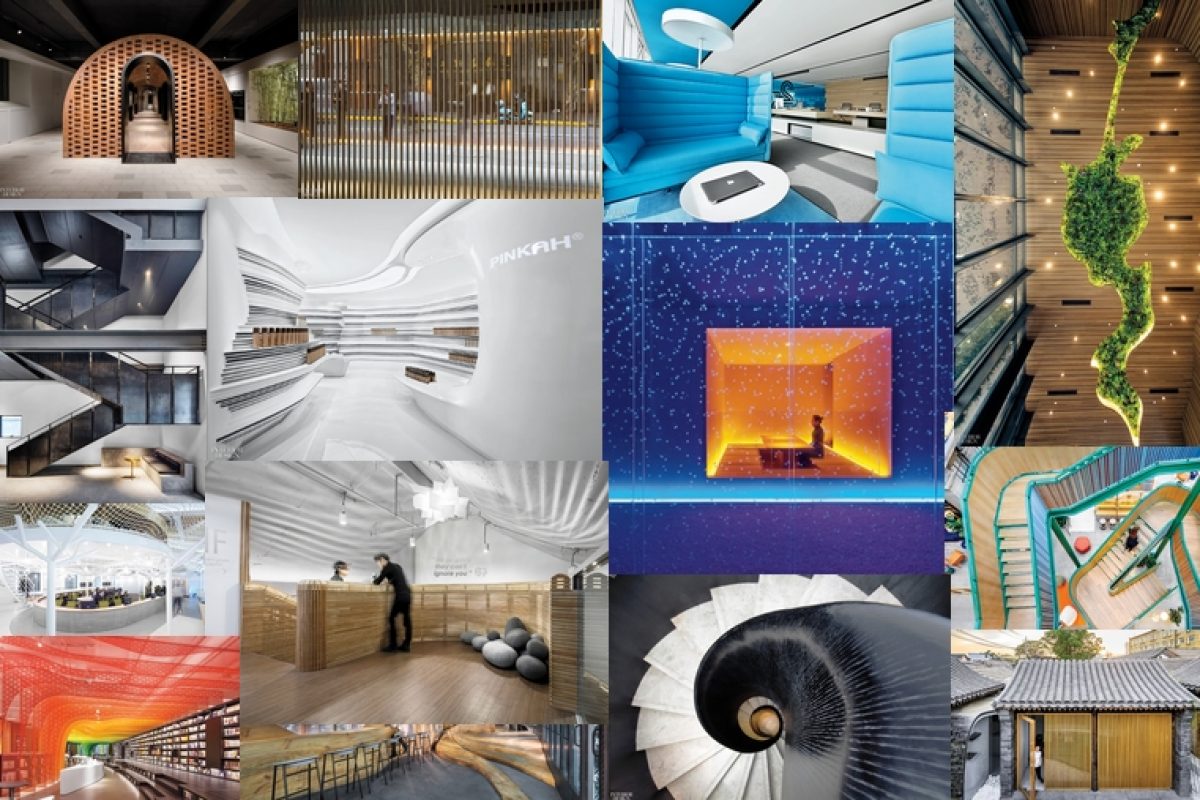
In 2017, China has stood out on many occasions, especially in terms of interior deign. Among the Best of Year Awards Winners of the year 2017, a majority returns to Chinese projects. Discover these projects that have won the prize thanks to their awesome design :
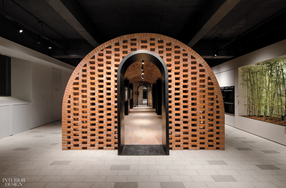
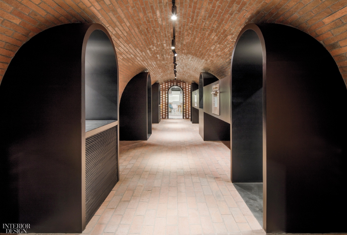
- Category Kitchen&Bath - The Culinary Village : Arda Co. Showroom by Lukstudio
A 10,800-square-foot floor plate there now contains what Luk calls a “culinary village,” a compound of small structures including four housing “ideal kitchens.” Each has a theme: minimal white, total black, rustic country, and modern American. A redbrick gallery shaped like a Quonset hut leads visitors through the evolution of oven technology. The neighboring cooking classroom, resembling a kitchen in a private residence, allows them to whip up a dish of their own on fully functional test appliances. Read more here.

Photography by PROJECT/ION/Motion Picture Production
Photography by Peter Dixie/ Lotan Architectural Photography
Photography by Peter Dixie/ Lotan Architectural Photography
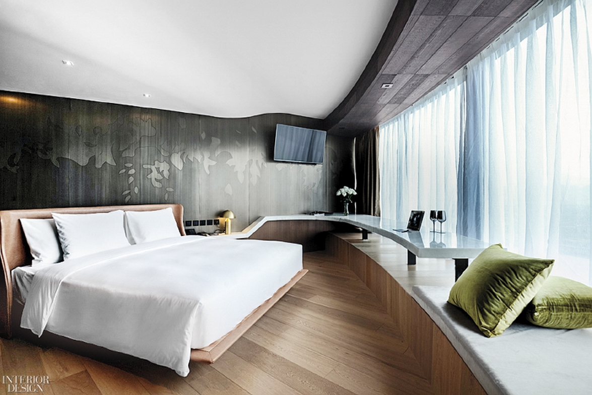
- Category Resort : The Macau Roosevelt Hotel by Gulla Jonsdottir Architecture + Design
Interior design project carried out by Los-Angeles-based designer Gulla Jónsdóttir, the Macao Roosevelt Hotel incorporates the Portuguese style of historic Macau, bringing a glimpse of the local community. Inspired by nature, the hotel design is integrated through a Chinese lotus flower, the official symbol of Macau. This beautiful flower is the thread that ties it all together and is seen throughout the hotel in various forms. Read more here.
Photography by Kelly Puleio

Photography by Kelly Puleio
- Category Bar/Lounge : Two Cups by Daipu Architects Design (Beijng) Corporation Co.
Hiking the trails that loop across the ridges surrounding the metropolis known as the Mountain City, a Yangtze River port that's become a major destination for Chinese tourists, principal DaiPu noticed how at ease residents were with the terrain. So Dai decided to channel it through the mountain like elm shapes that dominate this bar's 1,100-square-foot interior. The dark neutral background—raw concrete for the floor and sidewalls and charcoal-gray glazed ceramic tile on the back wall—throw the mountain shapes in high relief, emphasizing the organic character of the grain and knots. The wood is also intended to show wear with use, a natural process evoking those involved in making the international craft beers served. Read more here.
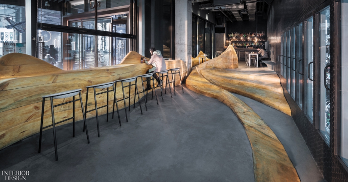
Photography by Wu Qingshan
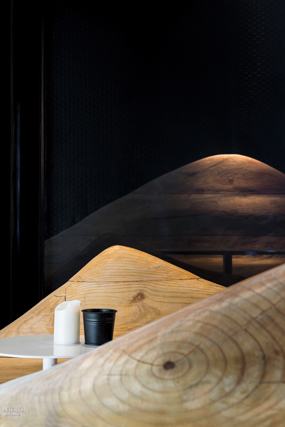
Photography by Wu Qingshan
- Category Coffee/Tea : Hutel Twisting Courtyard by Archstudio
Renovated by principal Han Wenqiang, what was once a single-story residence has become a rental property that can be booked for corporate retreats, business meetings, or overnight stays. The titular twist is a ribbon of gray epoxy-finished pavers that wends its way through the courtyard, peeling up here and there to form sloping walls and roofs of various rooms, including the kitchen in white-on-white solid-surfacing. Throughout the 1,730-square-foot interior, clever built-ins called “embedded furniture systems” allow spaces to morph from tearoom to bedroom and back again. Read more here.

Photography by Wang Ning
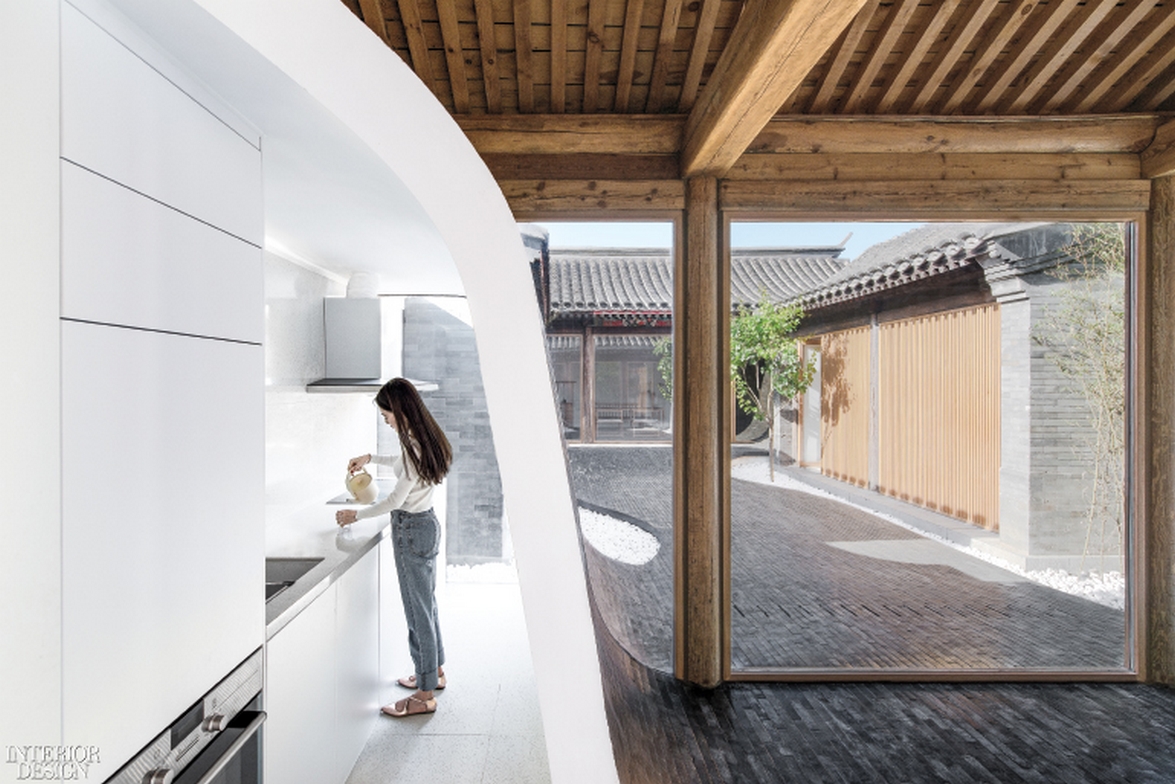
Photography by Wang Ning
- Category Asian Restaurant : Setsugekka Japanese Cuisine by Shanghai Hip-pop Architectural Decoration Design Co., Ltd
Chief architect Sun Tianwen has created this new restaurant project that focuses heavily on Japanese cuisine. The restaurant is individually covered in ultra-clear glass engraved with sakura, blue LED light bands emitting over black walls and ceilings. This aesthetic of space, color, and layout mix into a symphonic sense of zen that Tianwen utilizes in order to influence customers’ thoughts and behavioral pattern. Conveying the customer's core values and aspirations, the restaurant itself reflects the “setsugekka,” a vital aspect of Japanese culture that refers to the seasons of the year: blue-white (winter), yellow-white (autumn) and pink-white (spring). Each hue dictates the essence of the restaurant by using the colors in vivid LED lights around the interior space. Read more here.

Photography by Zhang Jing
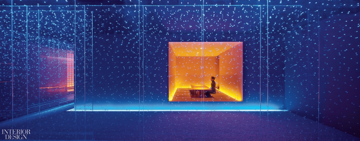
Photography by Zhang Jing
- Category Commercial Lobby : New Shanghai Theatre by Neri&Hu Design and Research Office
It had once been a proud movie house, built in the 1930's during the golden age of Chinese cinema. But many decades and multiple renovations later, the building was turned into a supermarket and eventually shut down entirely in 2011. Returning it to its cultural roots was therefore a major undertaking for husband-wife Interior Design Hall of Fame members Lyndon Neri and Rossana Hu. At ground level, vertical brass-finished strips evoke a gilded curtain cloaking a stage—a treatment that continues inside to define a series of spaces conceptualized as different dramatic scenes. In the double-height atrium, this “curtain” glows in the sunlight from apertures carved out high overhead or, at nighttime, from minimalist LED pendant fixtures. Beyond the lobby, a 300-seat theater awaits. This time around, it will host not movies but live performances, from plays to operas. Read more here.
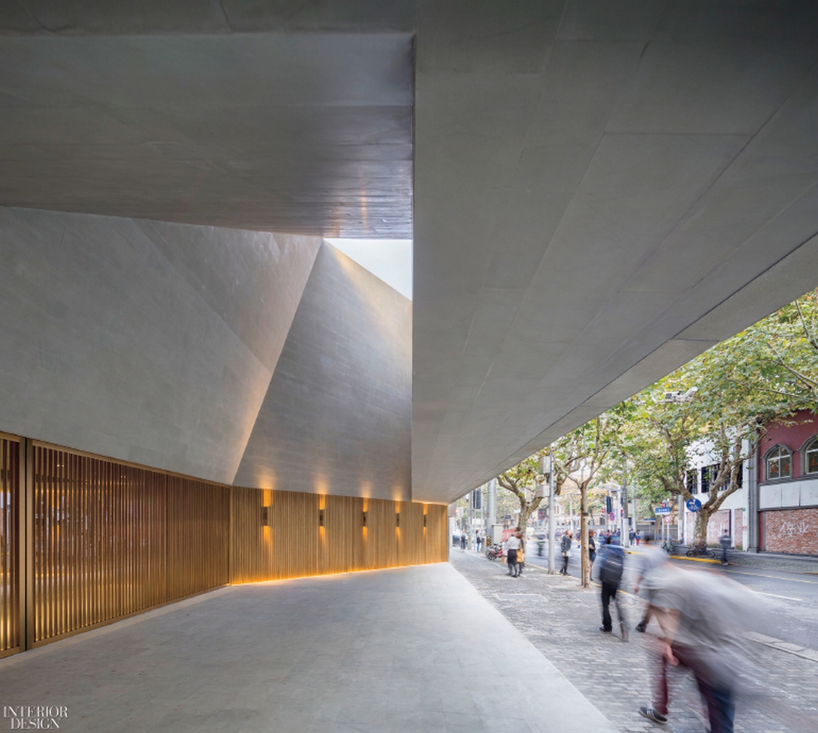
Photography by Pedro Pegenaute
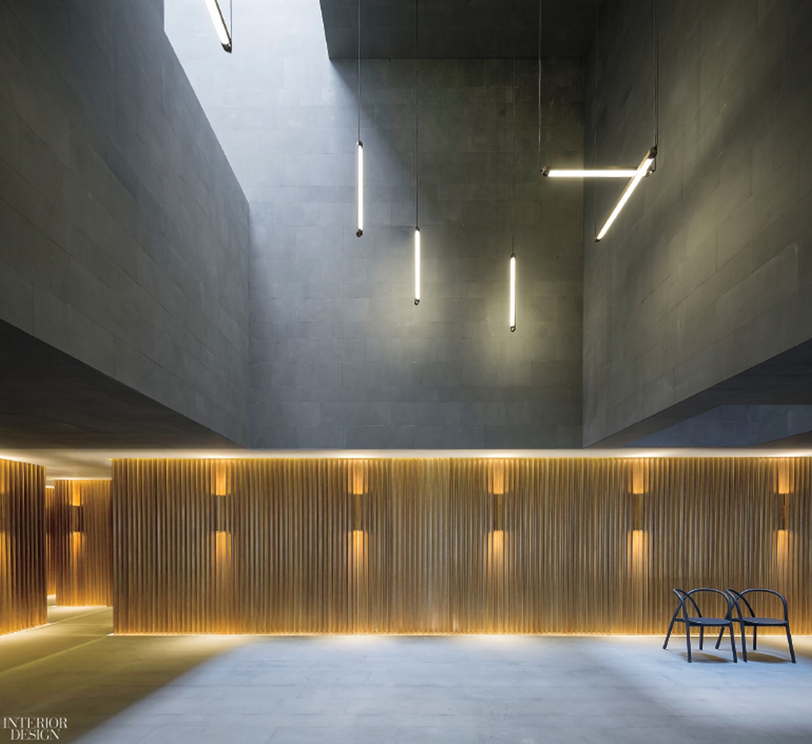
Photography by Pedro Pegenaute
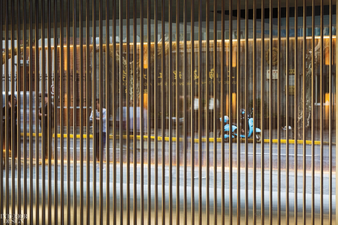
Photography by Pedro Pegenaute
- Category Mid-Size Creative Office - Space Design of Elephant ; Parade Office by CUN Design
The phrase “elephant in the room” gains new meaning, thanks to architect Cui Shu. Only this elephant is something that everyone is talking about. A staircase, elephantine in size and presence, even curves like a trunk as it winds through the 44,000-square-foot marketing agency. Connecting the top two of four levels, the stair fills an area that was complicated by existing beams. The striking result might suggest up-to-the-minute trends in visual language. Read more here.

Photography by Wang Jin and Wang Ting.
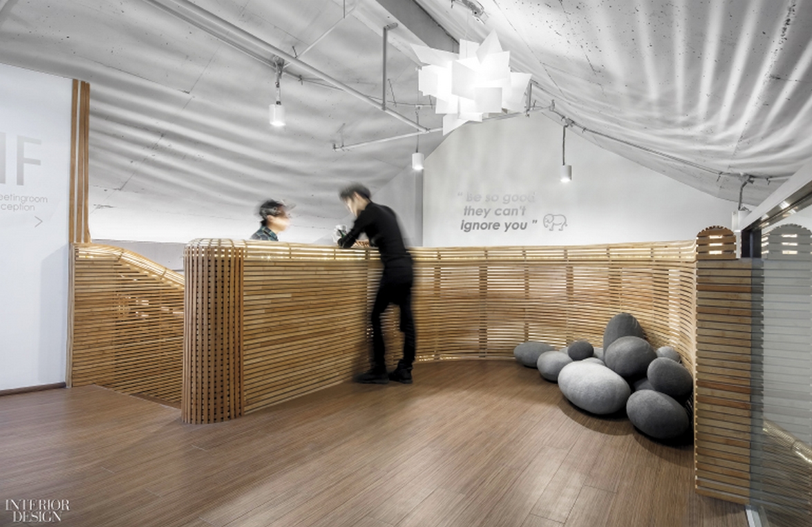
Photography by Wang Jin and Wang Ting
- Category Small Office : Poly K18 Office Building by PONE Architecture
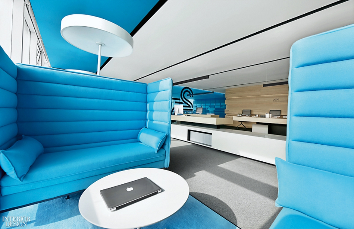
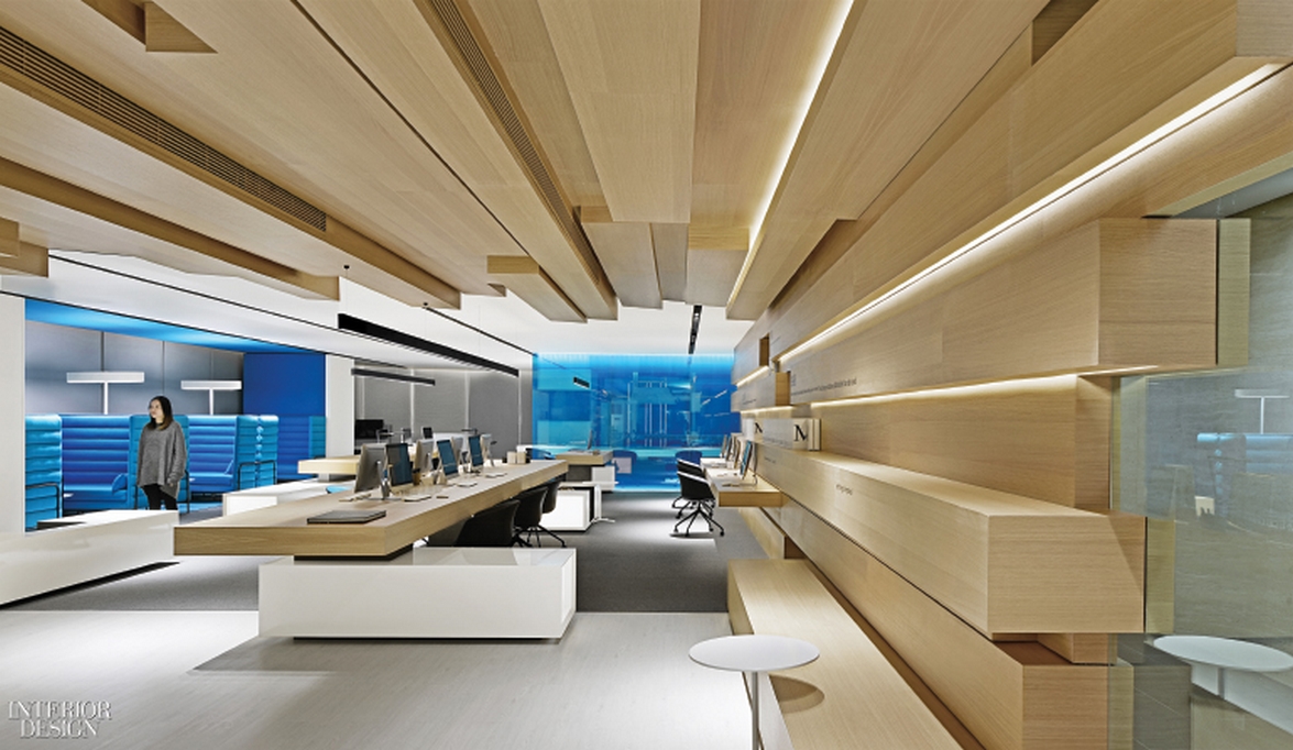
What's the best way to make use of a long, narrow layout? In a counterintuitive move, one of this firm's CEOs, Golden Ho, emphasized the linearity of a tech company's office by stressing the horizontal. The tunnel effect encounters no vertical breaks. “Ideas flow freely here,” Ho says. Even the few walls dividing the free-form 7,100-square-foot floor plan are in tempered laminated glass, their transparent blueness accenting the openness more than counteracting it. Blue seating and glossy white-lacquered storage units complement the pale sapele. And the combination of wood tones, blue, and white could be read as an idealized image of the Yangtze and Han Rivers as they flow past this inland city. Regardless, Ho succeeds in transforming constrictions of space into an opportunity for innovation. Read more here.
Photography courtesy of Pone Architecture
Photography courtesy of Pone Architecture
- Category Extra Small Office : Unbot inc. Office by Prism Design
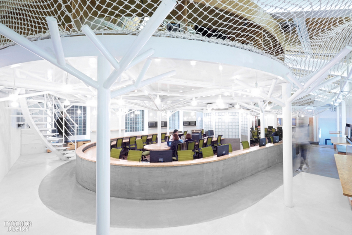
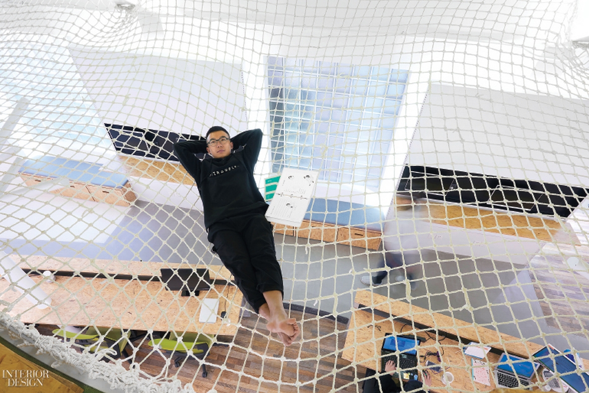
It's a universal truth that a company existing only in the 21st century should have a correspondingly high-tech office. Scratch that. Founder Tomohiro Katsuki has subverted type with a surprisingly low-fi workplace for a Chinese e-commerce and social media marketing agency. The 4,700 square feet on two levels of an existing office building has a childlike sense of wonder in nature. For starters, rope netting surrounds the mezzanine level “tree house,” where after heads-down work employees can indulge in feet-up relaxation. Read more here.
Photography by Watery Ishida/Studio W
Photography by Watery Ishida/Studio W
- Category Coworking Space : WeWork Weihai Lu, China Flagship Project by Linehouse
WeWork Weihai Lu is nestled in a turn of the century brick building; a former opium factory and artist residence. This building is surrounded by an old residential district in the heart of Shanghai. Linehouse celebrated the grandeur of the building, encapsulating the feeling of a grand hotel, transporting guests and members on an unexpected journey of whimsy, voyeurism and festivity. Read more here.
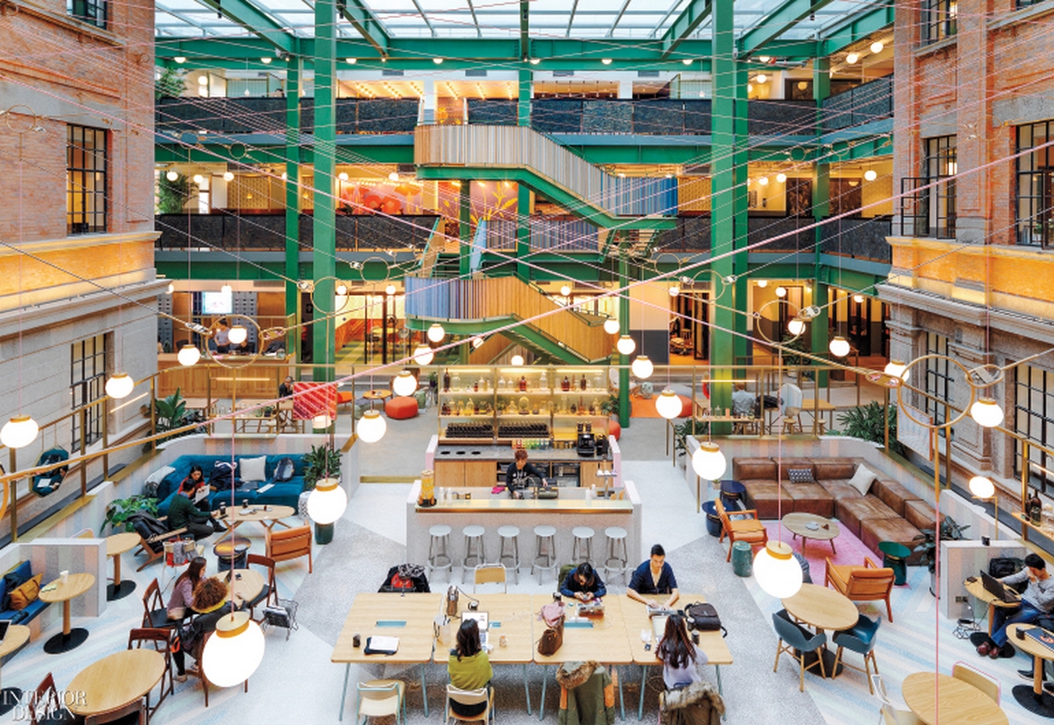
Photography by Jonathan Leijonhufvud
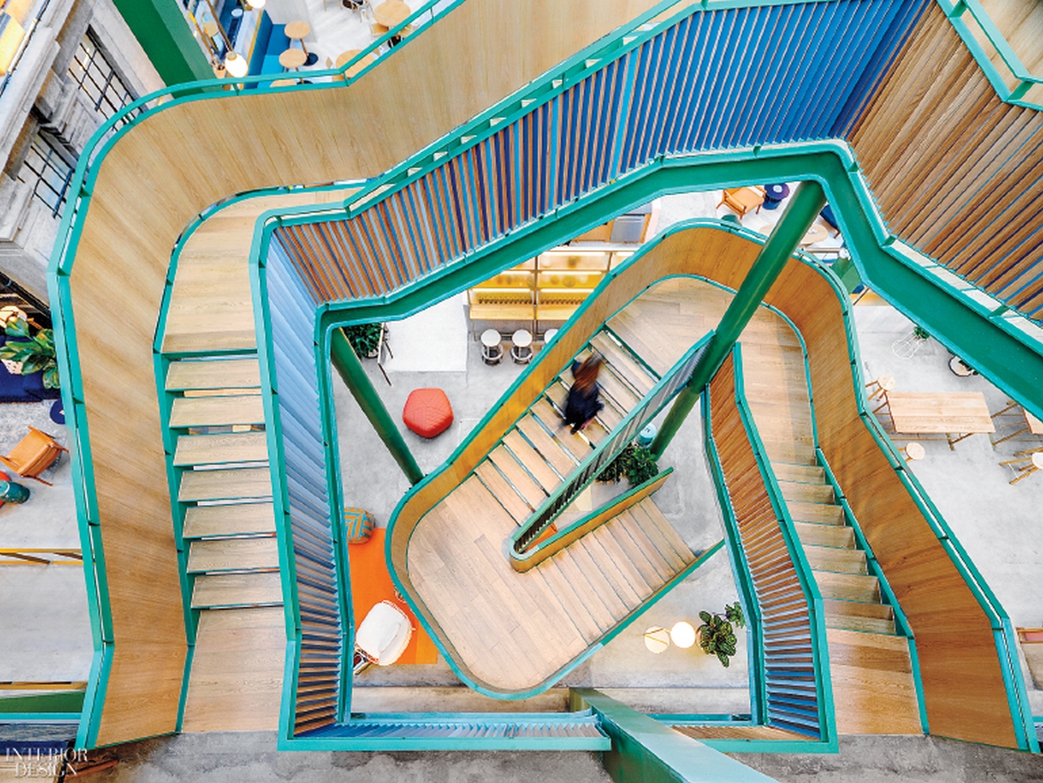
Photography by Jonathan Leijonhufvud
- Category Office Transformation : The Garage — Beijing B+ Automobile Service Center by Neri&Hu Design and Research Office
Neri&Hu's approach to the architectural renovation and interior design of an Automobile Service Center in Beijing attempts to recapture the allure and magic that was once associated with cars. Each of the main functional areas is contained within modularized steel and mesh boxes, a subtly refined interpretation of industrial storage facilities. With this project, Neri&Hu attempts to break through common expectations of what some might consider a vulgar typology, to inject a sense of warmth into an industrial context, and to portray the seductive side of the ubiquitous modern machine. Read more here.
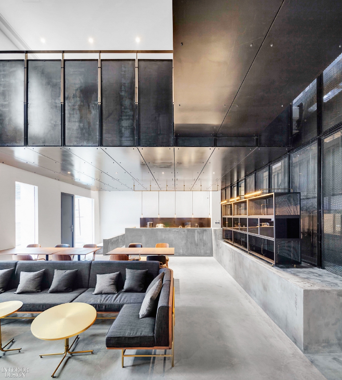
Photography by Pedro Pegenaute
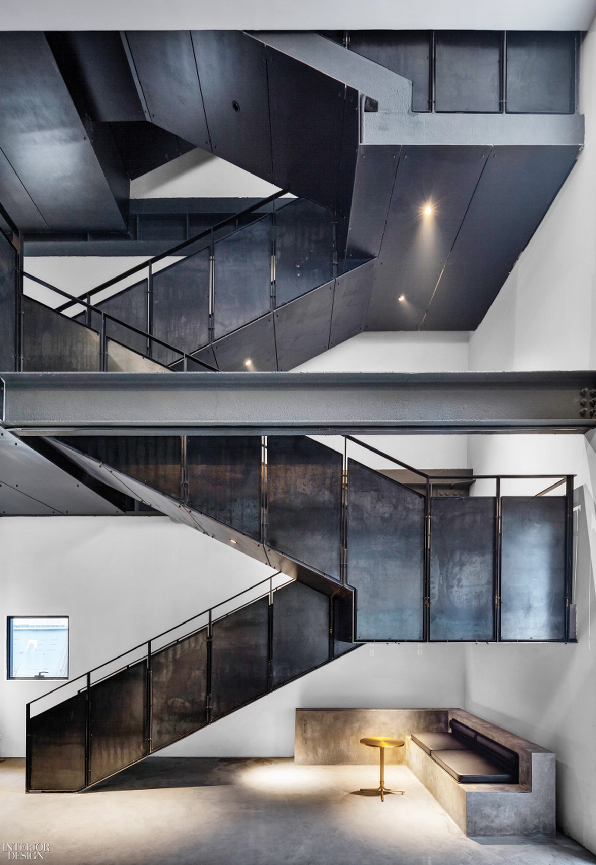
Photography by Pedro Pegenaute
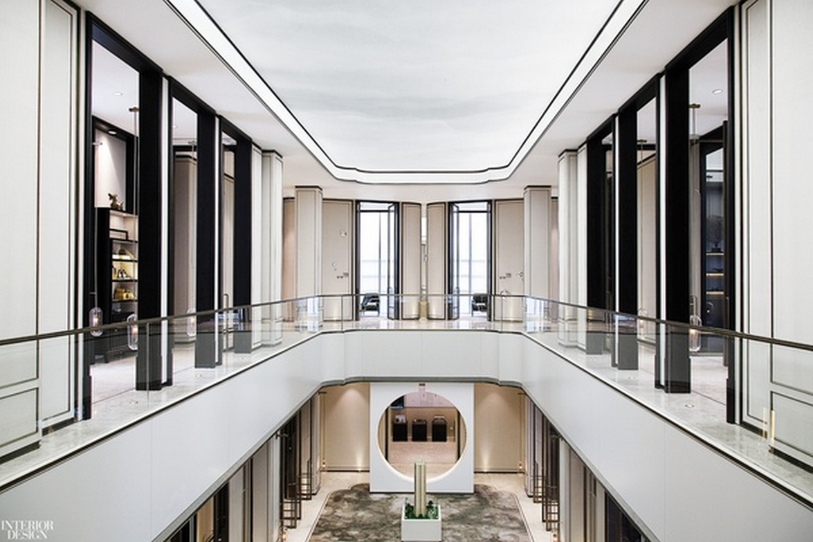
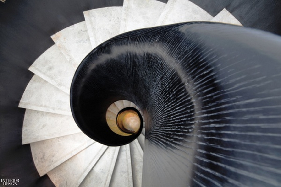
- Category Residentail Lobby & Amenity Space : The Center of Capital Visionary Residence by W.Design
The main building consists of two stories, a basement and first floor connected by the elegantly designed spiral stairs at the entrance. “Less is more.” Lines are few but functional and make the whole space simple but attractive. The 3D printed clouds are also seen in the basement. They are scattered in untrammeled forms, either floating above, rising from the ground, or as an element of the water view design. Read more here.
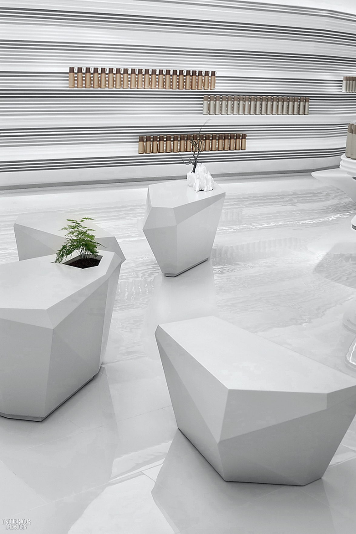
- Category Mixed Retail : PINKAH New Products Exhibition Hall by DaoSheng Design
Durability is a paramount concern when it comes to thermoses. This is one reason why founder He Yongming looked to the striated walls of a canyon as inspiration for his showroom for the popular Chinese thermos maker. After all, canyons are about as durable as it gets, withstanding rain, wind, and the test of time. The organic feel of the 1,400-square-foot space was critical to the overall effect, but so was a contemporary design aesthetic. There's a sense of order to the undulating faux-stone walls, as well, with straight horizontal lines that are perfectly suited to shelving. Read more here.

Photography by Peng Yuxian
Photography by Peng Yuxian
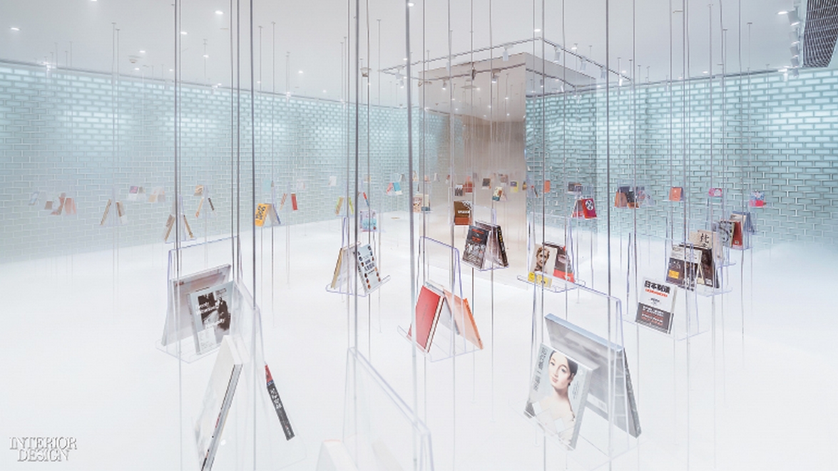
- Category Bookstore : Zhongshuge Bookstore in Suzhou by Wutopia Lab
Rainbows, crystals, fireflies, those exhibitionists of the natural world, are exuberantly reimagined at bookstore chain Zhongshuge's latest location, on the third story of a shiny office tower. From the street, the store first appears through the windows as a glimpse of soft rainbow colors. On closer inspection, the rainbow reveals itself to be a canopy constructed from layers of perforated aluminum powder-coated in gradated colors—the interplay between nature and artifice is central to the vision of Wutopia Lab principal Yu Ting. The storytelling enchantment doesn’t come at the expense of functionality, however. Encouraging customers to spend time sitting on the stepped platforms and other perches throughout the 15,000 square feet effectively increases. Read more here.

Photography by Hu Yijie
Photography by Creatar Images

Photography by Creatar Images
Source: Interior Design
Visit the Interior Design Best of Year Awards Winners 2017 website
News Infurma:
Online Magazine of the International Habitat Portal. Design, Contract, Interior Design, Furniture, Lighting and Decoration
