Stone Designs designed Moremoto. Much more than a store, a cultural melting pot
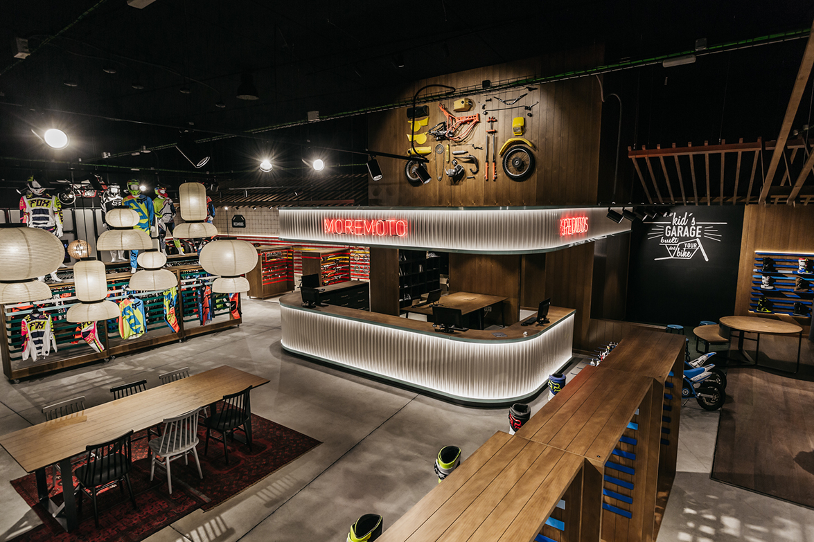
When someone travels as much as Stone Designs does, projects become a cultural melting pot, where we can find references to lots of traditions that correctly merged, shape unique projects, where spaces have a purpose: make the user feel. well and comfortable.
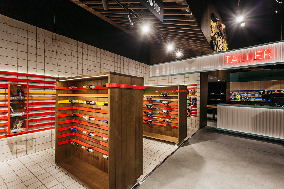
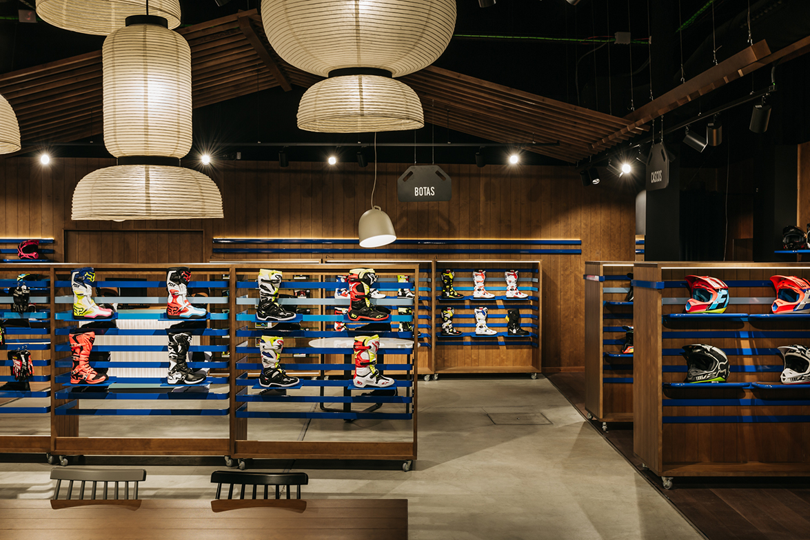
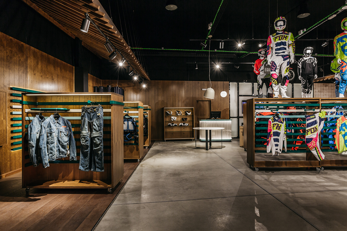
At Moremoto, this motocross store, located in Madrid, there are obvious references to the esthetic of the American discipline of the sixties and seventies. These are merged with touches of traditional. Japanese architecture and details of Persian tradition. Everything is delicately combined to offer the client an image that dazzles, but with no fanfare. In this space the color has been used to differentiate areas, and to add bright to the wood. The shop takes care of every corner and every space where to enjoy our hobby. This makes the shopping experience unique.
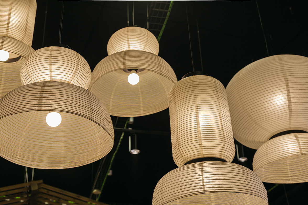
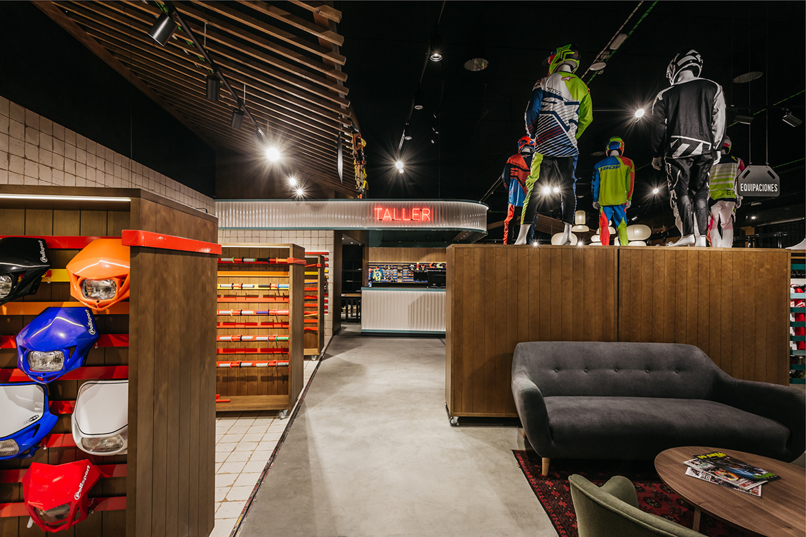
The space contrasts with the coldness of the main counter, made of sheet with red neon, that remind us of an old American gas station shelter, or to a Diners or to a motel, contrasting with the big wooden table of the entrance, with the rice paper lamps at the top, or the Japanese style wooden ceilings, inspired by the ones of the Gompachi restaurant in Tokyo.
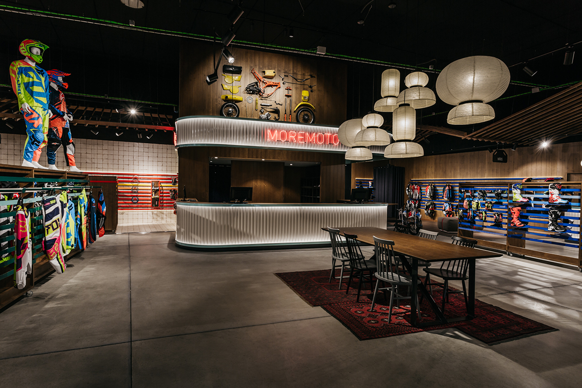
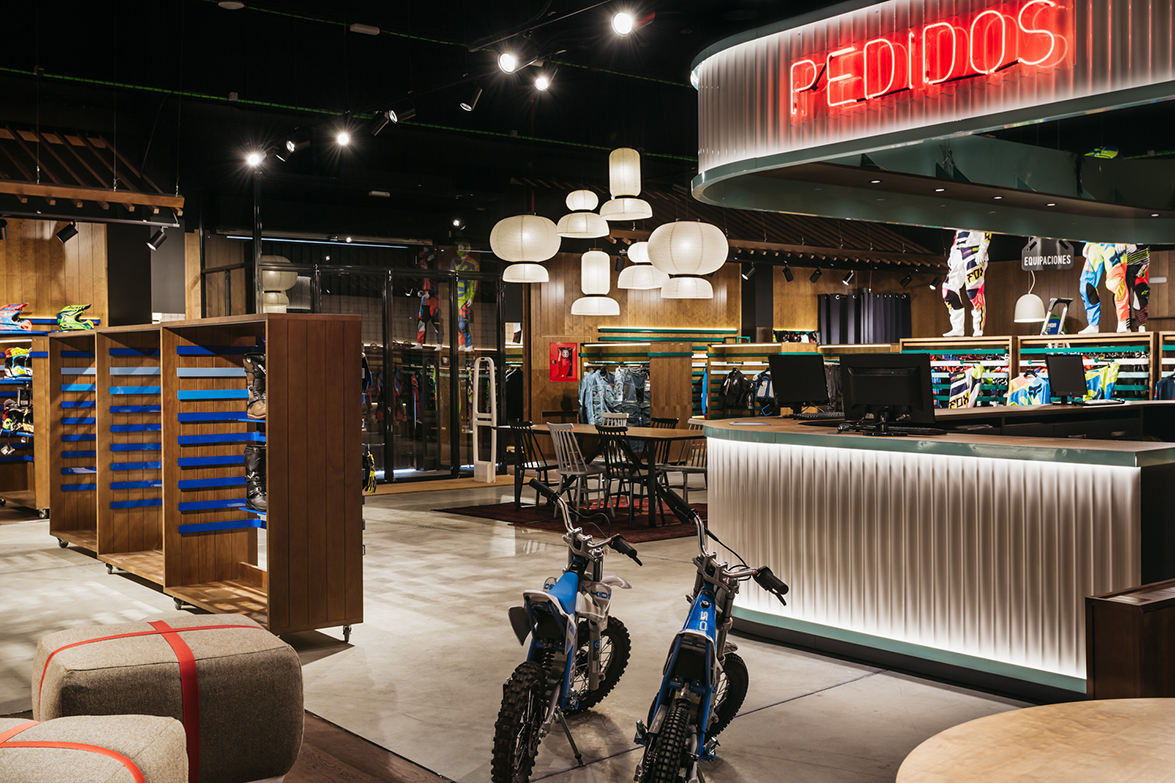
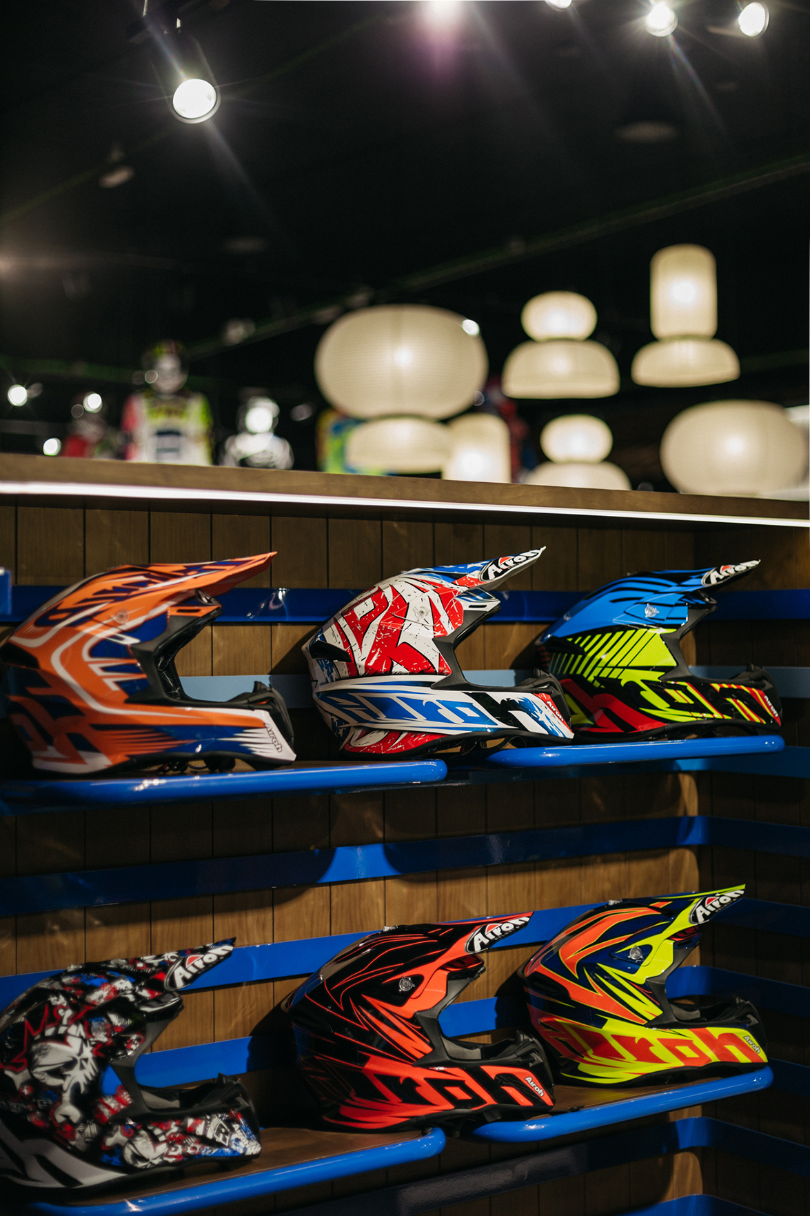
 The atmosphere is emphasized with the classical motorbikes hanging from the ceiling and on the top of the counter, showing that in Moremoto, they know what they do. The wooden slats on the walls add color to the project and make up a display system, which has been tailor-made for the project and where all elements have been designed so that each product is showcased as in a boutique store.
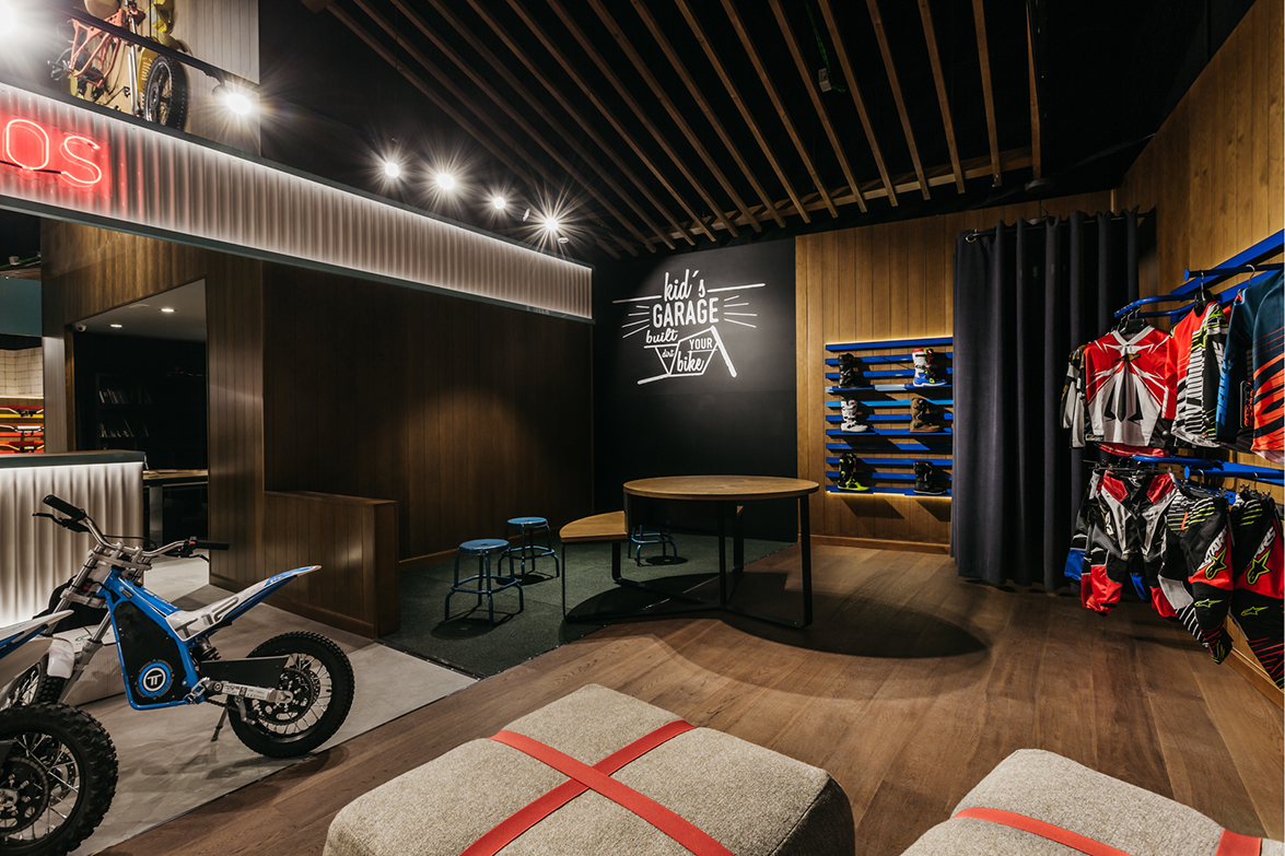
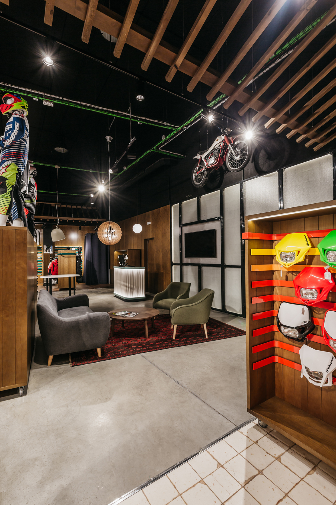
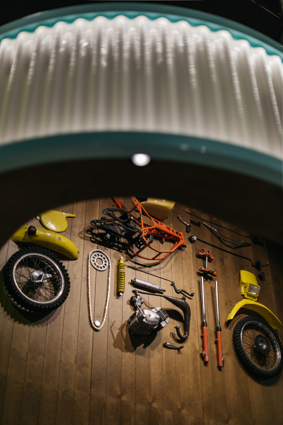 Materials have been carefully selected to highlight each other. Each one speaks about the space where it is located. The distressed tiles at the spares area, remind of an old garage.
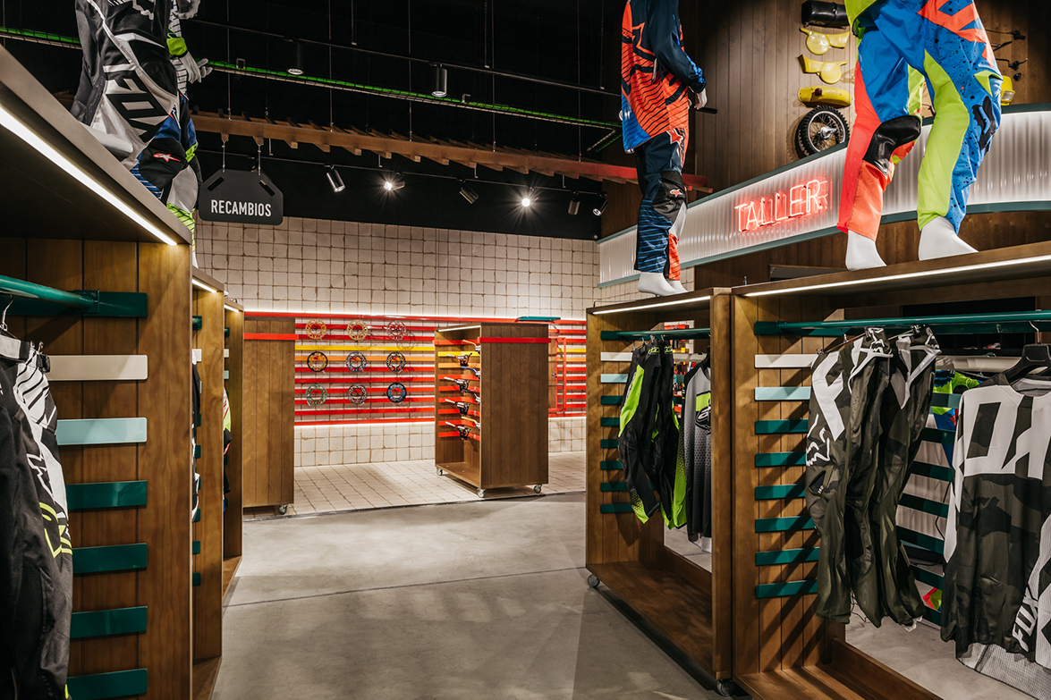
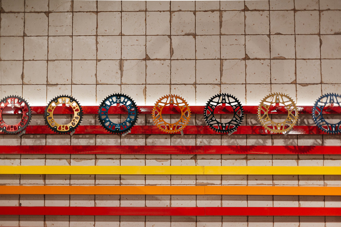 Wood is a common factor on walls and floors of the rest of the spaces, except for the kids’ area, where the blackboard allows them to have fun in their own area. Marble and Persian rugs are the final touch of a universe full of materials speaking about quality, tradition and compromise.
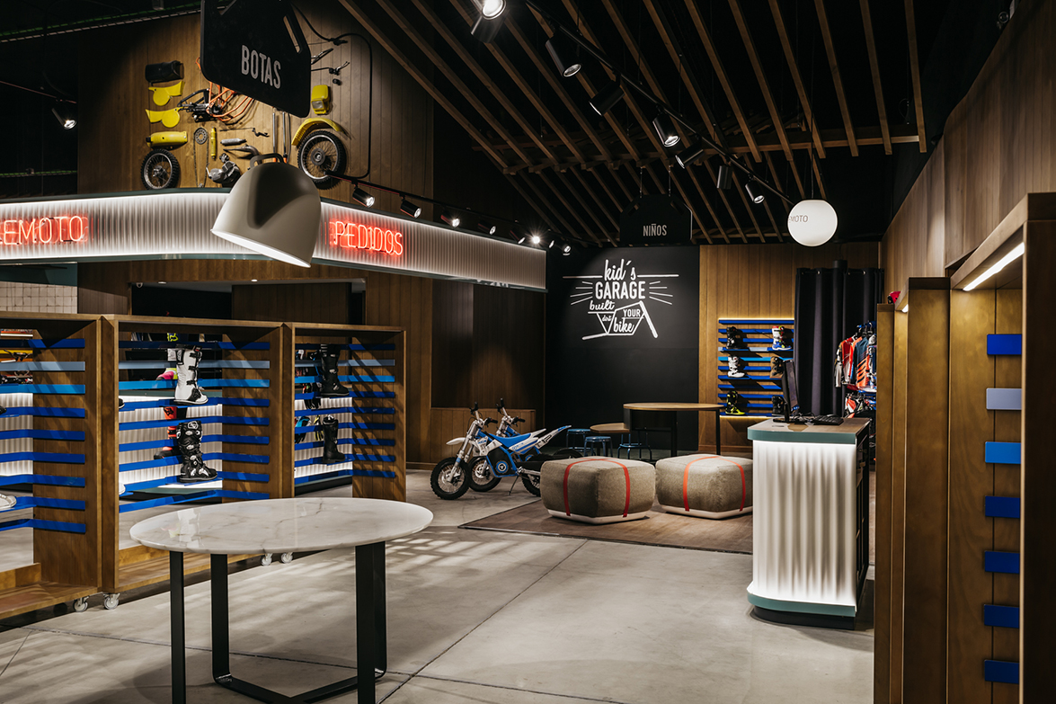
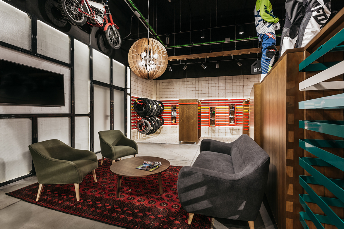
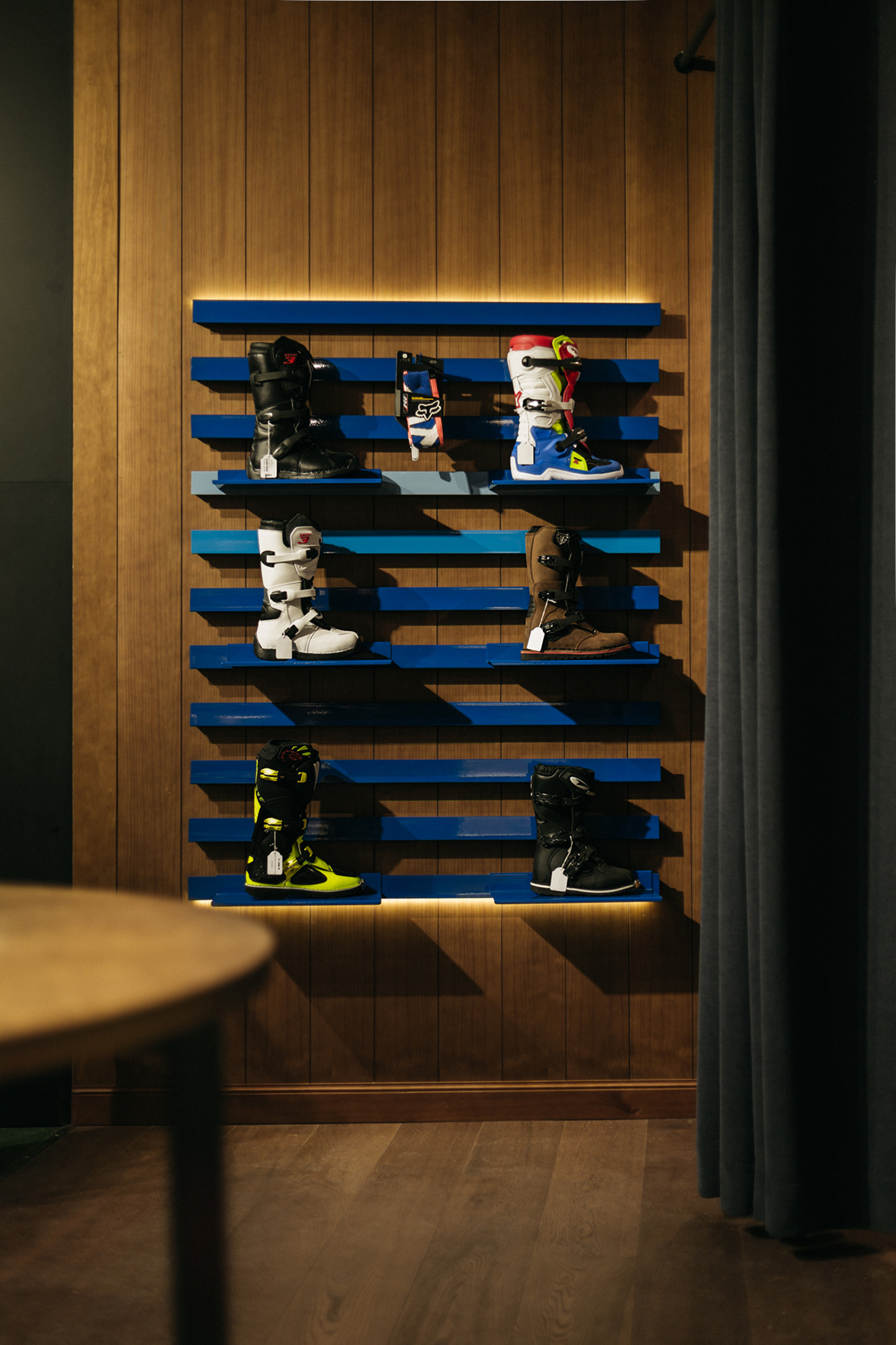 Everything in Moremoto is minutely calculated so that the user experience is superb. Lighting definitely contributes to this. The aim was to get a theatrical. light and in order to get it the top of the nave was painted in black. This way, the reference of the space is lost and there is a dramatic effect in each display area, emphasizing the project and leaving the walking area dark. Doing this, the client feels tucked in and less observed.
The space doesn’t leave indifferent. With no doubt, it is a new reference and a new turn to the motorbike equipment stores.
 NAME: Moremoto
TYPE OF PROJECT: Motorbike equipment store
LOCATION: Madrid
DESIGNER: Stone Designs
PHOTO CREDITS: Alberto Monteagudo
SIZE: 400 sqm
Information & images by courtesy of Stone Designs
Read more news related Stone Designs published at Infurma
Visit the Stone Designs website
News Infurma:
Online Magazine of the International Habitat Portal. Design, Contract, Interior Design, Furniture, Lighting and Decoration
