Surgenia and Reinadecorazones create a corporate space "with soul" for Covirán Supermarkets
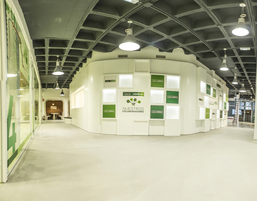
The Business School designed for Covirán, cooperative of supermarkets, connects emotionally with visitors and creates a sense of pride for belonging to this brand. The space, projected by Surgenia and Reinadecorazones design Studio, conveys modernity, avoiding a futuristic aesthetic or the classic partitioning, but opting for a unique architectural volume.
Surgenia, Andalusian Technological Centre of Design, has managed and implemented the design project of an innovative space for the Business School which Covirán, cooperative of supermarkets, has opened in Granada. The design studio Reinadecorazones has taken part in the creative stage of this project. It is a space of over 750 square meters that conveys the modernity and tradition of the company and connects emotionally with the visitor through a unique architectural volume which gives it identity and soul.
This project avoids the cold futuristic aesthetic appearance and traditional partitioning. It aims to avoid the inclusion of standardized structural elements and give the space a unique and personal distinctiveness. For this reason it has been proposed to design and manufacture unique items which convey the philosophy and values of the company. “The result is a space which makes the partners, workers and cooperative members of the company to be proud of belonging to this brand,” says Juanjo Guerrero, Project Manager in Surgenia.
Covirán Business School is a building, a compact piece with very clean lines, inside another building. “We found an empty warehouse,” Cesar Cintas explains, Creative Director in Reinadecorazones design studio, “so we have dressed it up creating a unique architectural volume, with a central hall which serves as a axis and creates a radial circulation towards the rest of the rooms“.


The white colour has been chosen as the leading figure to symbolize a genuine brand and a place to breathe clean fresh air. We used a combination of lacquered wood and neutral colours, along with glass and natural untreated wood, which conveys comfort and facilitates communication and dialogue. Regarding the graphic of signage, the values of modernity and soundness, through simple typographical games and iconographic elements have been chosen. In this way Covirán brand has a homogeneous identity.
The objective of this project was to design a space capable of communicating the values of the organization and promote business development. In the Business School, the history of the company is displayed, new trends in consumption are detected, new ways of purchasing are experienced and products are presented, in addition, the members of the cooperative receive training. In this way, the company is providing useful services for partners, workers and customers.
To accomplish this, Surgenia, through its Trend Observatory, has carried out a research on design trends, analyzing workspaces, coworking and culinary schools in order to detect opportunities to design an distinguishing space, able to meet the needs and expectations of the company. The new trends and opportunities in the use of materials, lighting, finishing and graphs have been also analyzed to find items that would help to strengthen the brand in the space. This research was completed with an analysis of policy and technical constraints to be considered for the development of the project.
After holding a co-creation meeting with the multidisciplinary team, appointed by Surgenia, and Covirán technical and management team, it has been identified the different spaces, the kind of materials and graphics which are the best to connect with the addressed audience for this space.
Following this roadmap, Reinadecorazones's team was responsible for the creative phase, proposing to organize the space around experiential zones based on the concepts of receiving, communicating, sharing and learning. Furthermore, the design has included a study area, a room for teachers, an administrative area and an area for toilets or changing rooms.
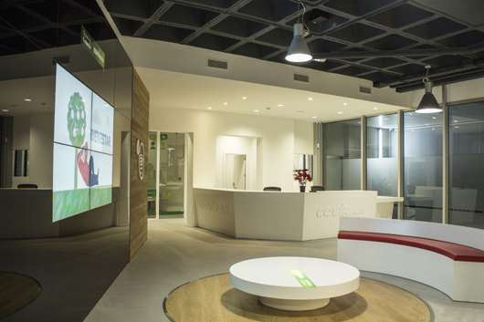
The reception place is an area for welcoming visitors and publishing the main message of the brand. The design seeks to generate an attractive and interactive environment. This area highlights the great black glassy wall which integrates a large plasma in which a corporate audiovisual is projected and serves as the brand presentation. In the reception area, there is a round table, which integrates the corporate brand backlit and a seat upholstered in red with a “C”, which reminds the company logo. The reception desk, with minimalist lines, incorporates Covirán's graphic identity through the corporate letters illuminated with LED technology.

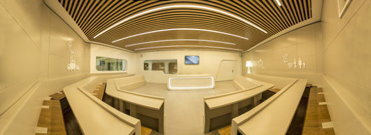
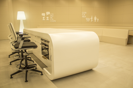
The place designed to communicate along with the reception place are the heart of the School. They are in the centre, separated from the other areas by a white skin, forming a ring around this heart. The space designed to communicate is thought for theoretical and practical training, product presentations and papers or press conferences. Its design resembles a television studio, with a large table in the middle - designed for the presenters - as the main element. The table has got elements integrated and kitchen appliances, for product or show cooking. Three screens in the training rooms allow the audience monitoring the communications that take place in this place, in case of exceeding the seating capacity. The bench, with an “U” shape and padded seats, creates an environment that fosters communication between speakers and attendees.

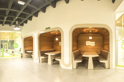
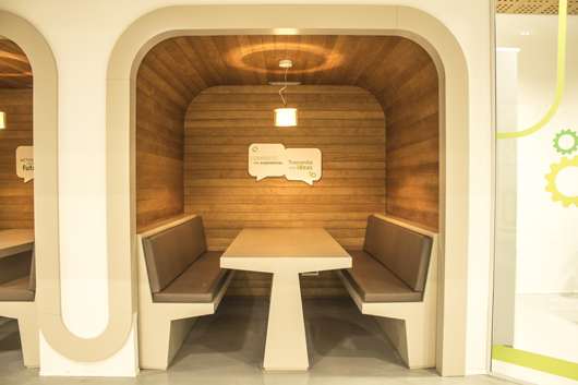
The place to share is located in the ring surrounding the central part of the Business School. It is intended for the empathy and understanding. There are three small spaces that do not exceed the capacity of four people. With a box structure, they are designed for meetings and discussion forums for small groups. They are nice cubicles because of their rounded corners and the natural wood lining that invite for conversation and understanding.
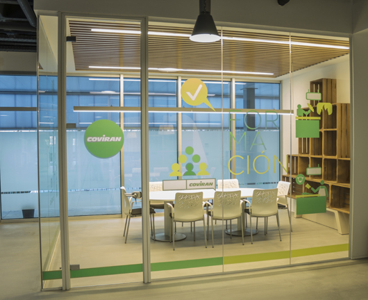
The space for learning is divided into three zones, intended for dissemination, promotion and training of employees, cooperative partners and workers. Its spatial flexibility stands out thanks to the mobile panelling, which allows changing the space adapting it to the different needs and making a wide open room. This area is framed by large windows, labelled with corporate adhesive vinyl, which communicate visually with the common areas.


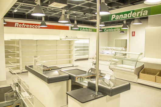
The place to experience is a classroom workshop, which reproduces a supermarket of the Covirán cooperative. This area is designed to develop the practical training activity of the organization.
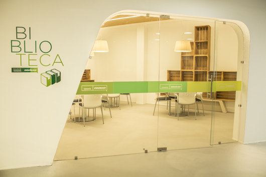
The circle is closed by the study area along with the library, the room for teachers, the space designed for the management and administration of the centre, the toilets and the changing rooms. The administrative area and the teachers’ room communicate visually with the reception through big glass canvases. It highlights the furniture of the library, designed by Reinadecorazones creative team, recalling concepts from the packaging, delivering, and manufacturing of foodstuffs. “We have looked for items that would help us to catch the best from the past to envision the future of the company,” Cesar Cintas explains, “so we have designed shelves evoking boxes of horticultural products.”


It should be noted that in the design of the space as well as along the execution, it has been taken into account the principle of accessibility, energy conservation and environmental sustainability at all times.
“The result is a place that gives you goosebumps” Cesar Cintas concludes, “and thanks to the research of Surgenia Trend Observatory - that has shown us the way forward in the creative phase - and thanks to the co-creation workday, which has allowed us knowing the customers’ needs and expectations directly and clearly.”
“The space we have developed with Surgenia's project has positioned us at the forefront of the business schools so we hope to be a leader in our industry,” Silvia Miranda says, Director of Marketing and Services in Covirán. “With the work methodology followed, we have been involved in the project and the development team understood the essence and values of the company quickly, adapting to our philosophy, without any loss of professionalism in planning, execution and leadership that this project required.”
Source: Surgenia
Visit the Surgenia website
Visit the Reinadecorazones website
Visit the Covirán website
News Infurma:
Online Magazine of the International Habitat Portal. Design, Contract, Interior Design, Furniture, Lighting and Decoration
