SEB Bank's New Stockholm Headquarters. Minimalist Scandinavian Design Meets the Corporate Workspace
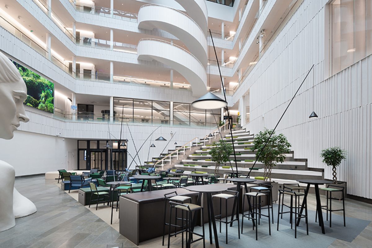
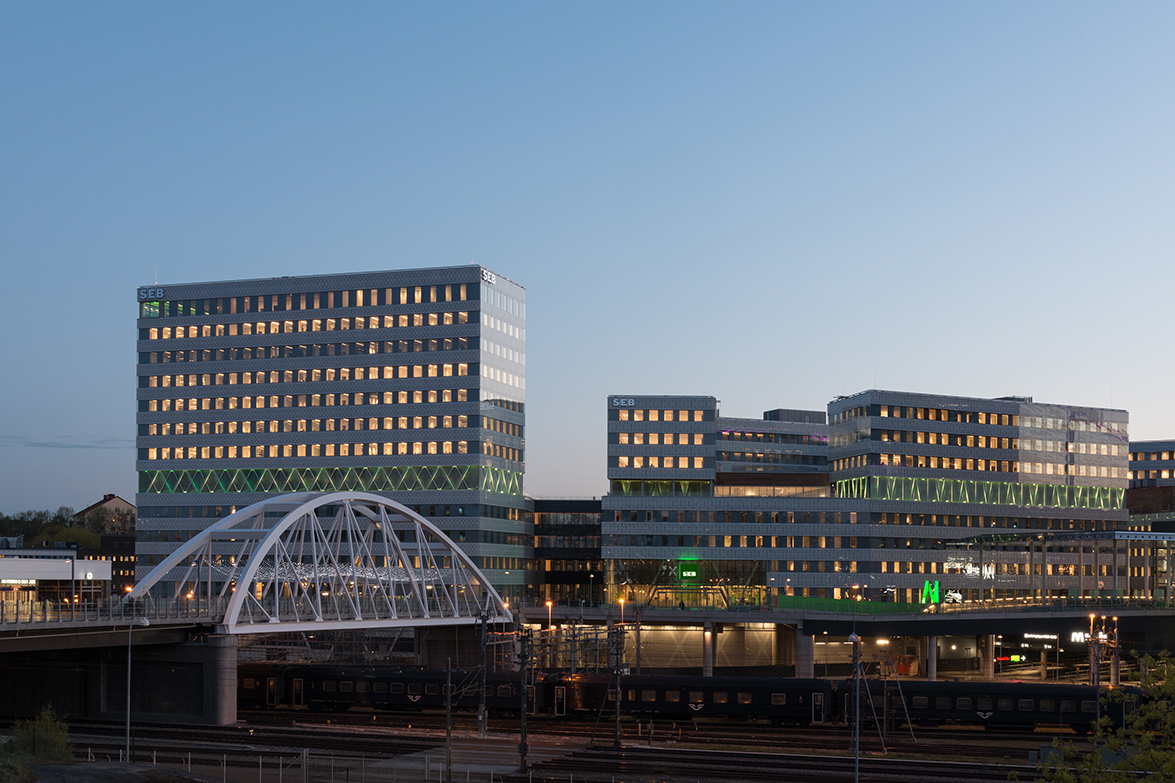
A leading Nordic financial services institution, SEB recently opened its new headquarters in Arenastaden near Stockholm. Housing approximately 4,500 employees, the 100,000 square-meter building features a modern sensibility and an open floor plan. Vibia spoke to the award-winning lighting designer on the project, Fanny Englund, who shared her inspirations and strategies and how she was able to create a dynamic atmosphere in a sprawling corporate space.
Based in Stockholm, Fanny Englund is a lighting designer specializing in office and residential buildings. Englund works for ÅF Lighting, where she was part of the team that won the 2016 Swedish Lighting Award for groundbreaking office lighting.
HOW DOES THE ARCHITECTURE AND DESIGN OF A SPACE IMPACT YOUR LIGHTING DECISIONS?
I try to work close to the architect to fulfill and enhance their vision of a space. The magic happens when architecture and lighting work together as one. But if the architecture doesn’t support the client I will always focus on making it as good as possible for them.
DOES A COMPANY's FUNCTION—IN SEB's CASE, A BANK—AFFECT WHICH LIGHTING YOU CHOOSE?
A good understanding of the client's needs is crucial in any project. The brand identity is also important. A big bank like SEB involves many types of jobs. Since almost all the employees are working in an open space it's impossible to meet the needs of everyone. Instead, we tried to make it as good as possible for as many as possible, including meeting ergonomic requirements. With all the different areas in the building it's easy to find a spot with the light that you need for the moment.
HOW DID YOU APPROACH THE LIGHTING DESIGN FOR SEB?
We aimed for very discrete general lighting, with a lot of focus on good vertical light to create soft ambience. We carefully designed the light for different types of rooms so that you have illumination where you need it and not just a flat, even light everywhere. This creates a peaceful yet dynamic foundation where you can experience the space without thinking about the light. And we let the more decorative fixtures be the focus. These are carefully selected in collaboration with the interior designer to fit each space. The decorative fixtures also serve as work lights over conference tables and create intimacy for more informal meeting areas.
WHAT WAS YOUR DESIGN INSPIRATION FOR THIS PROJECT?
Modern classic and Scandinavian design was what SEB wanted. They wanted their office to look and feel right for 20 years so we tried to avoid things that looked extremely trendy, to make the design more timeless.
WHY DID YOU CHOOSE VIBIA PRODUCTS?
The Vibia products we used in this project meet the minimal, but still bold design that we were going for. They feel modern and classical at the same time. The quality of both the light and the material make them products that will look good for a long time.
DISCUSS THE PARTICULAR FIXTURES YOU SELECTED FOR SEB
The Meridiano lamp is one of my favorites in the project since it serves as both a lamp and a table or a chair at the same time. You get two for one! Also, it produces a really nice light effect on the floor.
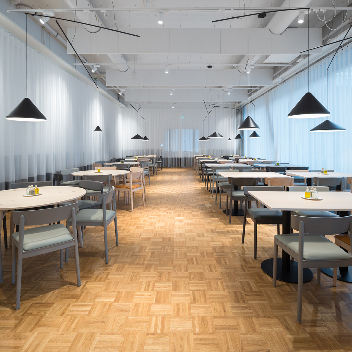
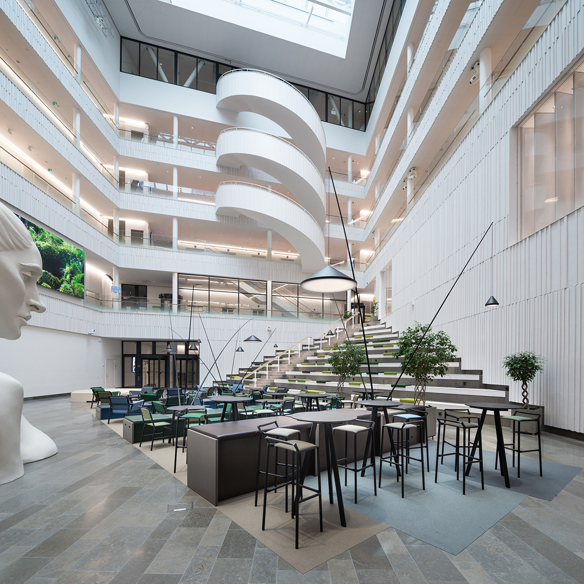
The North floor lamp was chosen for one of the big atriums since it helps to create a more intimate feeling and its minimal profile means it doesn’t disrupt the view.
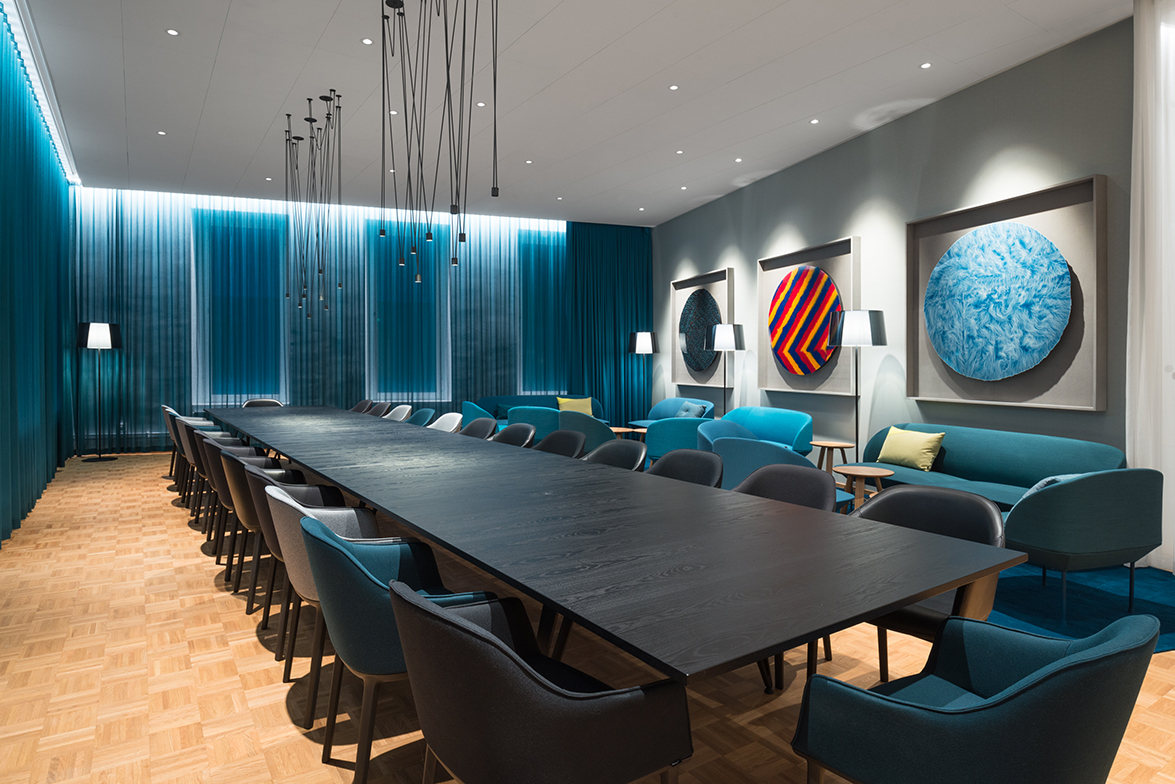
We chose the Match pendant for one of the bigger conference rooms because it fills the relatively tall vertical space over the table but is small enough so you can see everyone around the table as well as the projector screen. It also has the “wow” effect to impress clients who come for meetings here.
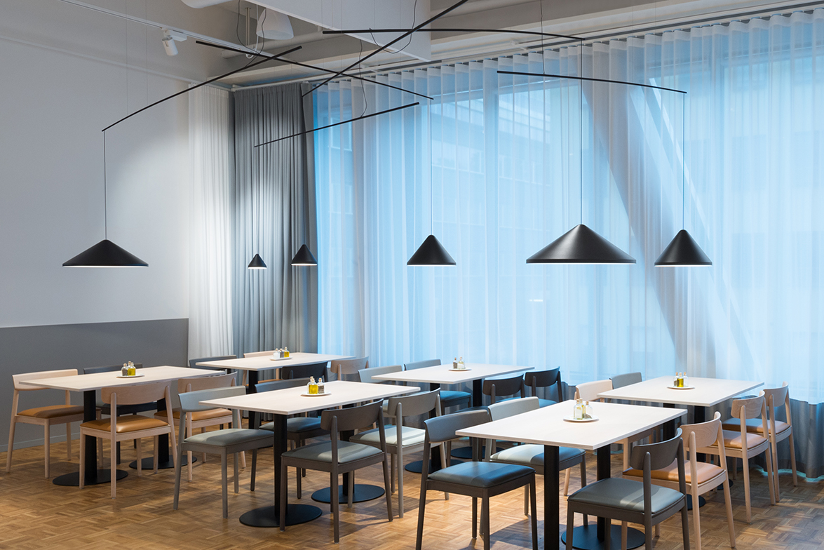
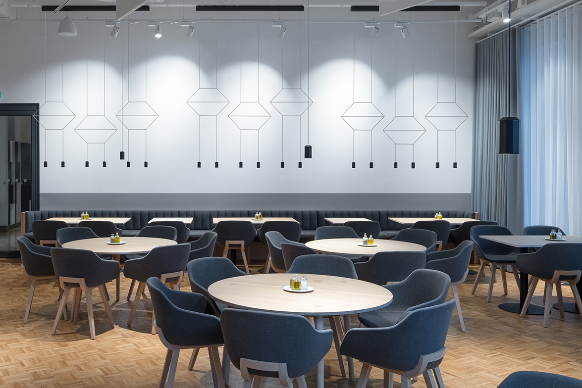
In the restaurant, Wireflow Lineal was perfect along a long white wall because of its graphic effect. Suddenly a boring wall turned really interesting! The North pendant, Wireflow Free Form and Suite floor lamps were also used in this project to create unexpected design combinations. The mix of different but still matching fixtures was important to achieve the dynamic impression we wanted.
WHAT WERE THE CHALLENGES OF LIGHTING THIS SPACE?
The biggest challenge was the size of the project. How do you make an office of almost 100,000 square meters feel interesting and welcoming—not standardized and repetitive— while still keeping the costs reasonable? With smart choices and close collaboration with the client and the interior architects we, for example, managed to make the 600 meeting rooms look different by small shifts in colors and design.
HOW HAS THE EVOLUTION OF LIGHTING AFFECTED YOUR WORK?
The most important thing is to always be open and learn about the possibilities the improved technology offers. But just because it's new doesn’t mean it's better. I try to evaluate new products live to make sure they have the qualities I’m aiming for. It's also important to remember that good lighting always is about creating a suitable atmosphere, and no cool new features of a control system, etc., will change that.
Source: Vibia
Photos by Lasse Olsson
Visit the Vibia website
Read more news related with VIBIA published on Infurma
News Infurma:
Online Magazine of the International Habitat Portal. Design, Contract, Interior Design, Furniture, Lighting and Decoration
