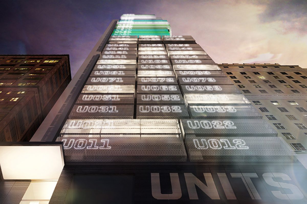
Gravity, the high tech start-ups office hub designed by Lagranja in Hong Kong

A futuristic facade of cubicles, a playful interior full of graphics and illustrations, metal surfaces and concrete coverings make Gravity, the latest project by multidisciplinary Spanish studio Lagranja carried out in Hong Kong. A giant spaceship that makes up an eccentric world halfway between artisanal and digital, between high and low technology.
Located in an industrial area of the Kwun Tong neighborhood, a boiling area of the Kowloon district, this complex of 33 plants owned by the company Hip Shing Hong (HSH), is set up for technological start-ups.
The initial brief was to create the façade of the building, along with the cubicle offices (or “units”), common areas and all interior treatments. The façade remained in project stage, due to local construction laws. Designed as a stacked tower of modules baring futuristic LED signage (from graphics by Mario Eskenazi), it went on to steer the form, IDs and industrial functionality of the units, which have been left bare so that each tenant can adapt them to their particular needs.

In contrast, Lagranja has installed the parking area, lobby and lifts and washrooms of Gravity with an upbeat playfulness. With polished concrete floors, metal finishies and illustrated surfaces, the overall feeling is of being inside a giant space ship on a journey to Planet Fun. Lagranja invited Barcelona-based artist Javier Royo to design the graphics. Bicycles, whales, rockets and even tooth brushes make up a kooky world that sits between the handmade and digital, the high and low tech.


The tonality of these surfaces changes from floor-to-floor, from turquoise to ice-green; adding a spatial illusion to the confined, narrow layouts. Shiny steel surfaces, mirror-like texture ceilings (which conceal electrical and plumbing installations) add further depth and the sensation of being suspended in time and space.


Gerard Sanmarti and Gabriele Schiavon, cofounders de Lagranja, say that this project was driven by the city's social, cultural and architectural character “We are always aiming to contextualise our projects.” says Gerard. “In the case of Gravity, we think that it could have only been designed for Hong Kong: a daring, incredibly dense city, but one that can often lack a human touch.”

Source: Lagranja Design
Photos: Lagranja Design
Read more news related Lagranja Design published at Infurma
Visit the Lagranja Design website
News Infurma:
Online Magazine of the International Habitat Portal. Design, Contract, Interior Design, Furniture, Lighting and Decoration
