Kitayama K Architects designed a sustainable Café in Melbourne with a modern clean aesthetic
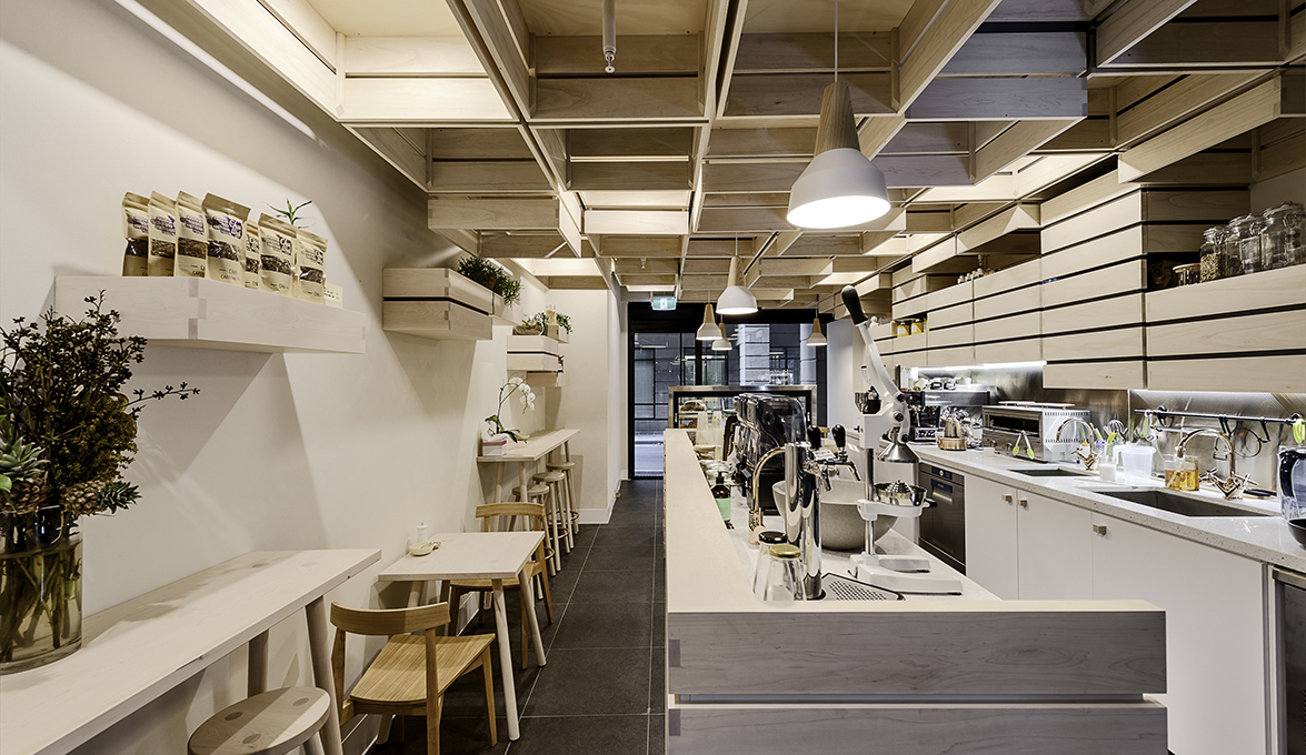
The commitment to seasonality and sustainability of Hunters’ Roots Café and Juice Bar in Melbourne's Katherine Place is evident in its honest and fresh design. Kitayama K Architects were called on to create an environment which aligned with the food philosophy of owners Jeffrey and Kerry Chew.
Responding to a brief for a modern clean aesthetic, Architect Kei Kitayama has created an interior inspired by wooden fruit crates used in abstract form. The crates fill the spaces, creating an immersive, almost cave-like sculptural form, yet one that is produced from simple and straight geometric shapes. The result is a clean and controlled spatial experience.
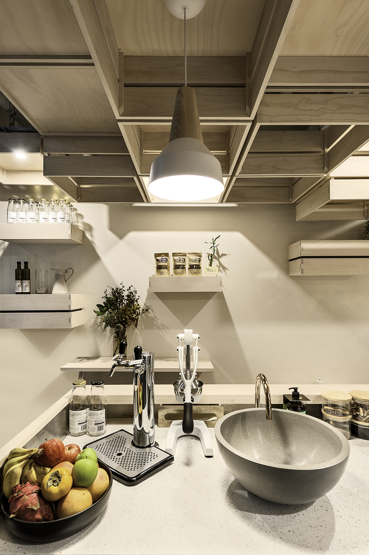
The clever design also maximizes the limited space by turning practical fixtures into decorative features. The lights, cupboards and shelving contribute to the design concept and sculptural visual.
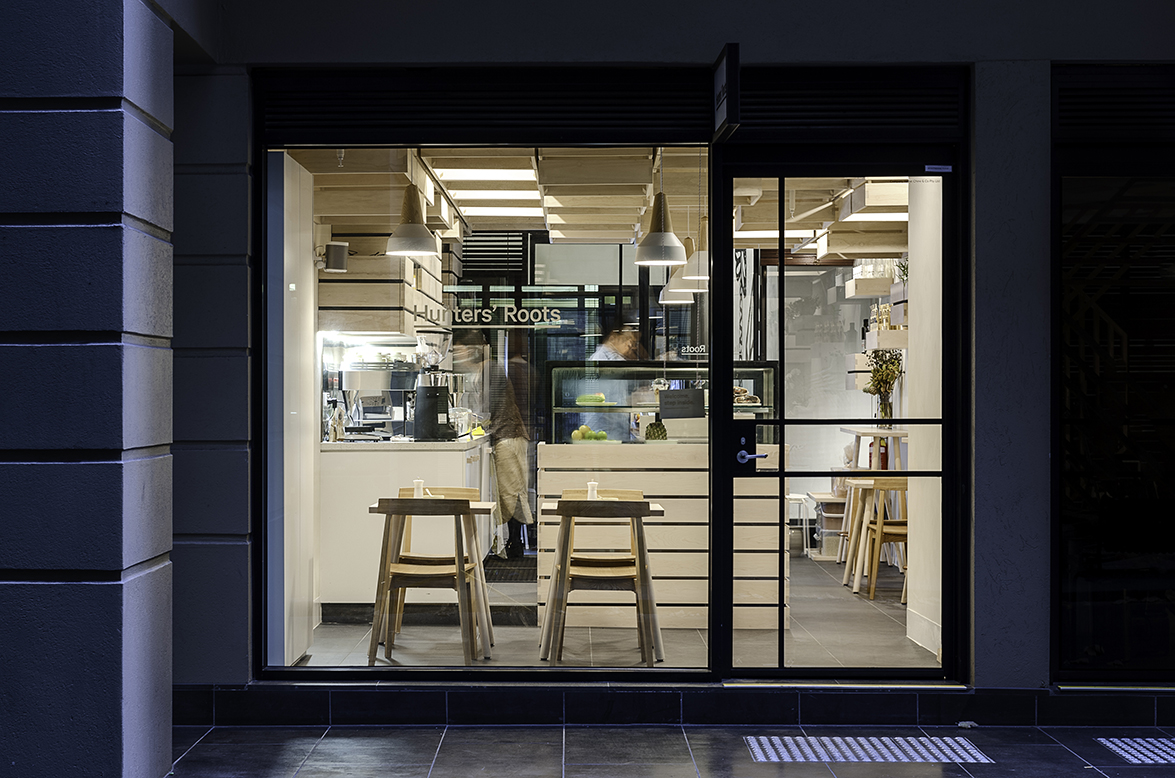 A light, yet warm colour palate has been achieved by using American hard maple and paulownia throughout the space, which have both been further lightened with a lime wash. Some of the crates suspended from the ceiling double as light fittings, creating shadows that add depth and interest to the interior.
Paulownia hardwood was chosen for the crates suspended from the ceiling. The lightweight timber did not require additional steel structure and installation was relatively simple. However, the remaining joinery and lower crates are formed from American hard maple. Kitayama was familiar with the robustness of hard maple from a previous project. It is a species that has a tight smooth grain and is popular for use in high traffic areas - most famously in basketball courts.
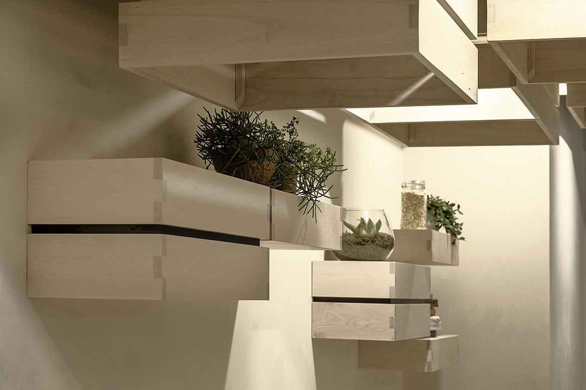 Orio Bundi, from Arteveneta Joinery said that the choice of American hard maple was primarily for its light hue but also describes the hard-wearing timber as “soft to the touch” which was important in achieving the overall immersive experience.
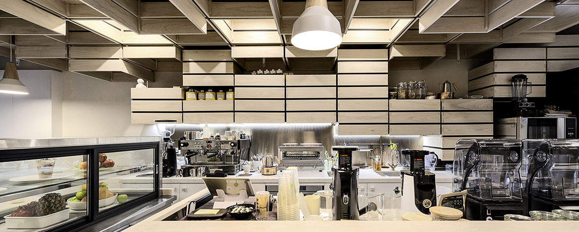 Kitayama says of his design: “Our decision was to use an abstract form of timber crates, to avoid being too literal. We wanted to give the patrons a chance to decide what they represented. Are they fruit and vegetable crates or do they look more like fruit peels. It's a playful concept”.
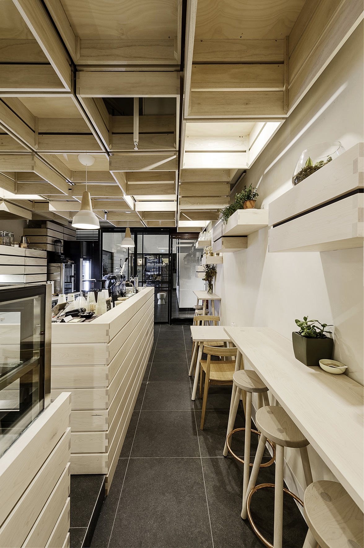 Kerry Chew comments “Kei has exceeded our expectations. What we love most about our space is that it is striking when seen as a whole design yet clean, inviting and cozy for our customers to relax in”. She goes on to add that the hand finished joinery detail “adds a very tactile and solid feel to our small space”.
 Project Details:
Project: Hunters’ Roots Café www.huntersroots.com
Client: Jeffrey y Kerry Chew
Location: 26 Katherine Place, Melbourne, Australia
Architect: Kei Kitayama kitayamakarchitects.com.au
Contractor: Orio Bundi, Ian Reid, Arteveneta arteveneta.com.au
Photography: Itsuka Studio
Source: AHEC
Read more news related AHEC published at Infurma
For more information on American hardwood species and case studies, visit www.americanhardwood.org
News Infurma:
Online Magazine of the International Habitat Portal. Design, Contract, Interior Design, Furniture, Lighting and Decoration
