La Primera, new restaurant in Madrid designed by Tarruella Trenchs
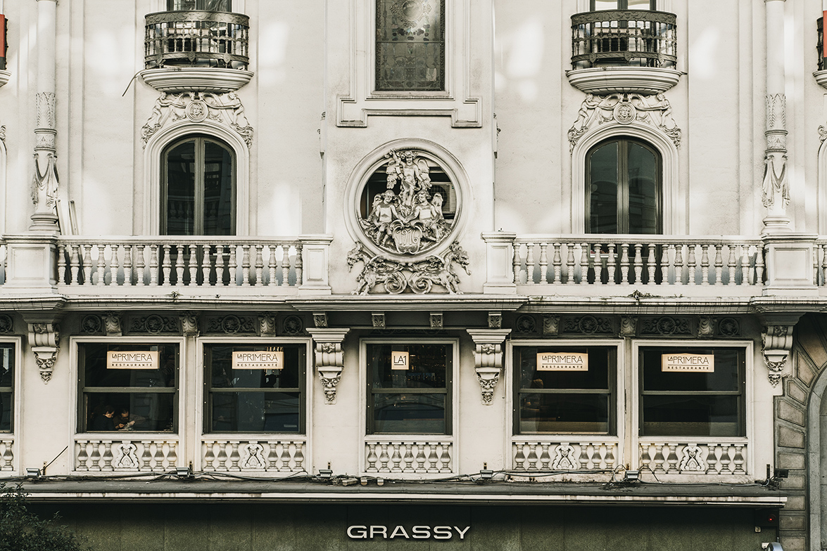
La Primera Restaurant is the third gastronomic project of chef Paco Quirós and businessman Carlos Crespo. It is located on the frst foor of the iconic Grassy Building. A protected listed property on a prime location in Madrid at 1 Gran Via. Tarruella Trenchs Studio has carried out the interior design project, and so they have been explained.
The project is in a space that had previously been used as restaurants, such as: El café Sicilia Molinero, Gula Gula and Atalanta Restaurant. Throughout the years, the diferent remodelations had been stripping the most ornamental part of the interior space evolving towards a more contemporary style.
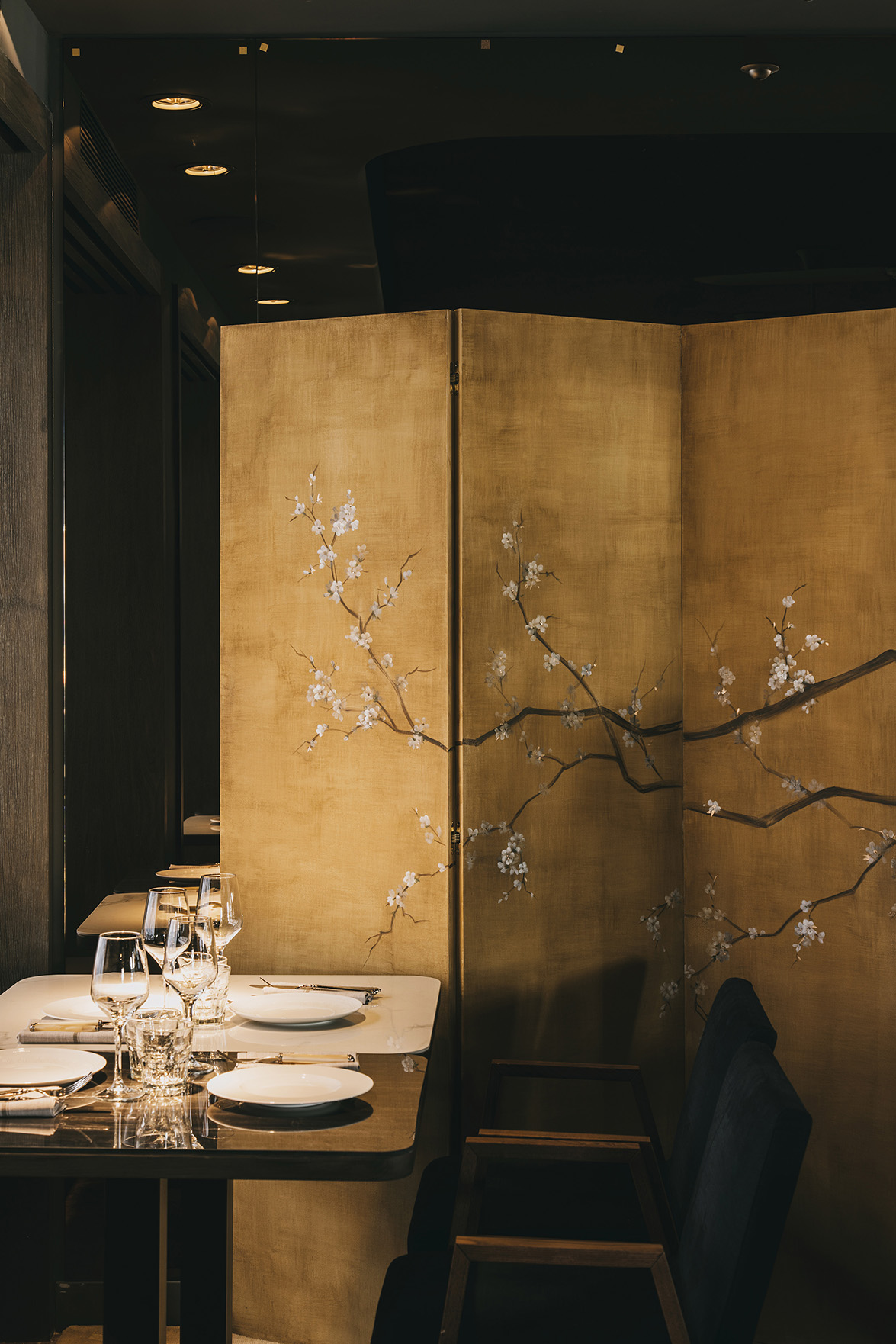
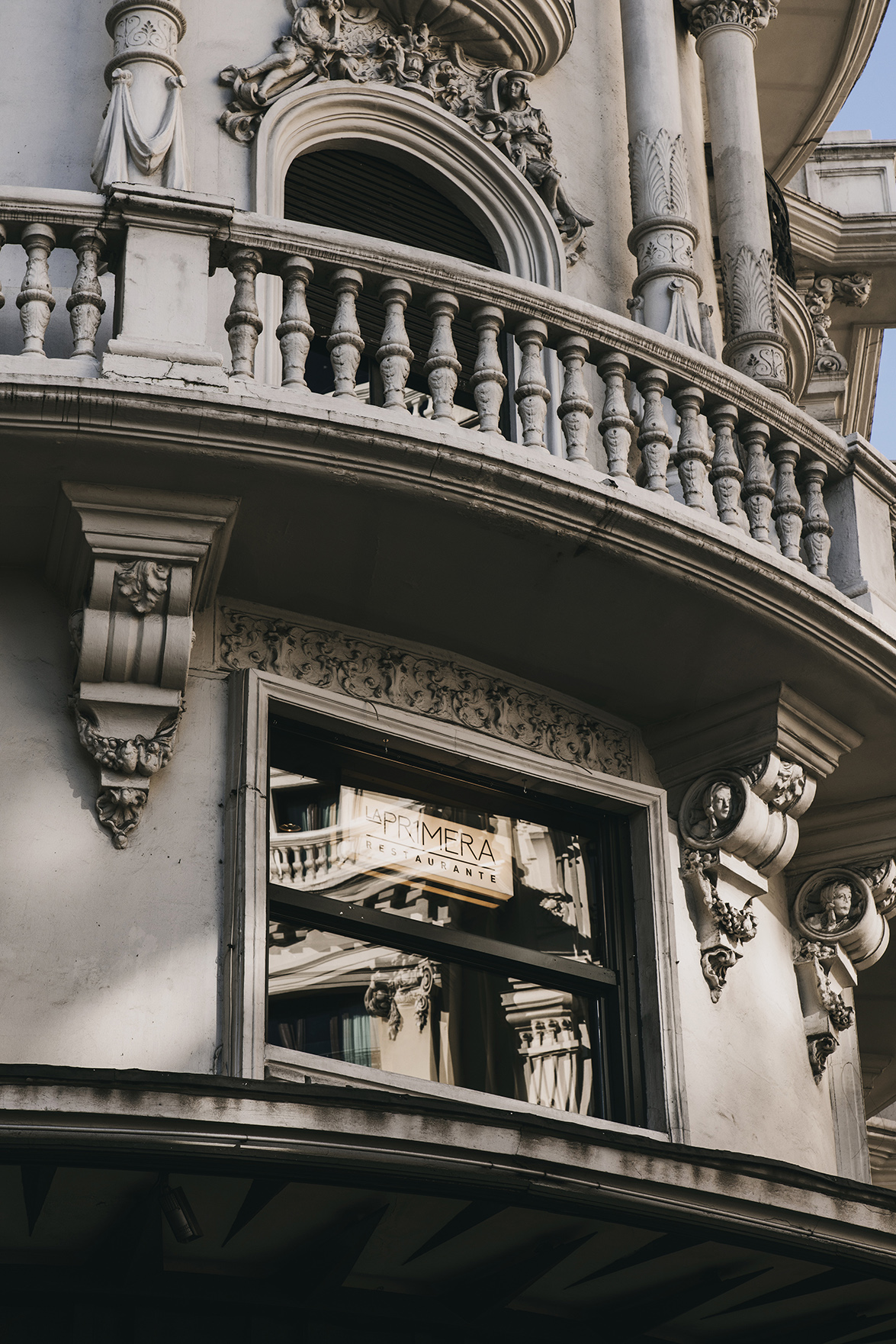 Our project intervention has been on a surface level by dressing again the existing space following the aesthetics of the Emblematic building where the restaurant is located. We have created a cozy and elegant space, but with a casual and current focus aligned with the type of ofer our client wants to give; ranging from breakfast service to cocktails after dinner.
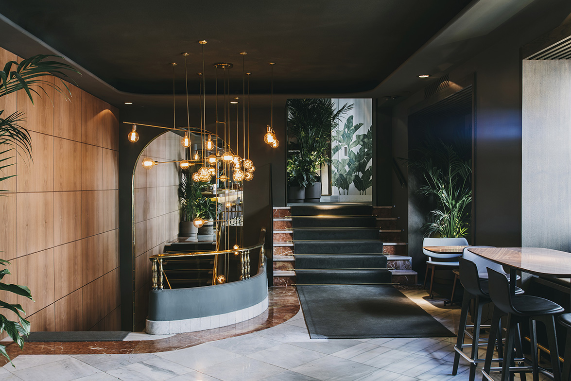
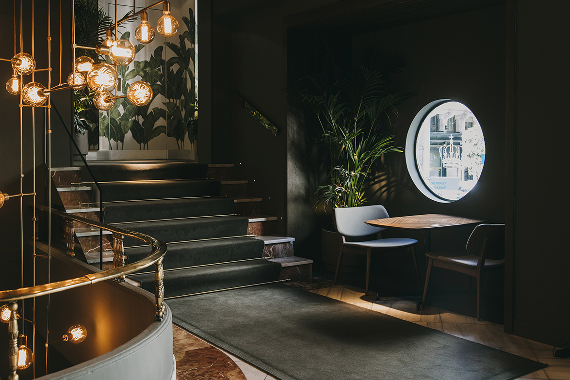
The project aims to review its historic context in a respectful manner by reusing certain elements found in the original intervention. Some of the architectural elements built are soft ceilings with illuminated moldings throughout their perimeter and round columns. The façade has been respected, as well as the access stairways, natural stone foorings with patterned motifs, besides the wooden window frames.
Three large wooden elements have been added to provide the warmth the space required, by adding wooden panels on the stairway, the bar, and both the wood fooring and circular bench on the round corner.
The new layout of the restaurant has been designed to create zonings with multiple possibilities to enjoy the space.
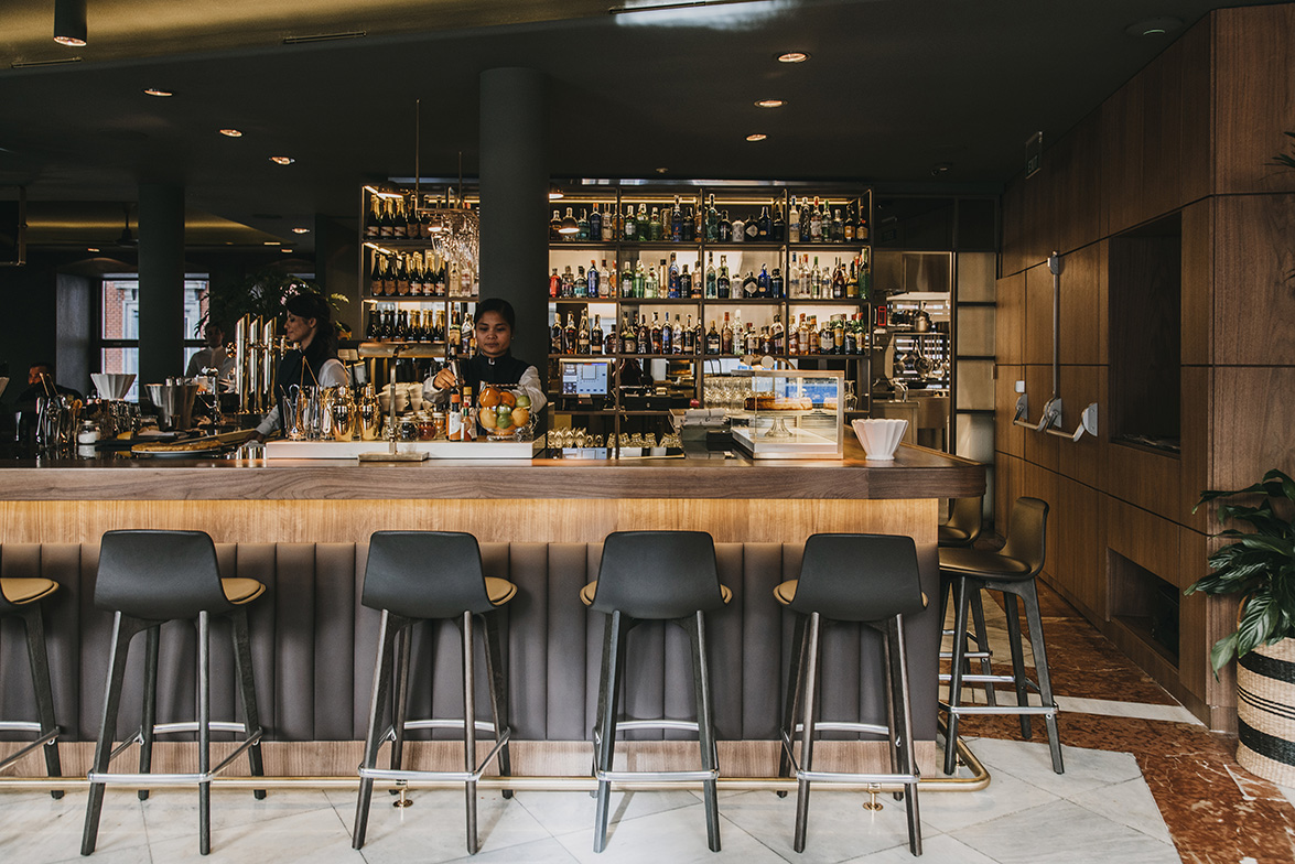
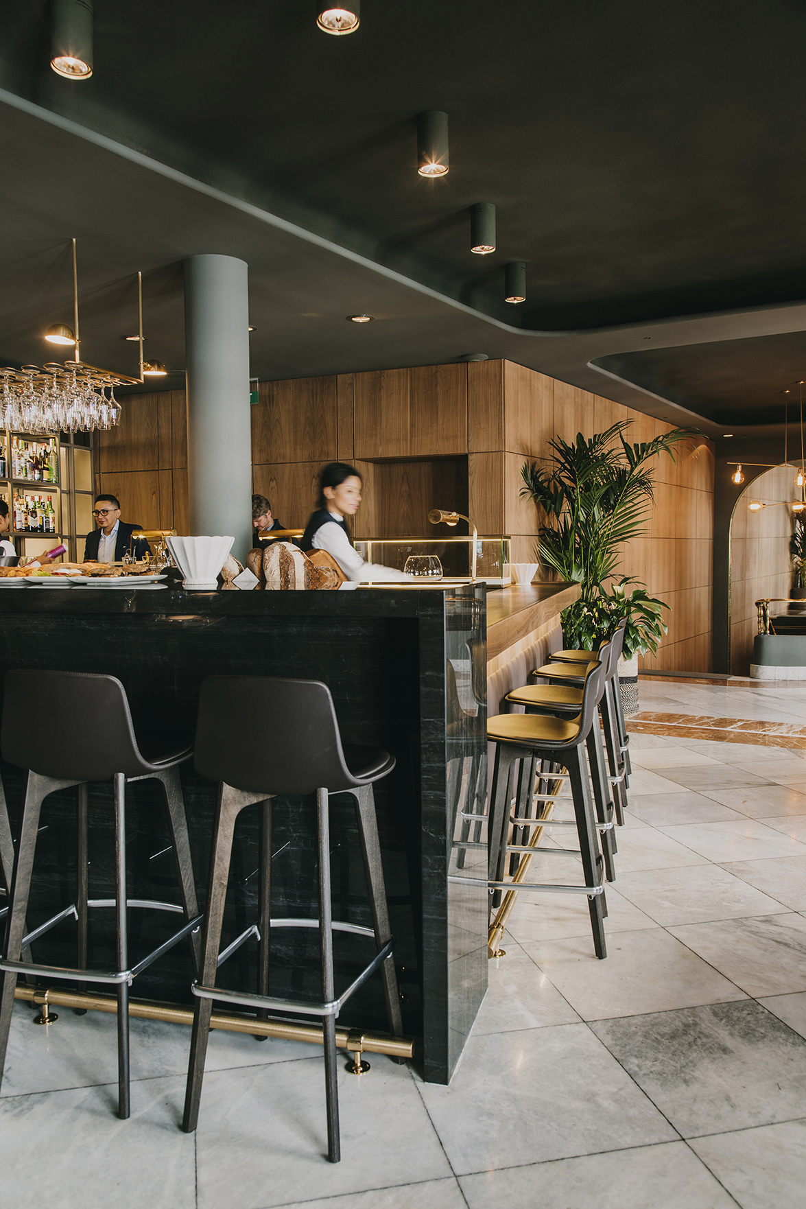
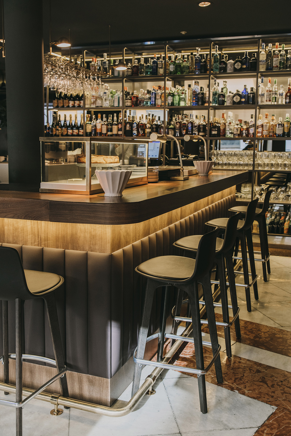
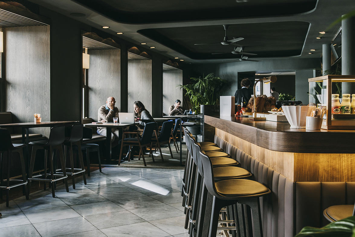
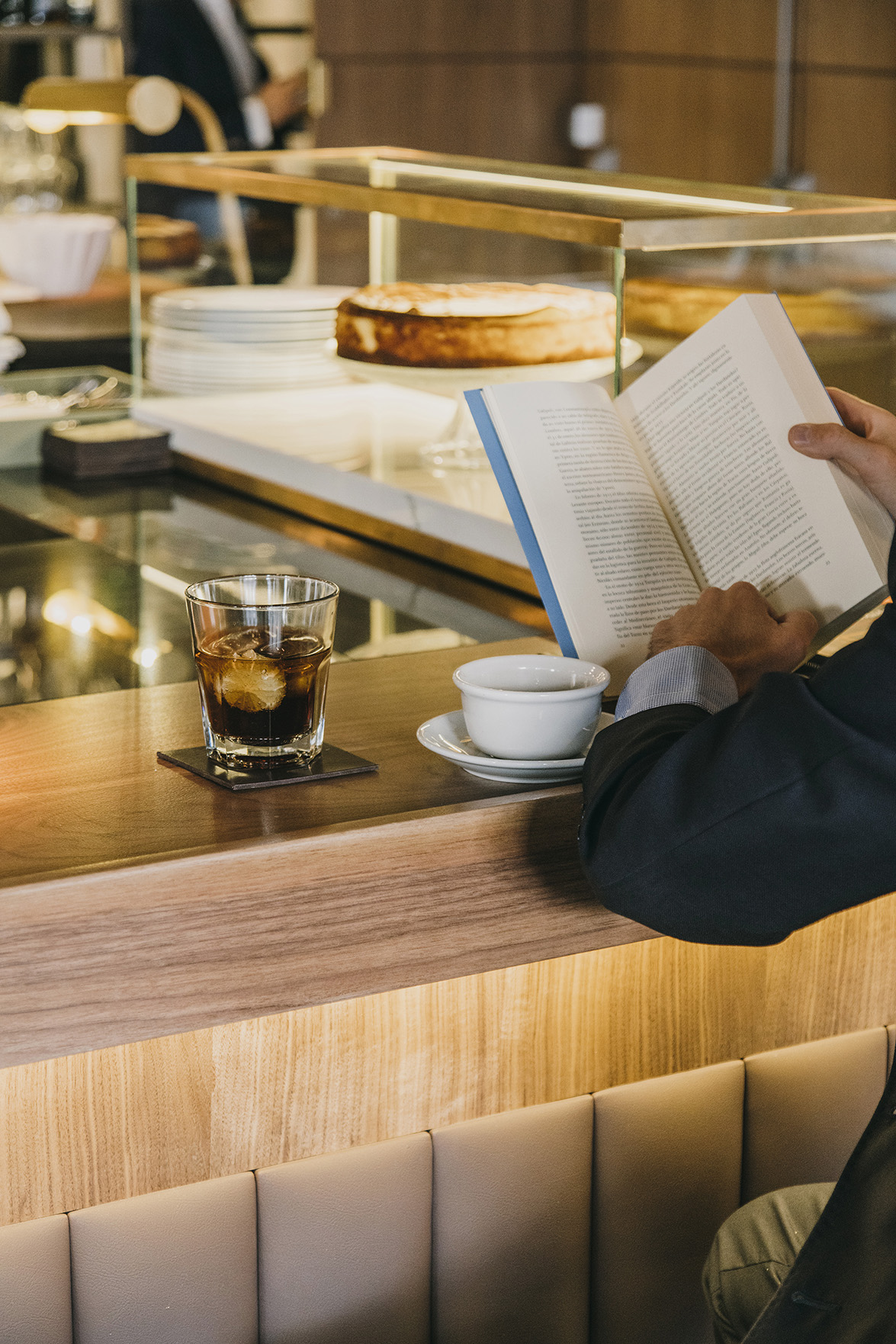
The central bar welcomes guests once they have ascended the stairways, and gives dynamism to the space surround it. The bar is fnished with noble materials to provide a well thought aesthetics by using leather, wood and white and black stones. Hence, the space can be adapted and transformed to provide an extended service, from early morning breakfast to evening cocktails. Behind the bar, there is a shelf that serves to display wines and spirits, and allows to glimpse at the busy kitchen, the main protagonist of the restaurant.
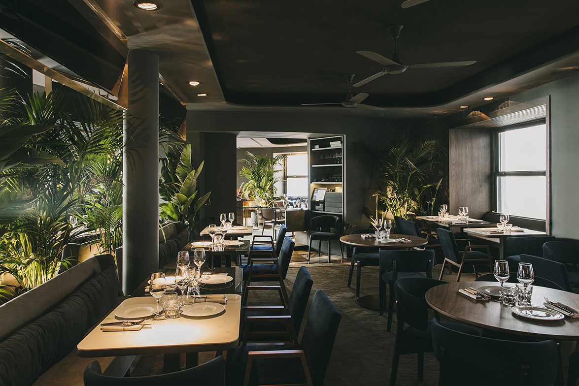
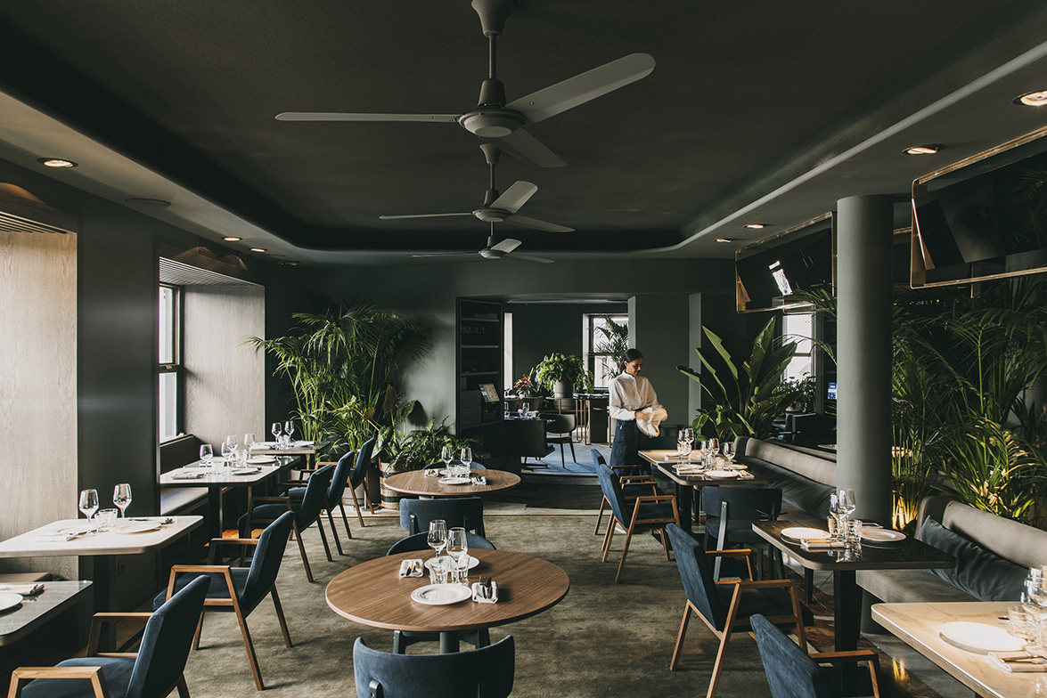
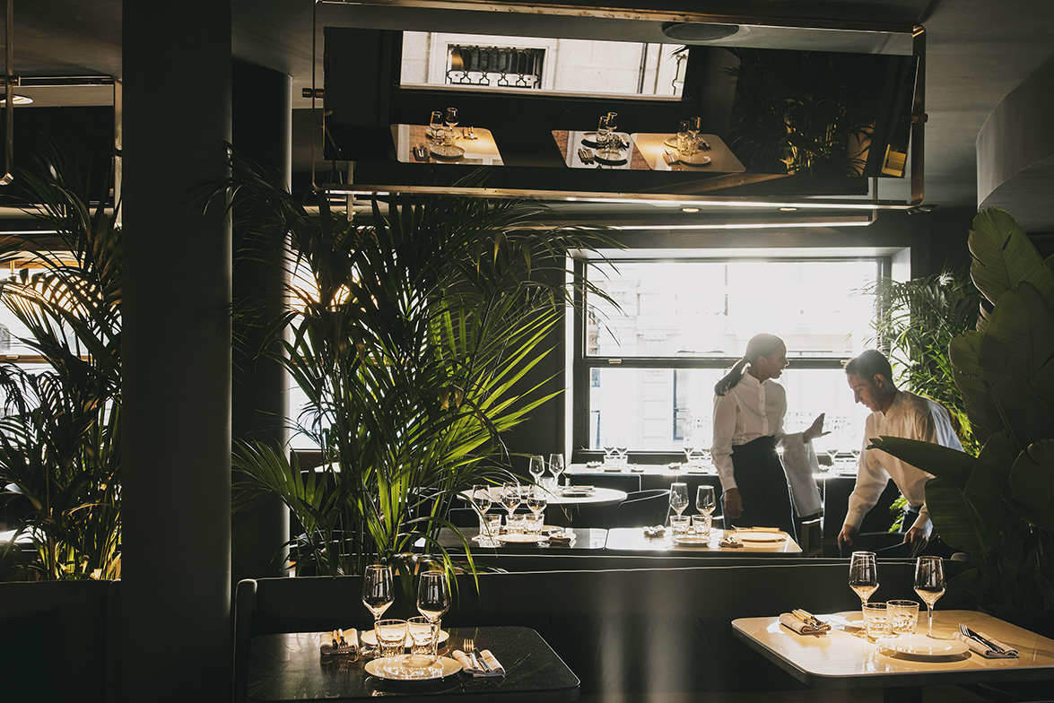
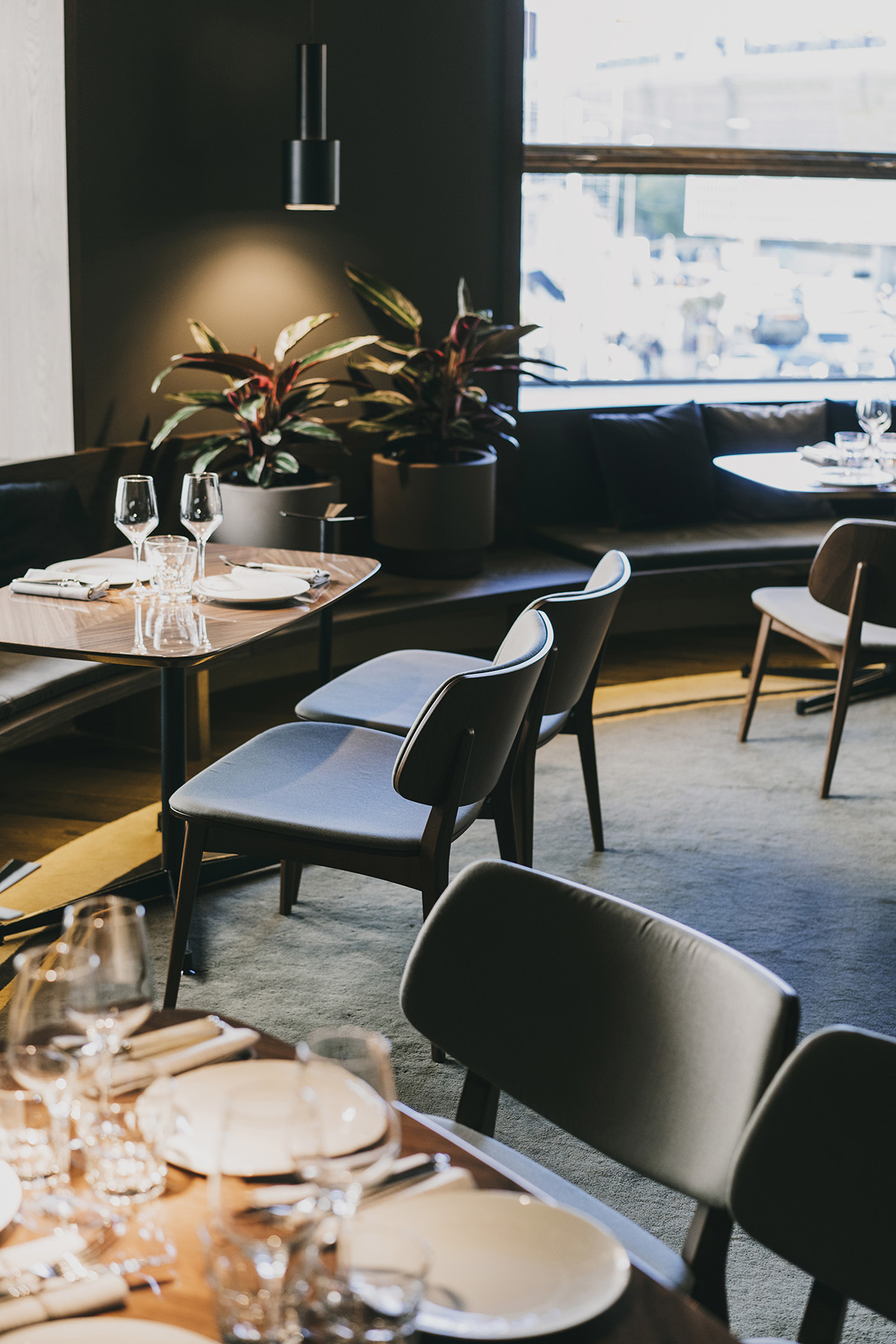
 In the wedge-shaped space and adjacent to the bar, two very similar dining rooms have been designed and are divided in the center by lush vegetation and upholstered banquettes. The existing wood banquettes, placed against the façade, have been kept, and the two rooms have included central tables to complete the space.
 Finally, in the area of the building´s round corner, the idea of a living room has been enhanced in a room surrounded by windows, where wooden foorings, the comfort of a freplace, low furniture pieces, upholsteries and a banquette along the perimeter reinforces the circular layout plan and its retreat.
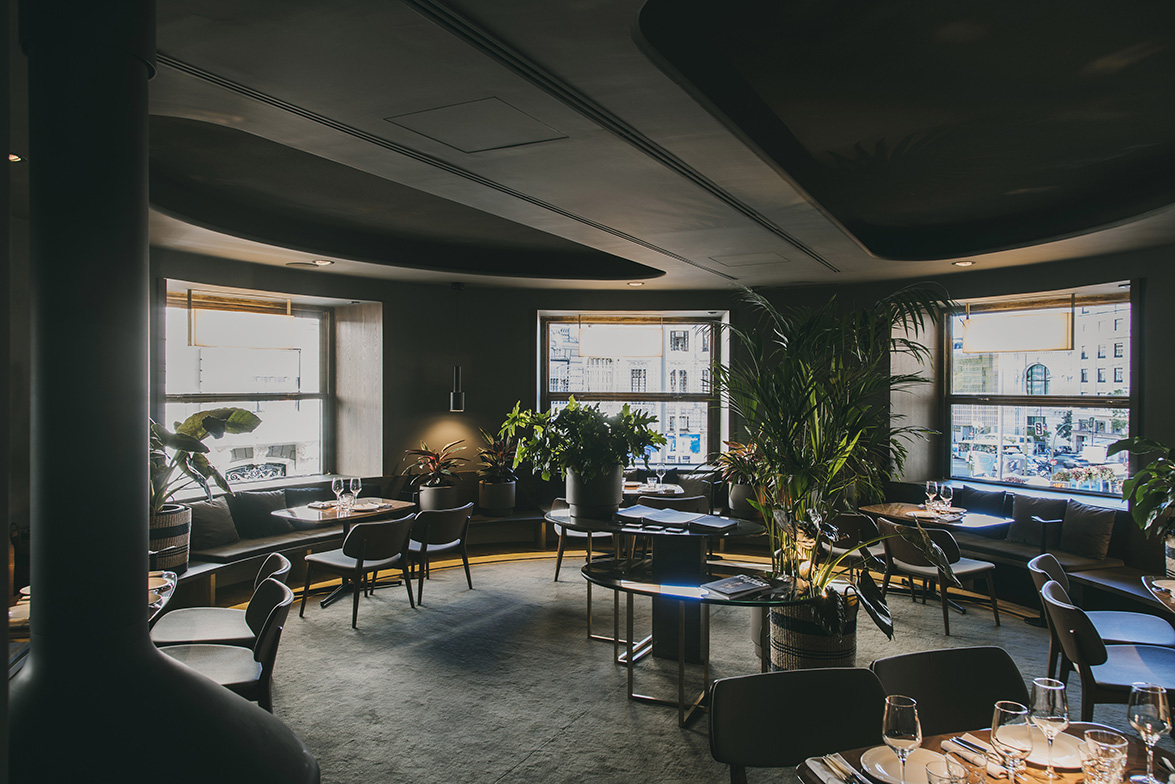
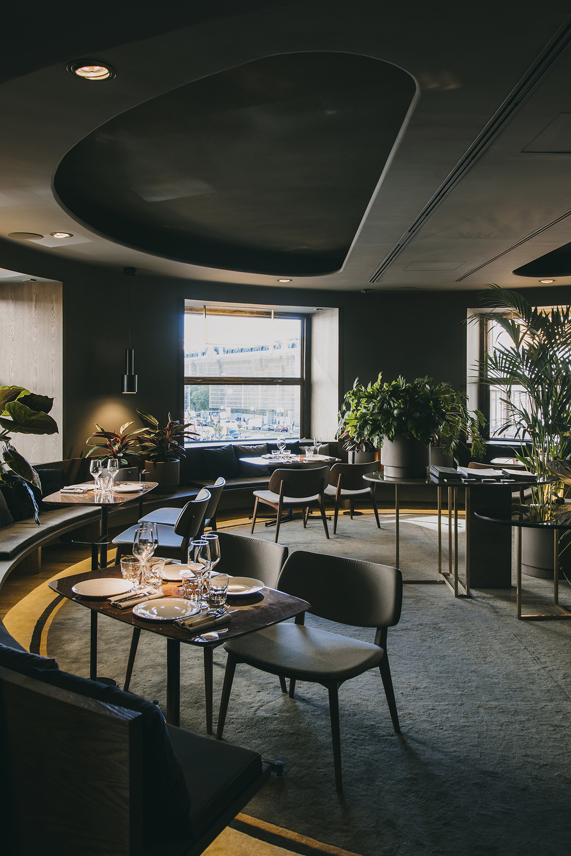
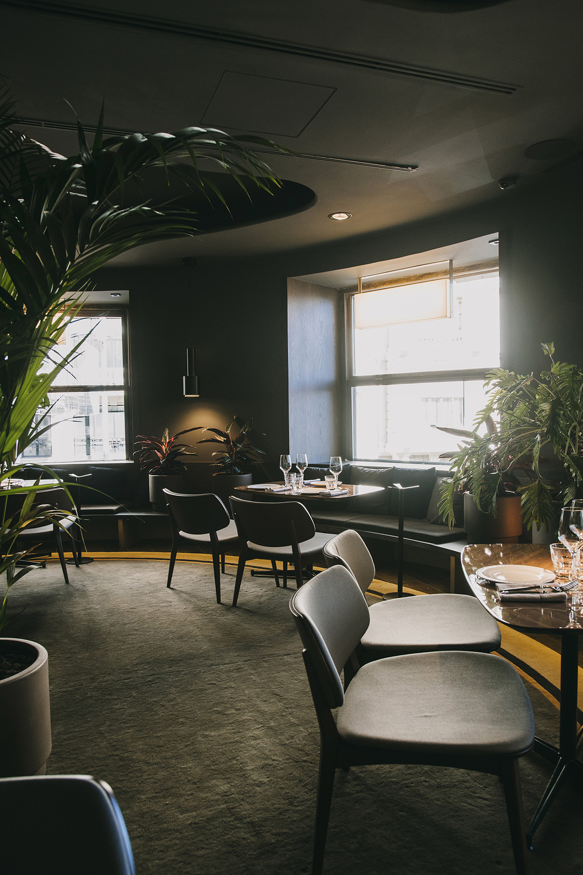
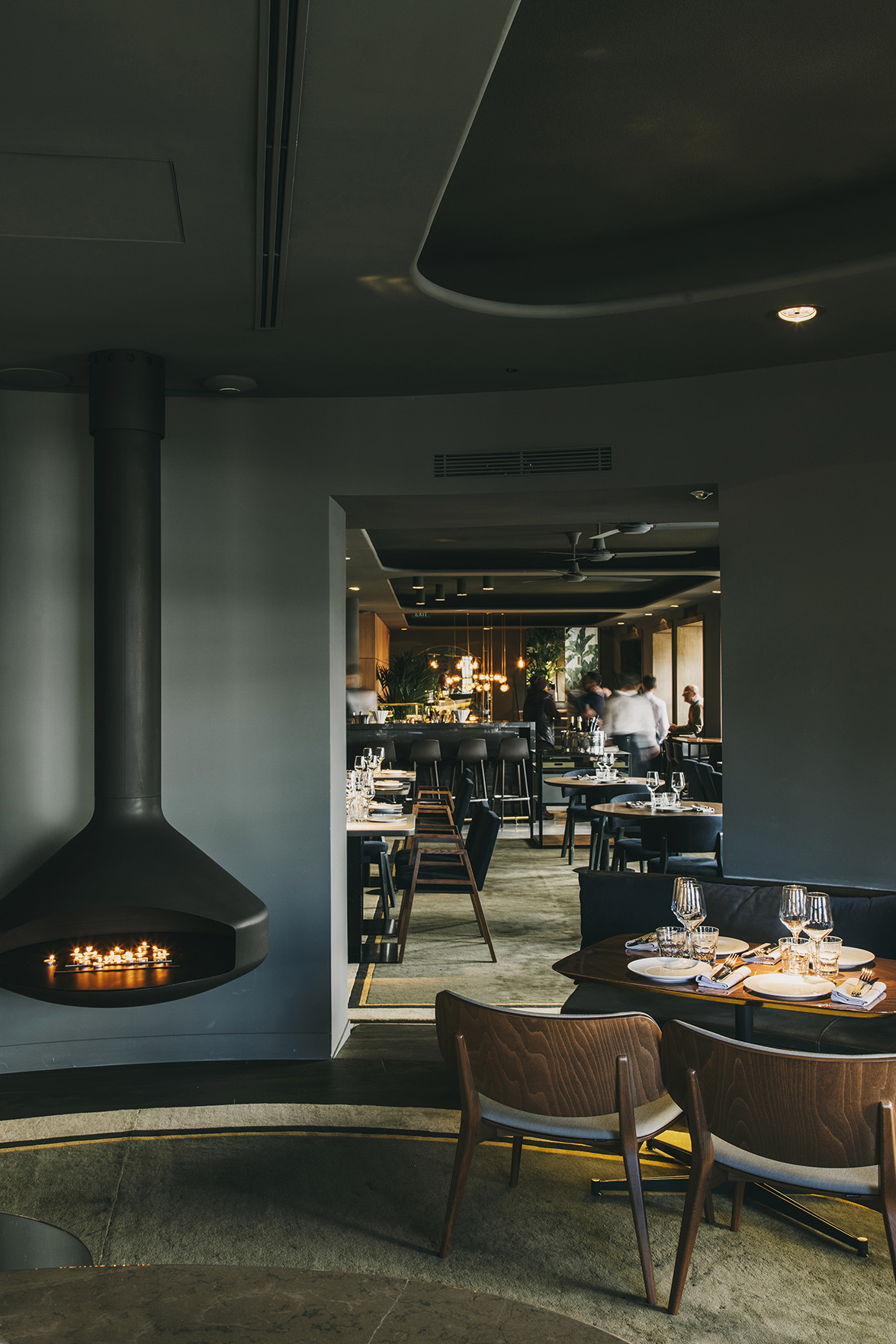 Relative to color, the decision to paint all the walls and ceilings with an intense greenish-blue tone gives a freshness sensation during the day, yet during the evening, it helps to create a more intimate night ambience. The theatrical illumination focused on tables and also on the vegetation, brings retreat and protection, delimiting spaces without the need to use physical divisions.
On the floor, the large geometric rugs made in wool with shades of yellow and white bring comfort and elegance, and helps dress the space.
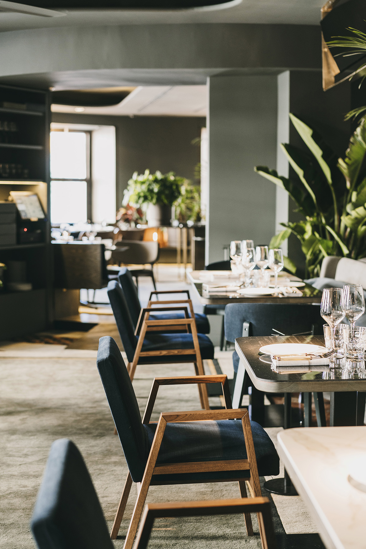
The furniture pieces, largely reused and having pure and simple forms, have been reupholstered, also existing oak woods have been tinted in a dark tone, and bluish chromatic tones, brown leather and dark wood have been introduced to provide an elegant and sober ambience without losing the freshness this place needs to transmit to invite guests throughout the day, from early morning to late evening.
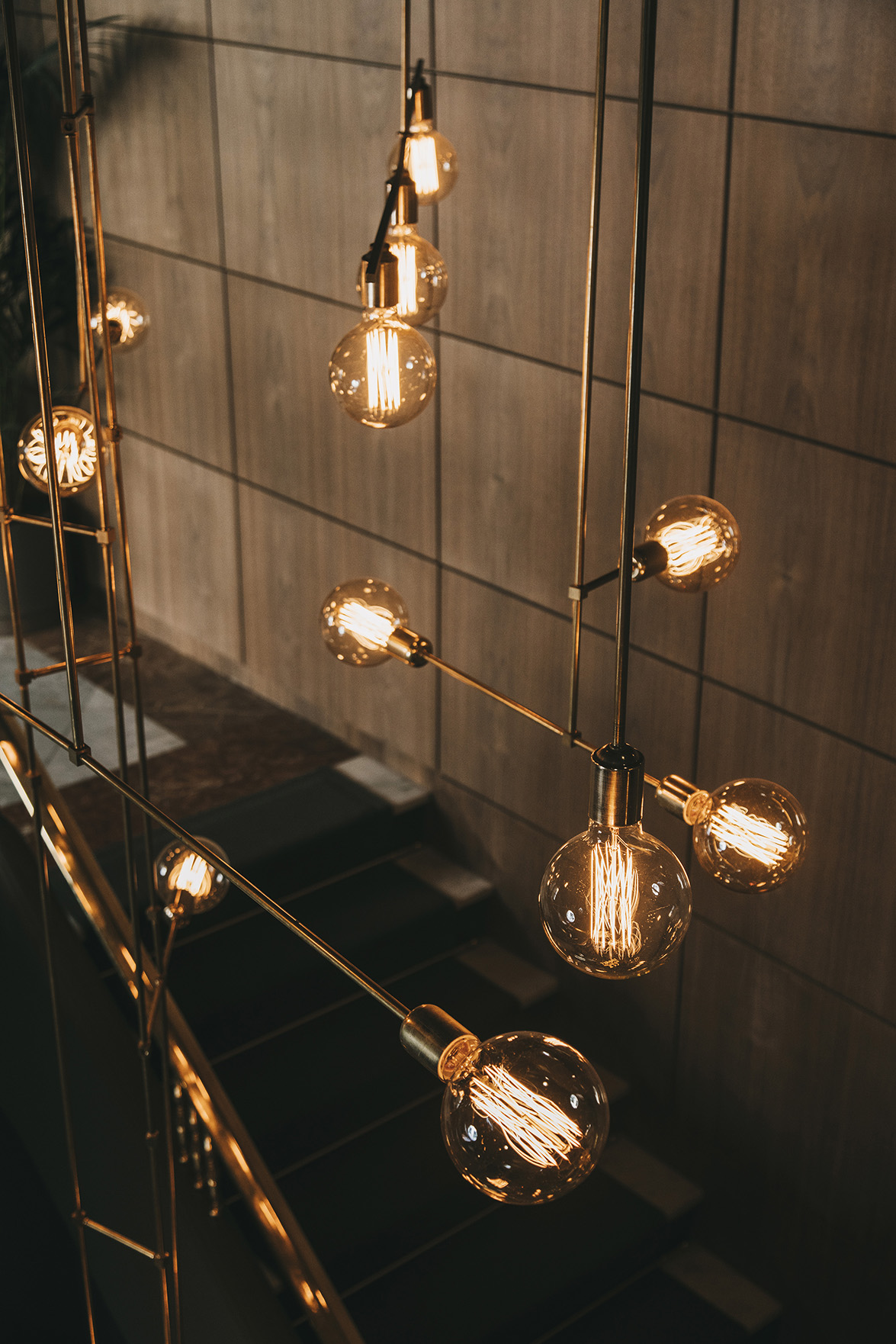
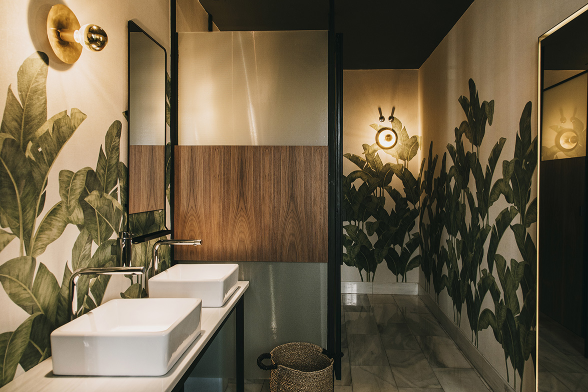
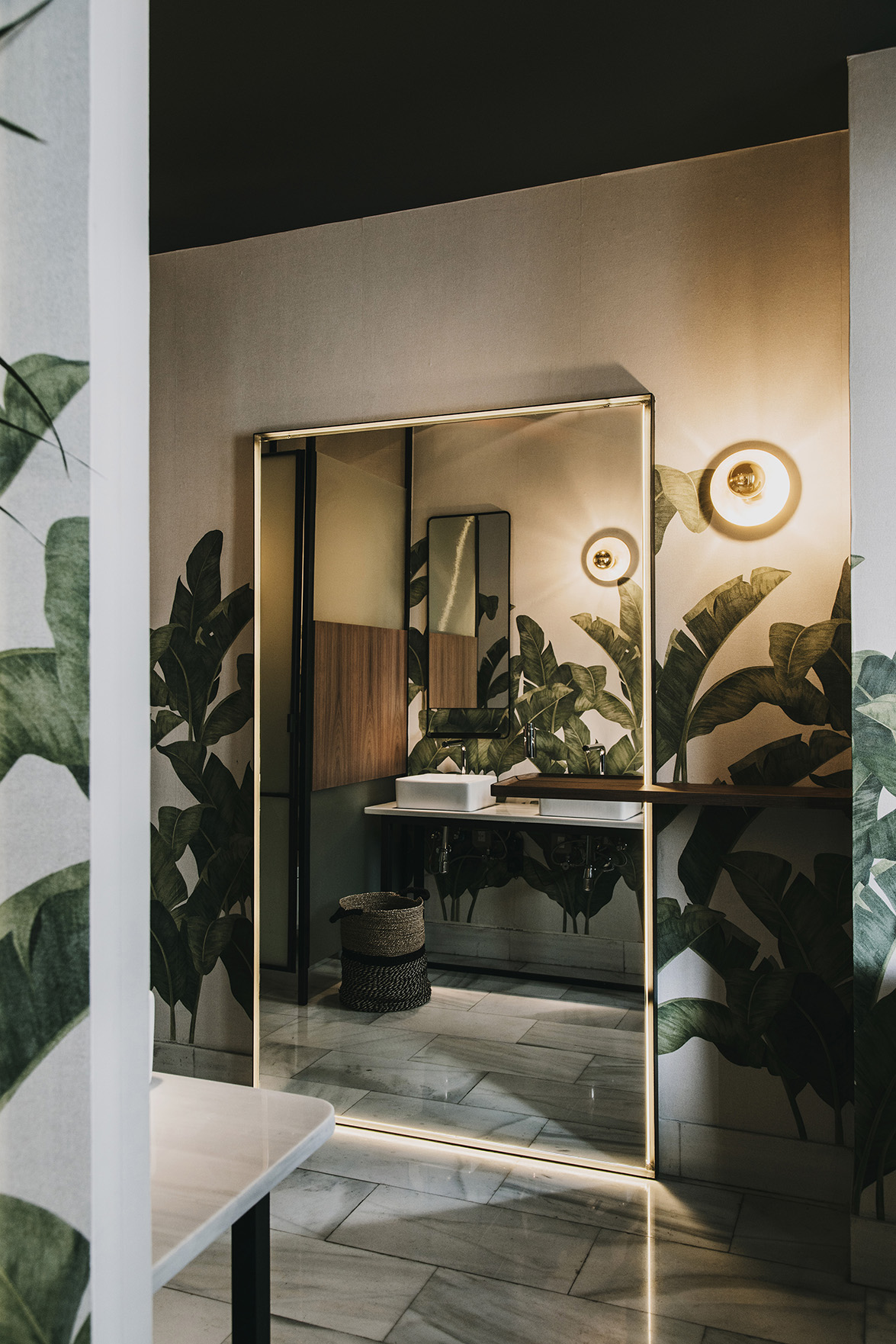
 The intervention in the restrooms follows the same approach as the rest of the premises; it is a superfcial treatment on the surfaces of existing elements. Wallpaper with vegetation motifs has been selected, some lighting elements have been reused, and two warm materials - wood and brass- have been used on the dividing stalls.
 Creative Directors: Sandra Tarruella y Ricard Trenchs
Project Leader: Mariona Guàrdia
Collaborator: Núria Martínez
Source: Tarruella-Trenchs Studio
Photos: Salva López
Read more news related Tarruella-Trenchs Studio published at Infurma
Link to Tarruella Trenchs Studio website
News Infurma:
Online Magazine of the International Habitat Portal. Design, Contract, Interior Design, Furniture, Lighting and Decoration
