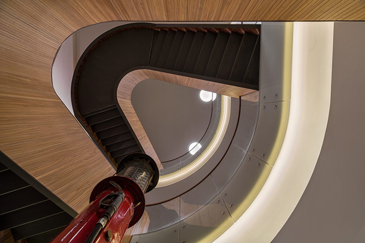
Lagranja designed the new Petrol Ofisi headquarters, the Turkey's leading fuel distribution company

How do you express a concept as natural as geology in a manmade structure?
This was the challenge behind the new HQ for Petrol Ofisi, Turkey's leading fuel distribution company. Using this question as a starting point, Lagranja Design has come up with stylish new corporate offices for the company in Istanbul.

The Lagranja team had many factors to consider; namely timelessness, well being for the company's employees, and optimal organisation of over 10,000 square metres of office space.
The new HQ is situated Emaar AVM; a mega, mixed-used complex on the Asian side of the Bosporus. An initial study on the scale of ‘internal urbanism’ was undertaken by the studio in order to optimize internal traffic flows and organise the different departments over three floors in a fluid and dynamic way. Main outcomes of this phase includeda cluster of meeting rooms on each floor, along with acentral patio for the internal stairs, which promote pedestrian traffic and minimize dependence on elevators. 


Visually, the driving force behind the project is layering, a reference to the geological nature of the oil industry. Stonewalls, tectonic plates and stratification were the visual cues for the project, executed in natural and manmade materials with a ‘sexy’ sensibility and colour scheme that draws from the murky, mysterious palate of the earth sciences.
Each of the three levels of the project has been rendered a different tone, from green to petrol blue and red, the company's corporate colour. Red has also been used in a wide range of furniture and details, legs of worktables, armchairs in the cafeteria, and the lining of the 16 elevators - providing striking aesthetic unison. 


As is a feature of all Lagranja projects, custom made elements play a major part. Carpet and wallpaper - which was used as an ‘external skin’ in the modular bathroom units - feature a flowing lava pattern, and pillars made of dark olive marble were hammered and brushed in order to bring out the textural characteristics of geological layers. Natural materials come to the fore in the shape of oak wood cupboards that double as workspace dividers, andin the 400- square metre executive zone, another layer of tonality was employed with a darker wood along with more premium, grey-ish coloured textiles and finishes.


For productivity and wellbeing, effective lighting was paramount to the project. Two models were designed by Lagranja, and both emit a soft, diffused light. The first, used for the public areas, is a plaster dome set flush into the ceiling, like a cluster of moons. The other, installed in the workspaces, is a suspended ring. It supports little bursts of plant life, and is lined with a special felt that helps control the ambiance acoustically.
The overall result is a work environment that bridges the experiential and corporate, that is dynamic and imaginative, and at the same time possesses a functionality and operational ease demanded by a company of this size and status.
Source: Lagranja Design
Photos: ©Ali Bekman
Read more news related Lagranja Design published at Infurma
Visit the Lagranja Design website
News Infurma:
Online Magazine of the International Habitat Portal. Design, Contract, Interior Design, Furniture, Lighting and Decoration
