Odosdesign redesigns Federico Giner's comeback to school
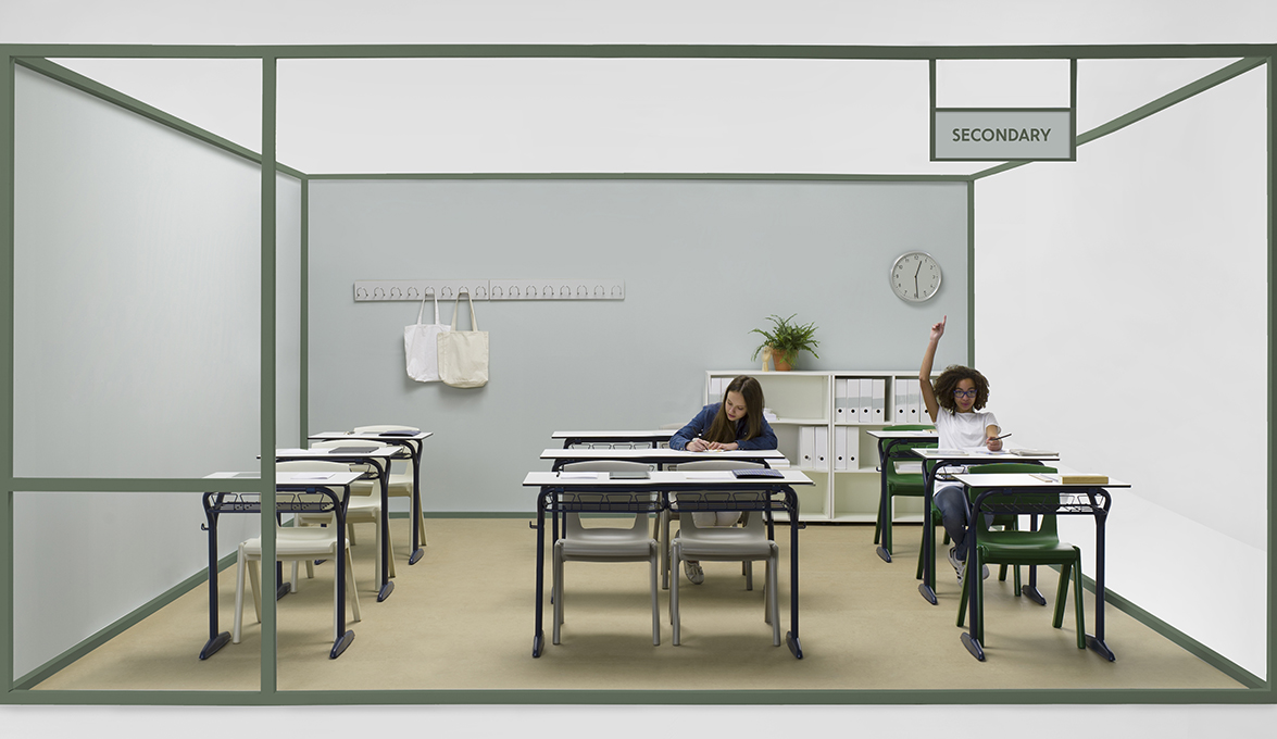
For more than a century, the vast majority of the Spanish educational facilities have been equipped with furniture made by a Valencian firm. They are their classic green desks, the grate folding chairs or the movable arm tablet desks; iconic pieces that have been with us throughout school and have had the privilege of watching several generations of Spaniards grow up. The company in charge of manufacturing these products is Federico Giner, which is now presenting a new image in order to face a new stage full of challenges posed by the new educational environments.
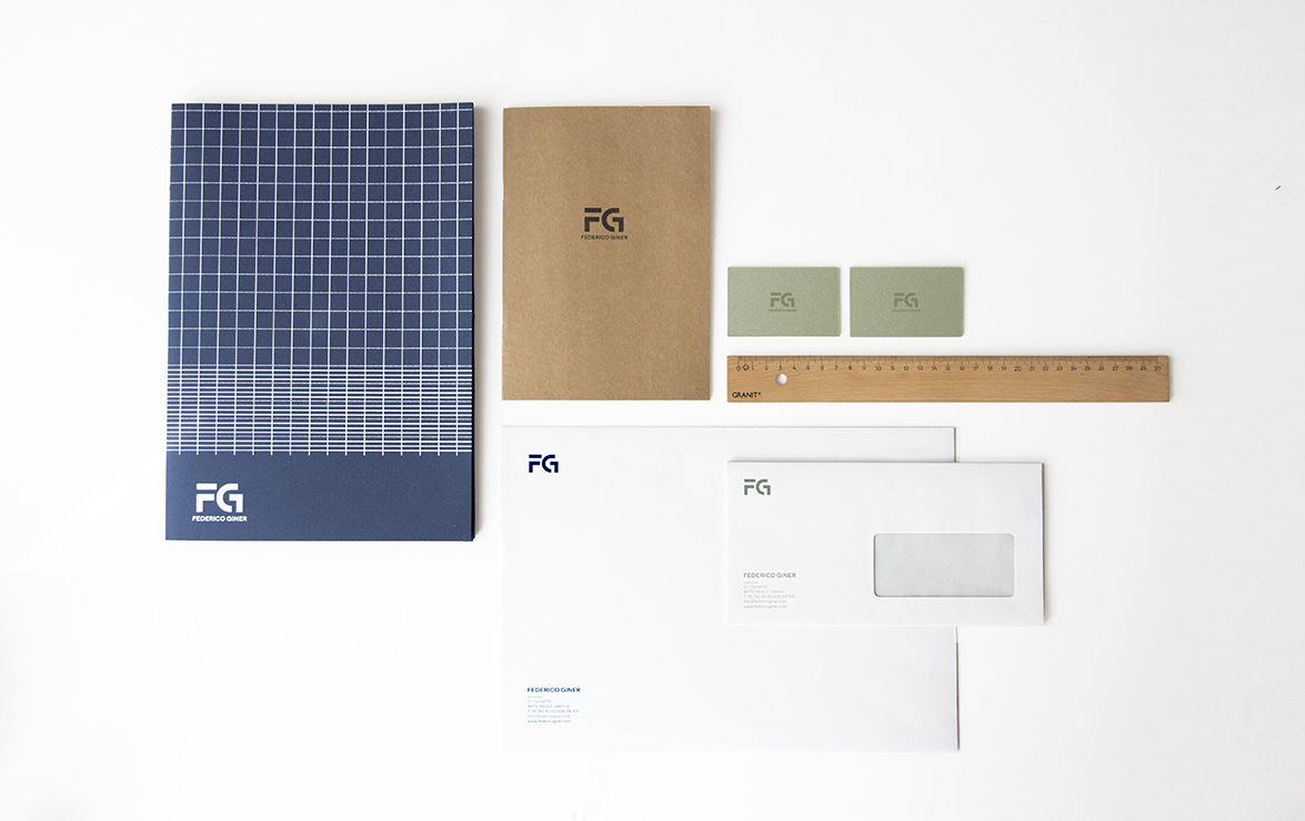
A total renovation of their graphic materials, with a new corporate image, art direction, catalogue edition and even the revision of their traditional pieces with new finishes and colours developed by Odosdesign, a comprehensive design agency. “The new brand keeps its essence and experience as a centennial firm, as well as their products do. It also embodies its renovation and its investment in evolving into this new stage. With all this in mind, we have not only developed a new corporate identity, but also a whole new communication campaign narrating its evolution. It is visible through its art direction, corporate stationery, catalogues and social media communications”, Ana Segovia, designer at Odosdesign, explains.
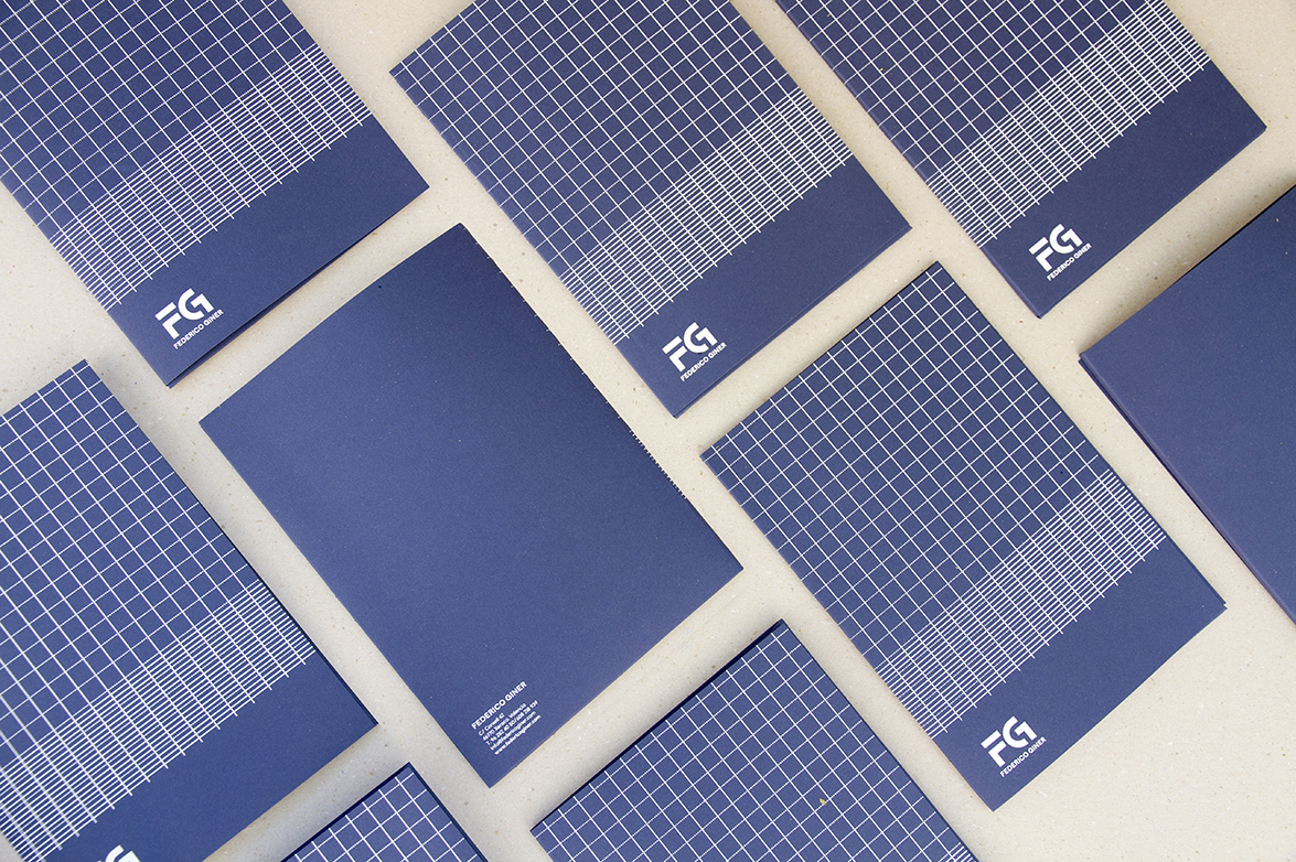
Since the company is looking ahead, but proud of their history, their logo could not radically break with the company's past. Thus, the redesign of the corporate identity meant modernizing the brand image taking from the foundation of the preexisting image. “We worked on the same structure, but updating its shape. We have elongated its lines, its fonts have been renewed, and its lines have been centered. We have used a much more contemporary palette of colours, with textures and tones used in classroom materials”, María Mengual, designer at Odosdesign, says.
 The company's corporate stationery has been designed to instill the highest degree of sensitivity, with graph paper patterns reminding us of our school days, and subtle colours evoking warmth. “As for the corporate stationery, as well as for the brand launch campaign on their website and social media, it is a nod to our school years, when we used to share and make handicrafts. All prepared materials use textures, emotions or colours, which imply an educational environment”, Mengual adds.
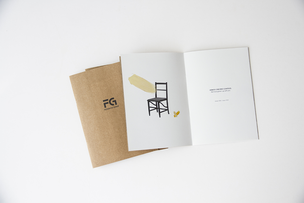 The whole trademark launch goes along with a series of pictures where the firm timeline is narrated by means of slight peeks. “It is all about a graphic, social media oriented campaign where two images, past and future of the company, are presented along with slogans summarizing the company history. For this campaign, we have used graphic resources such as graph paper patterns or childlike brush strokes, two instant reminders of those notepads we used while in school”, says the designer.
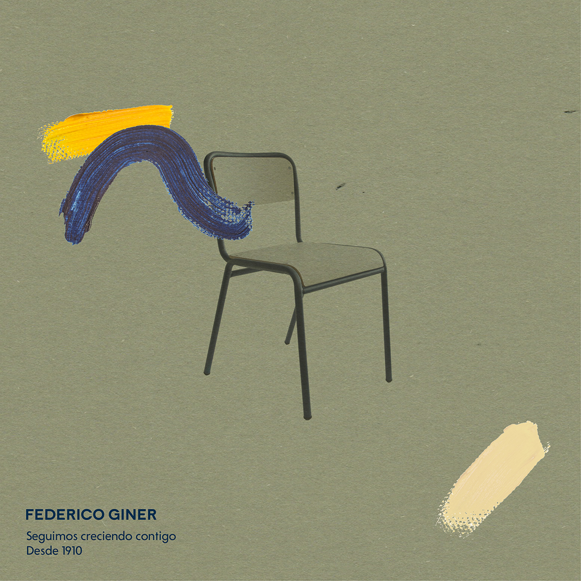
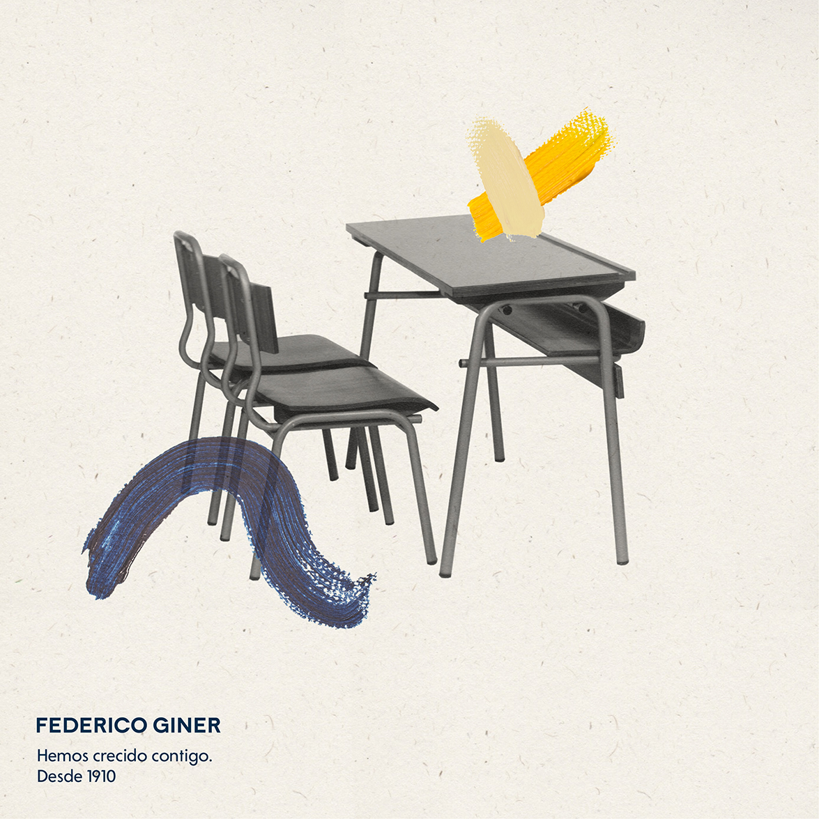
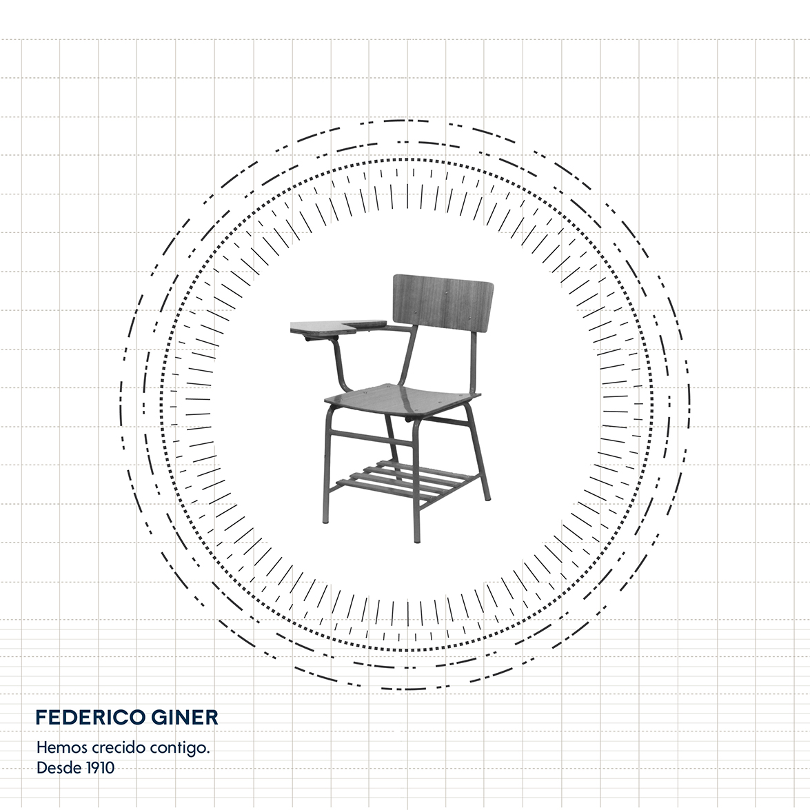 Along with all these graphic materials, the studio is already working on their first catalogue for Federico Giner, where preexisting furniture collections have been updated with a new chromatic line promoted by Odosdesign. “In this first stage we have updated their classic furniture with new tones and colours. Thus, we will still find the products that helped Federico Giner become a big manufacturer for features such as sturdiness, safety and durability, but with new, more up-to-date finishes”. Ana Segovia sums up.
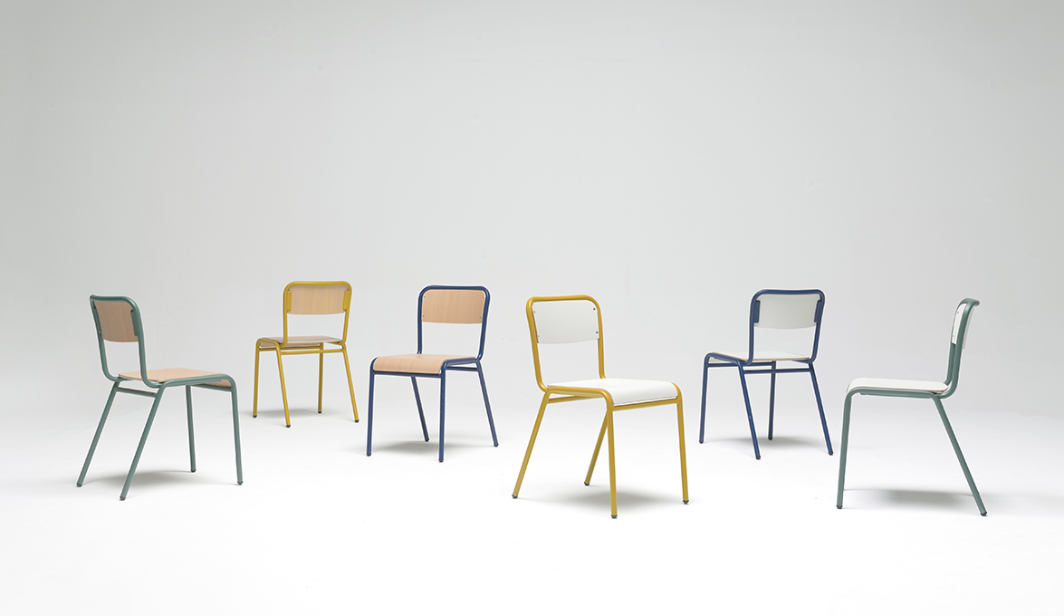
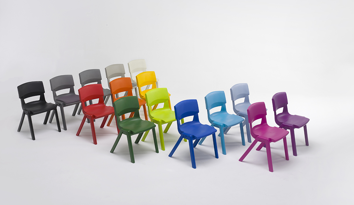
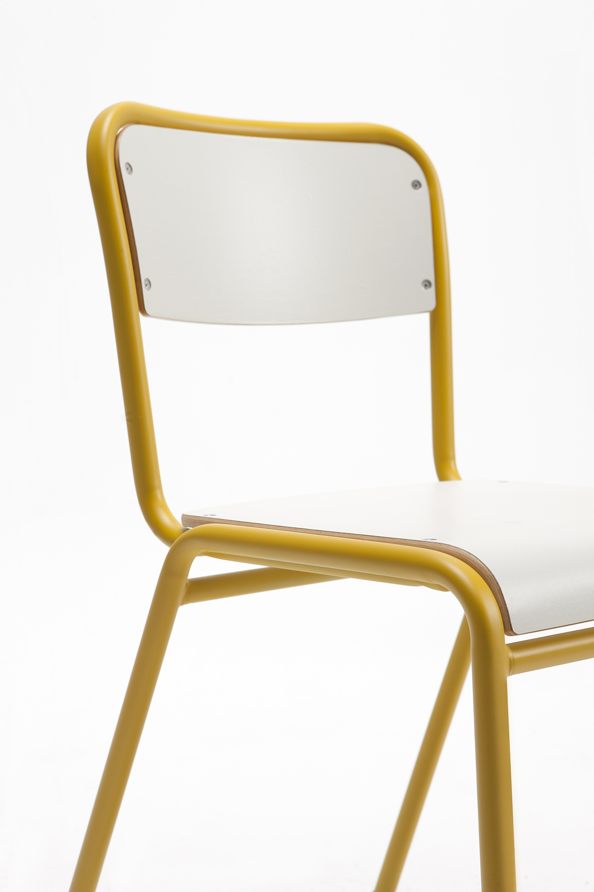
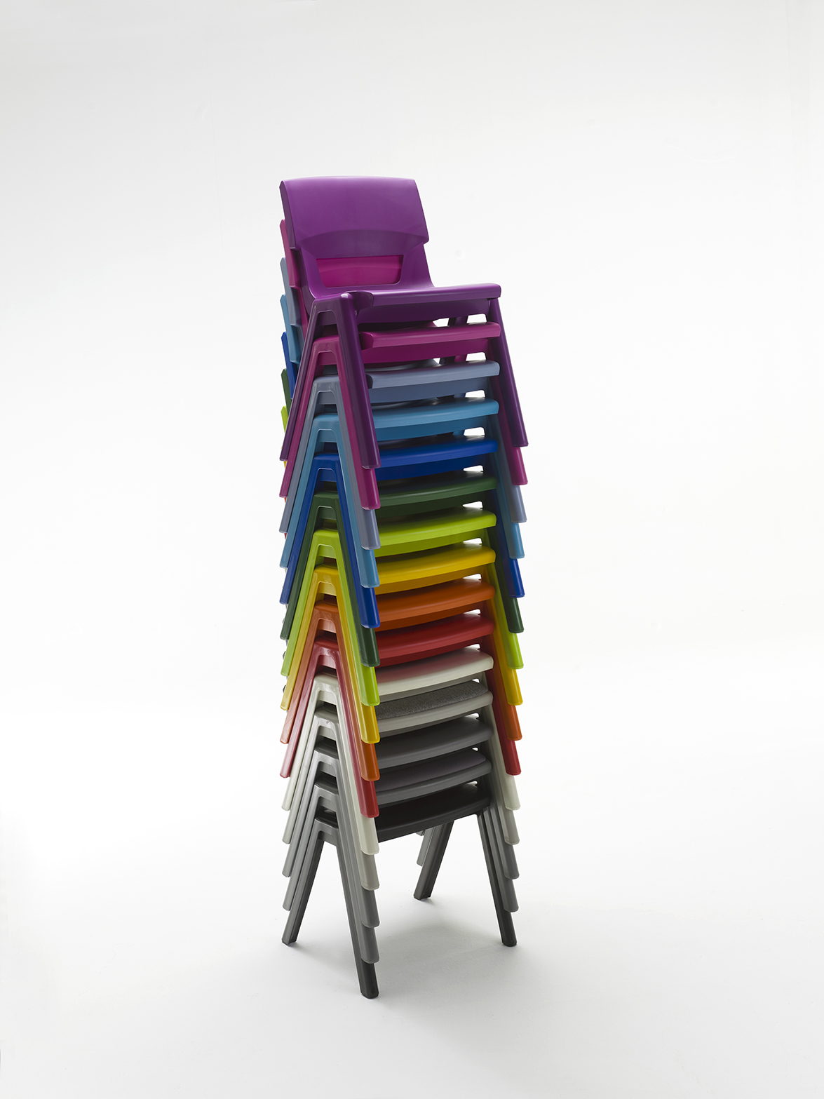 The art direction for new catalogue was also managed by the studio, showcasing the new products in five different environments: a preschool classroom, a secondary classroom, a dining room and a lab. “In order to show each of the references, we chose conceptual and modular settings with an open architecture where the piece of furniture is presented in a very visual manner, accompanied by real-life models: as if they were stage wings, we placed the product and matched the walls and floors to the different atmospheres created”, Ana Segovia explains.
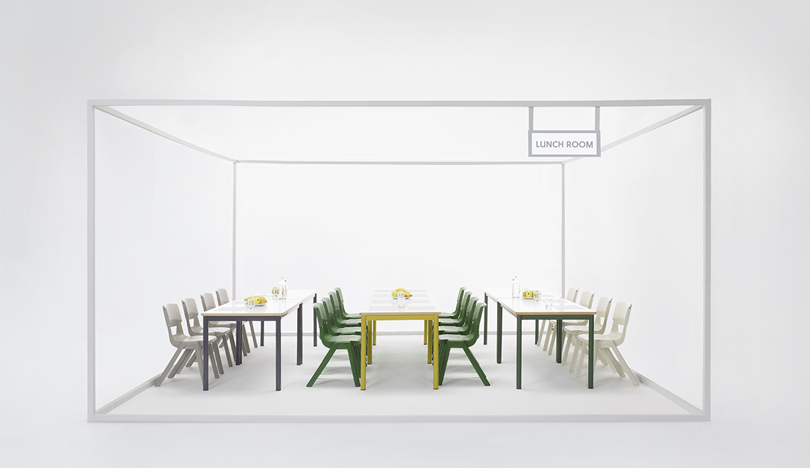
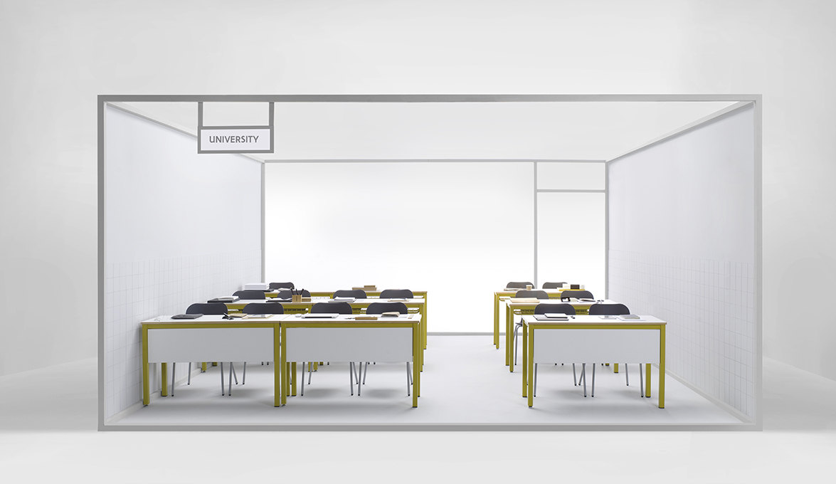 The catalogue, which will soon be available to the public, keeps the strategic art direction plan devised by Odosdesign with which they will soon go back to school, having the expertise and security a firm like Federico Giner has, with a brand completely renovated and adapted to the 21st century challenges.
Source: Odosdesign
Read more news related Odosdesign published at Infurma
Visit the Odosdesign website
News Infurma:
Online Magazine of the International Habitat Portal. Design, Contract, Interior Design, Furniture, Lighting and Decoration
