Office interior design project by Zooco Estudio. When the morphology of space becomes the leitmotiv

The award-winning interior architecture studio, Zooco Estudio, presents the intervention carried out in its own Santander offices. They explain us,
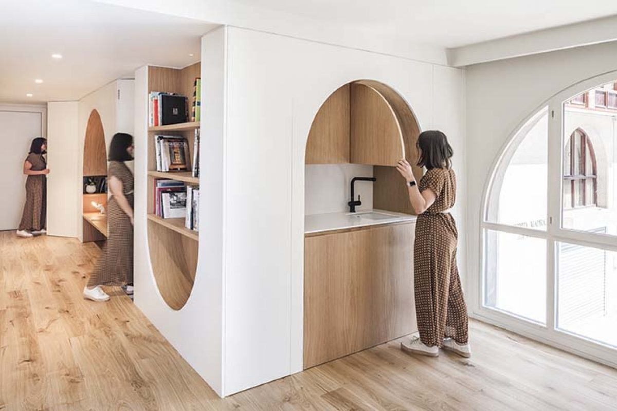
The place is located in a corner and it has two facades with a strong rhythm of windows with a semicircular top shape. This gives the space a great personality. These elements are so strong that it is going to be the leitmotiv of the local morphology itself.
To solve the functional needs, the rounded arch is used as the only geometry, giving continuity and enhancing the pre-existing spatial language. 


In a completely diaphanous place, two elements are inserted in a way that organize the space to adapt it to the needs. The first of these elements contains all the services (toilet, office-kitchen, room for facilities and storage), while the other defines the two existing meeting areas, independent of each other, but visually connected.
The rest of the space is conceived as a common room where work areas, relax and relationship are mixed. It is the distribution of the furniture itself, which establishes the circulations and stays, generating a flexible space that allows multiple configurations.
The natural oak material is present in the holes of the arches and the floor. This material turns paramount due to the absence of color of the rest of the furniture and furnishings, creating a pleasant feeling of harmony.


Project: Zooco santander office
Year: 2019
Team: Miguel Crespo Picot, Javier Guzmán Benito, Sixto Martín Martínez ZOOCO ESTUDIO
Collaborators: Paula Cruz, Beatriz Cavia, Beatriz Villahoz
Photography: Imagen Subliminal
Builder: NIMBO PROYECTOS S.L
Lighting: ZOOCO ESTUDIO
Furniture: ZOOCO ESTUDIO


Source: Zooco Studio
Read more news related Zooco Studio published at Infurma
Visit the Zooco website
News Infurma:
Online Magazine of the International Habitat Portal. Design, Contract, Interior Design, Furniture, Lighting and Decoration
