Hunke brings together jewelery and optics in an incredible space designed by Ippolito Fleitz Group
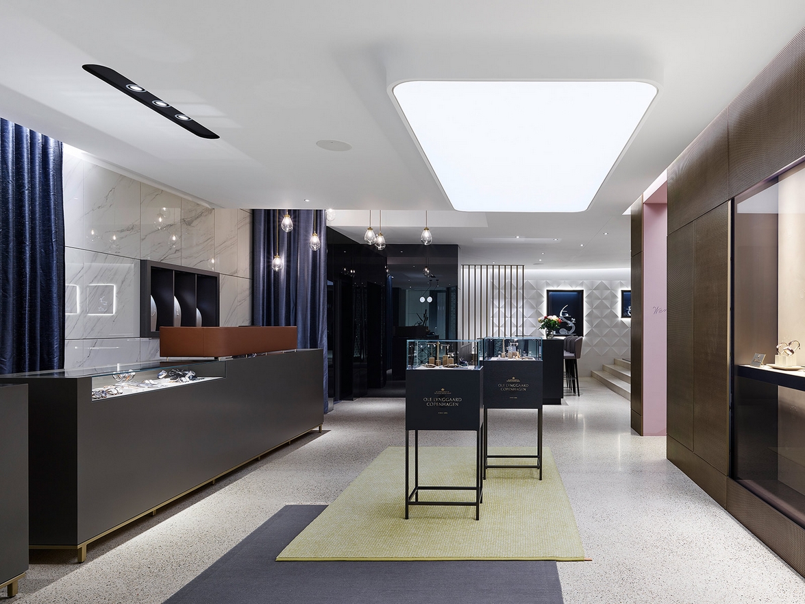
For many years now, the Hunke family has been operating a successful jewellery and optician business within the inner city of Ludwigsburg, near Stuttgart. In order to retain their leading position in the region's, a consolidation of the different departments was required. The Ippolito Fleitz Group has been commissioned to design this new exceptional space.
Three aging family-owned buildings were transformed into a sustainable and future-compliant retail store. At the request of the owners, we incorporated both their family tradition and the building's history into the interior design. In close collaboration with the builders, we created iconographic and vivid sales and show rooms, spreading over a total area of 750m2 (8073 ft2).
Previously separated facilities were combined into a conclusive floor plan, as the listed building of former court jeweller Kiesel as well as parts of the backyard with its historic royal silversmith shop was integrated. The entire storefront received an extensive reconstruction, allowing for a smooth integration into the surrounding inner-city development.
The jewellery and optician departments each form an independent unit with cohesive visuals and distinguished colours and materials, reflecting their differing product ranges and target groups.
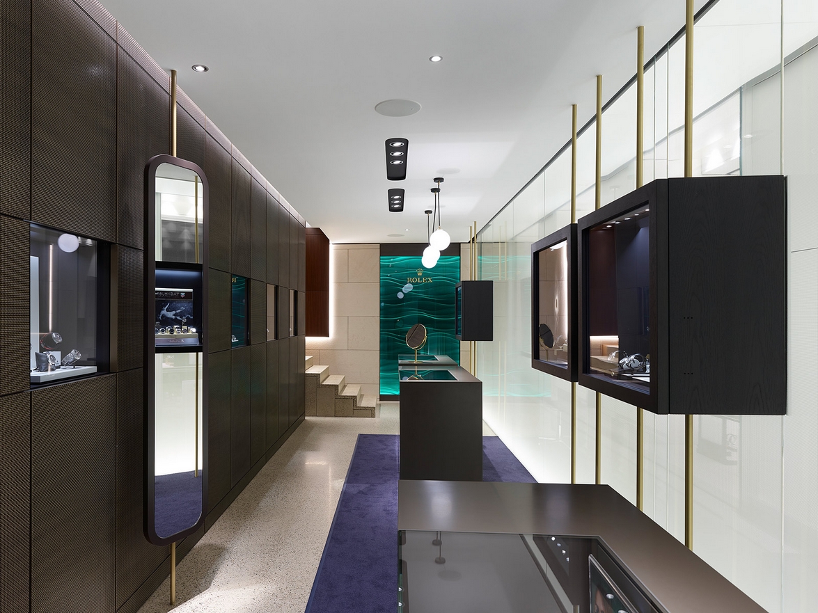
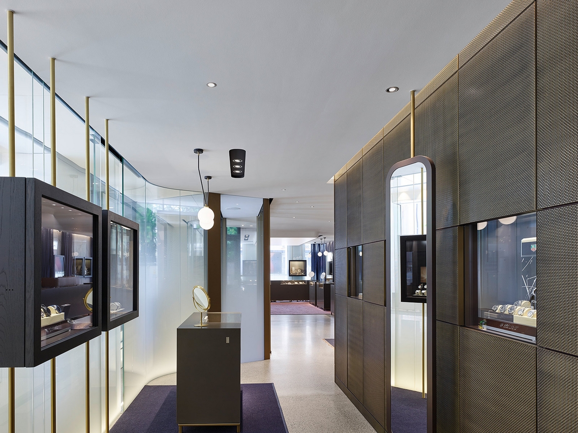
A narrow and cosy section to the right of the entrance presents the watches. Clad with braided brass, the listed former Kiesel building provides an authentic background for the products on display, emphasising craftmanship and high-quality materials.
To the left, the spacious jewellery section with its soft curtains and loose carpet over polished fair-faced screed welcomes customers with subdued elegance and a relaxed atmosphere. Here, the entrance area's interplay of smooth marble and flowing curtain segments along with braided metals are at the centre of attention.
On the opposite wall, a three-dimensional plaster relief lures visitors into the rear area of the shop with its fascinating play of light and shadows.
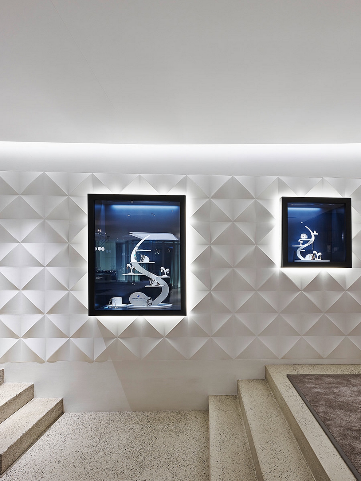
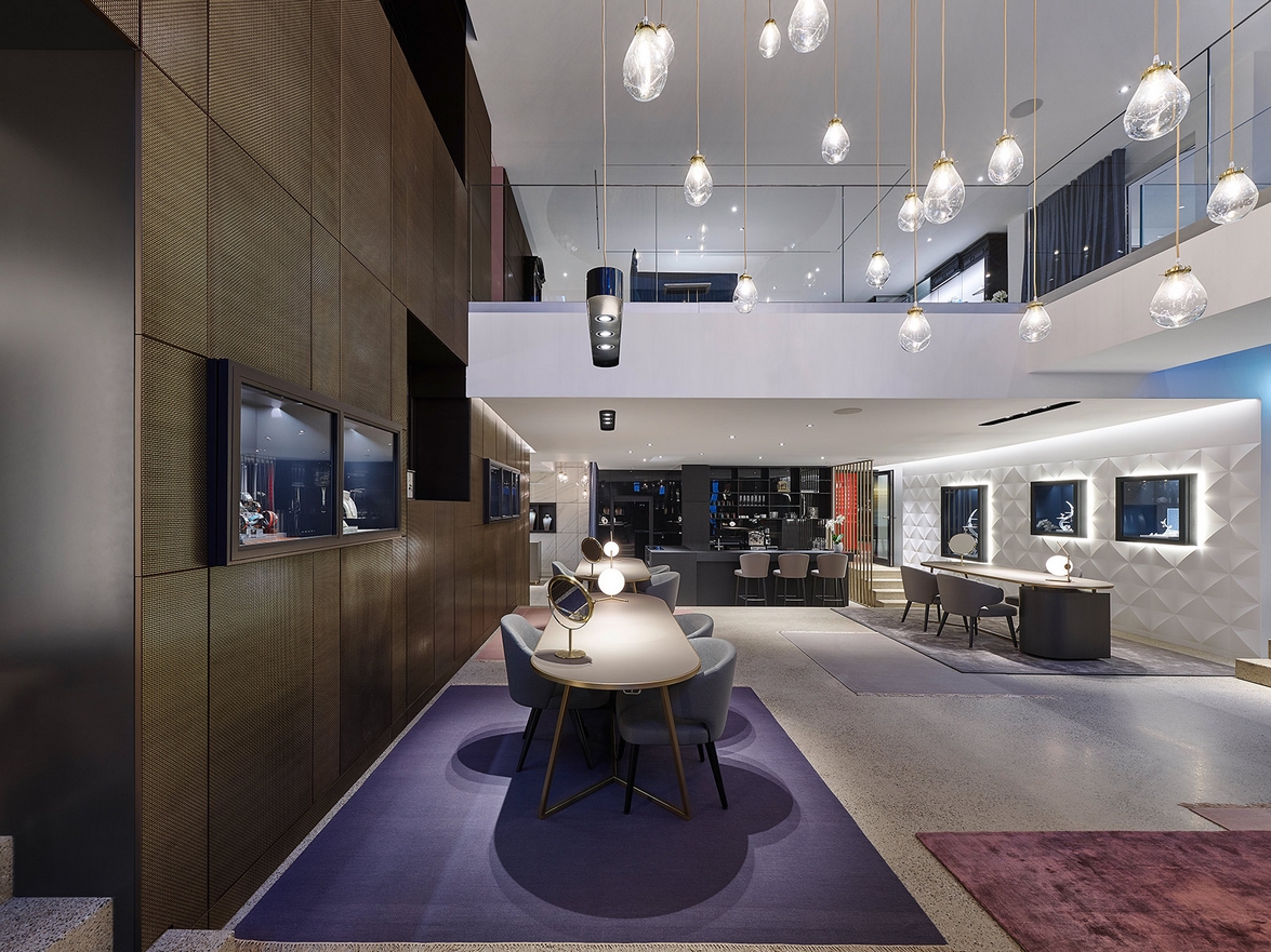
Past the checkout area and coffee bar, the room unfolds into a two-storey atrium, which replaces the old courtyard as a spatial connector between the old silversmith shop and the Kieselhaus. This is where the diversity of materials and facets reaches its peak and history comes alive in a visual experience.
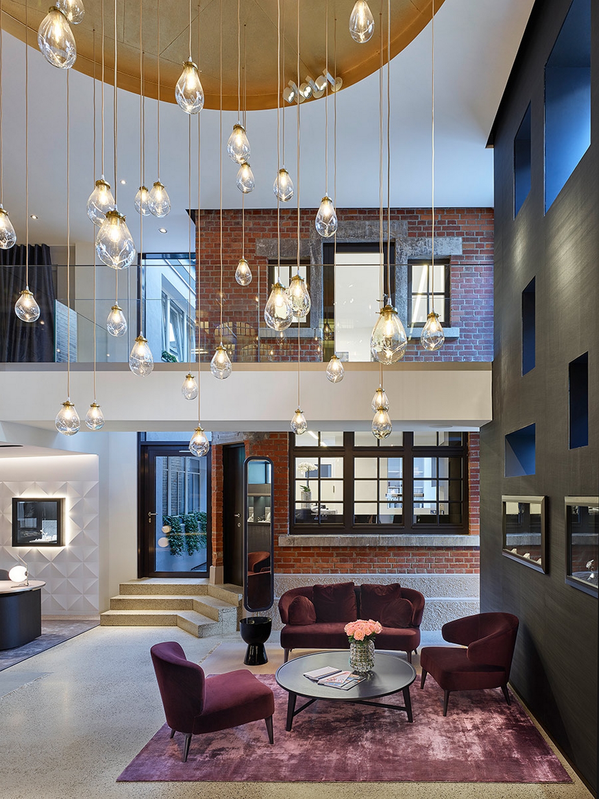
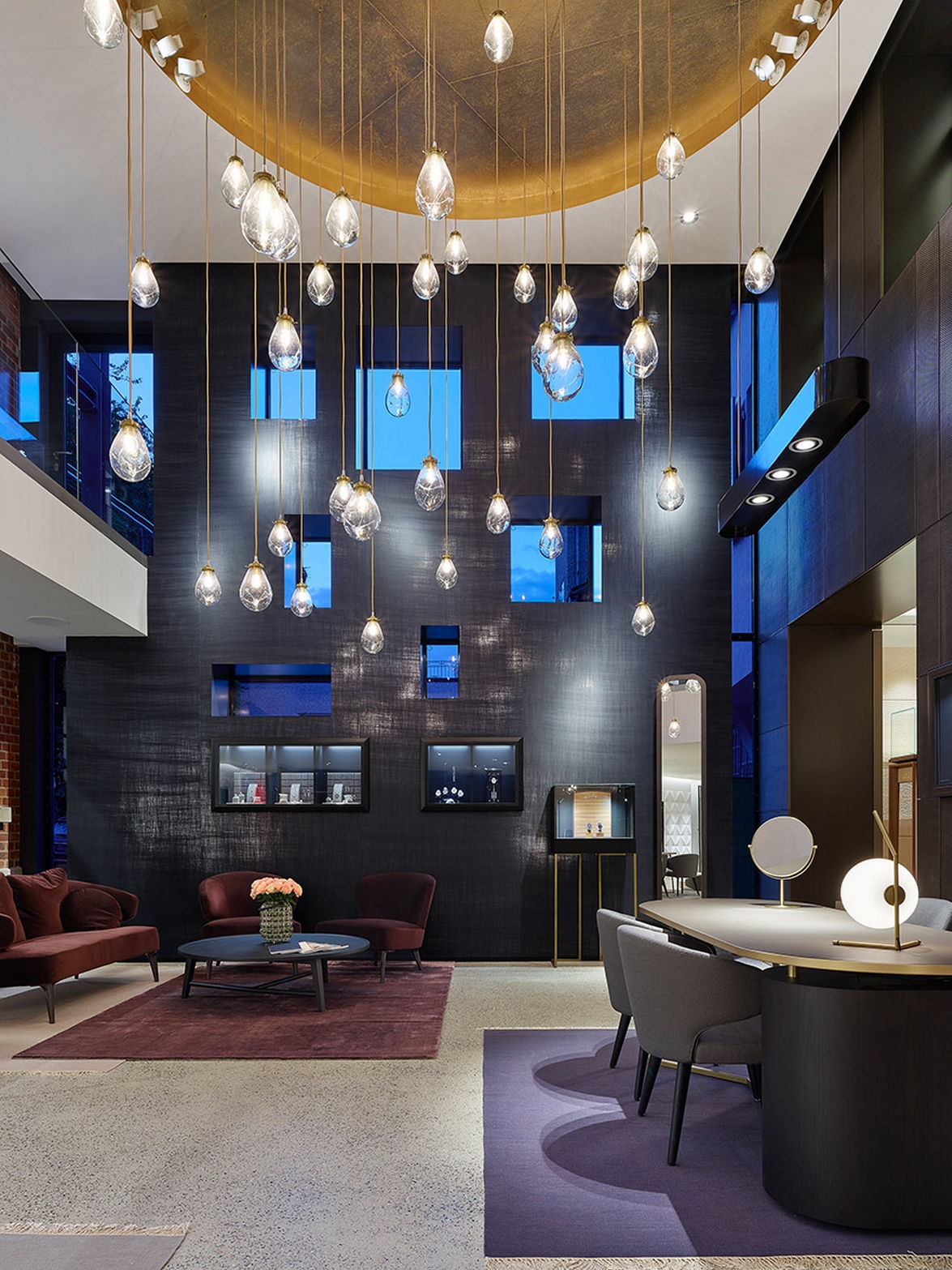
Mouth-blown glass lights trickle down from the ceiling like raindrops with a glow of gold, drawing the view upwards. Glimmering reflections of light on a glossy black wall with rhythmic openings lend an aura of mystery to the room.
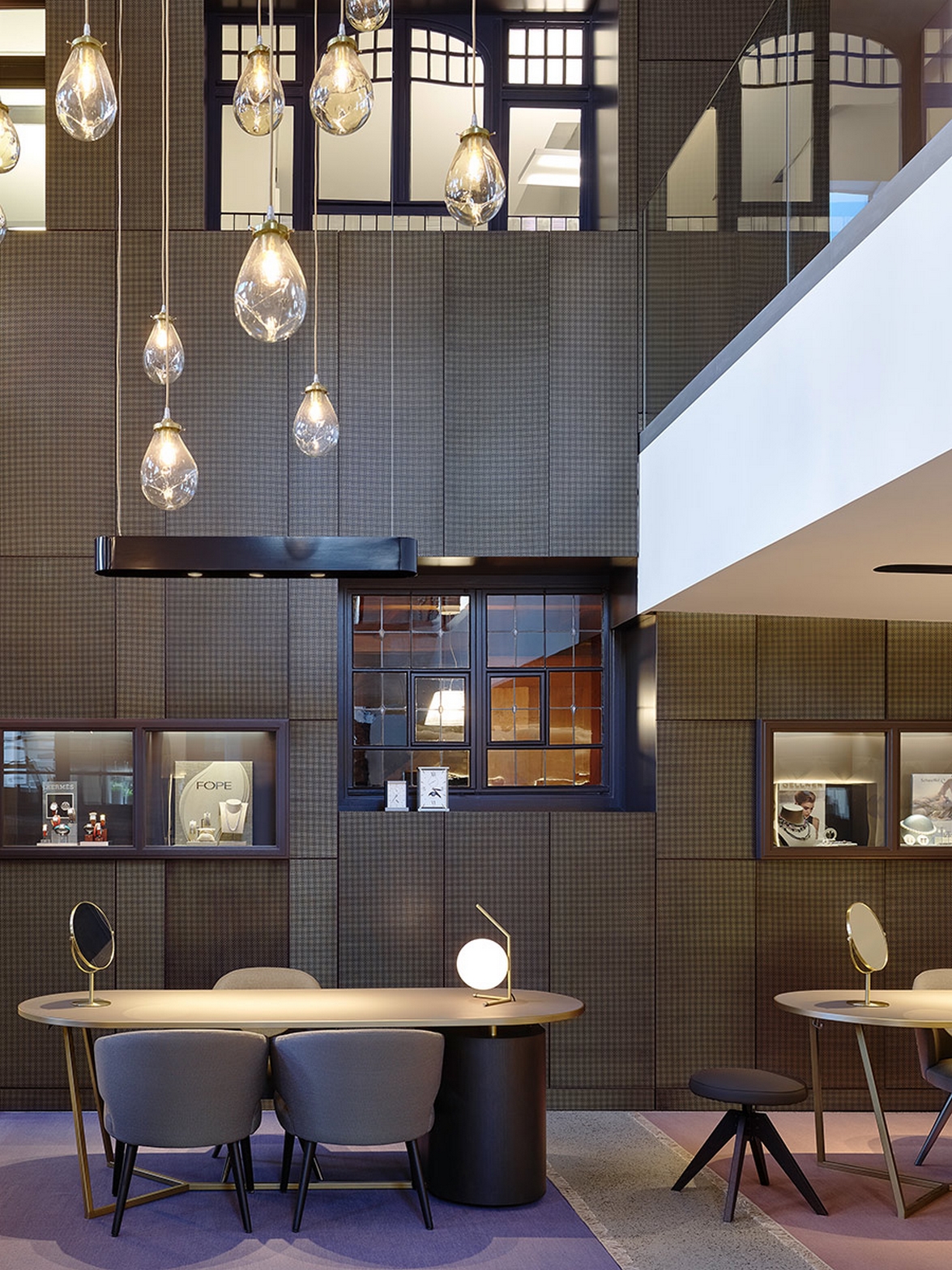
A gilded ceiling section shines down on the room as reminiscent of the rich history of the goldsmith's craftmanship and material. The bare brick wall of the old silversmith shop beautifully contrasts with new smooth surfaces and the metal-coated façade of the historic Kieselhaus.
Three luxurious consulting zones in the atrium welcome high-price segment customers with classy leather surfaces and brass elements, while a comfortable lounge area invites visitors to pause in a premium yet relaxed atmosphere.
The Kieselhaus marks a central point within the floor plan. Hidden on the inside, the 400-year-old “gute Stube” with its original historic furnishing now serves as a consulting area for the watch segment.
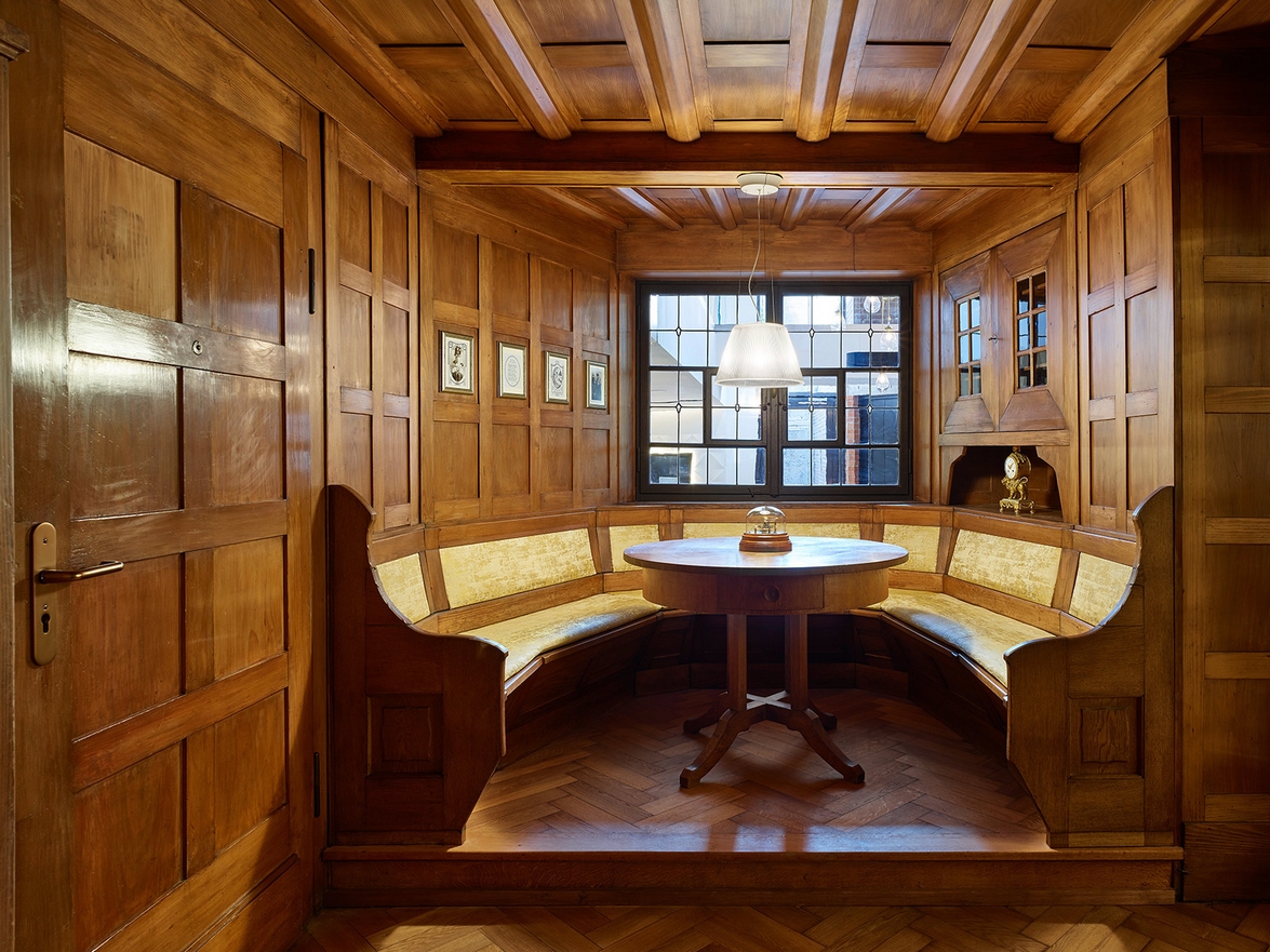
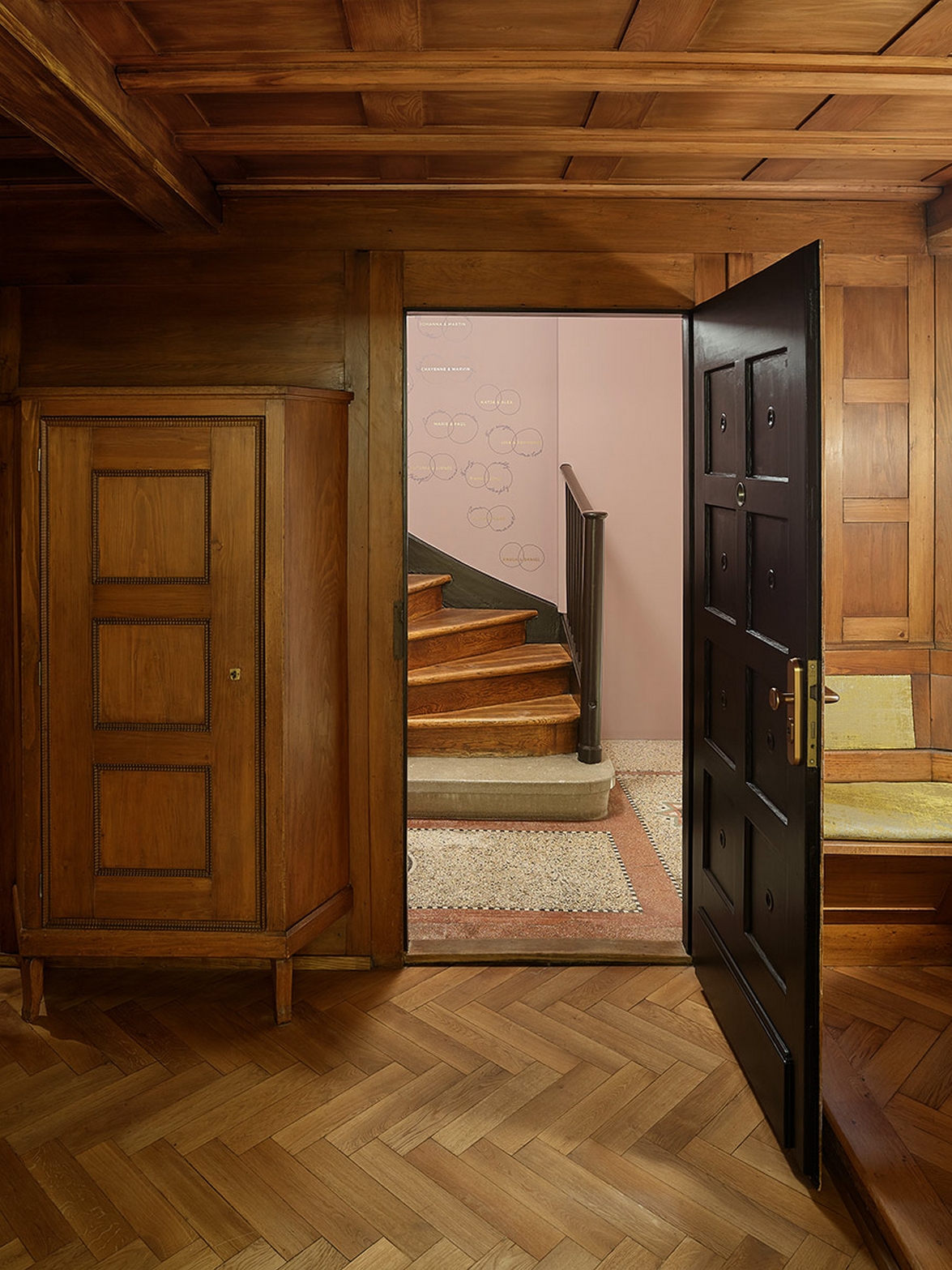
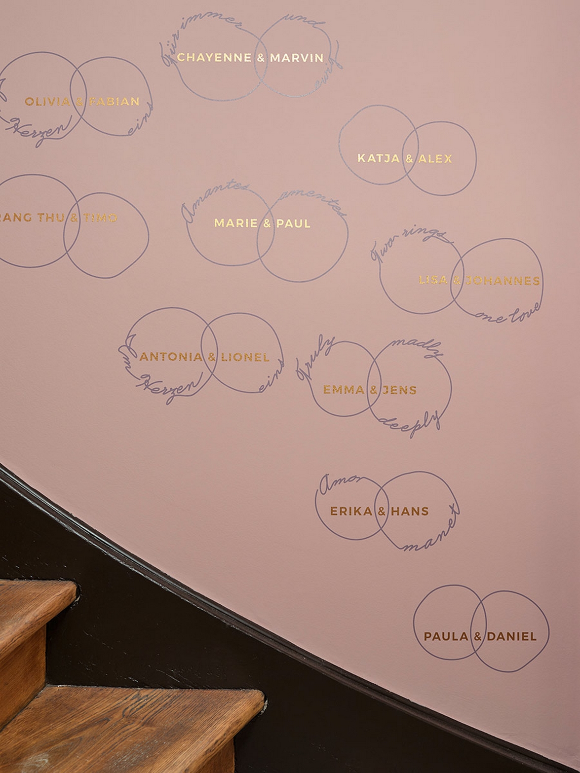
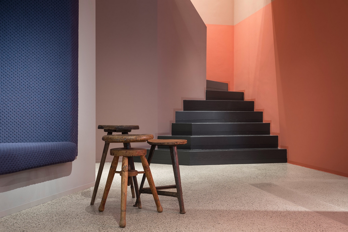
A high-value Rolex brand presentation can be found in the rear area, whereas a writing on the warm rose-toned wall draws attention to the renewed historical staircase to the upper floor.
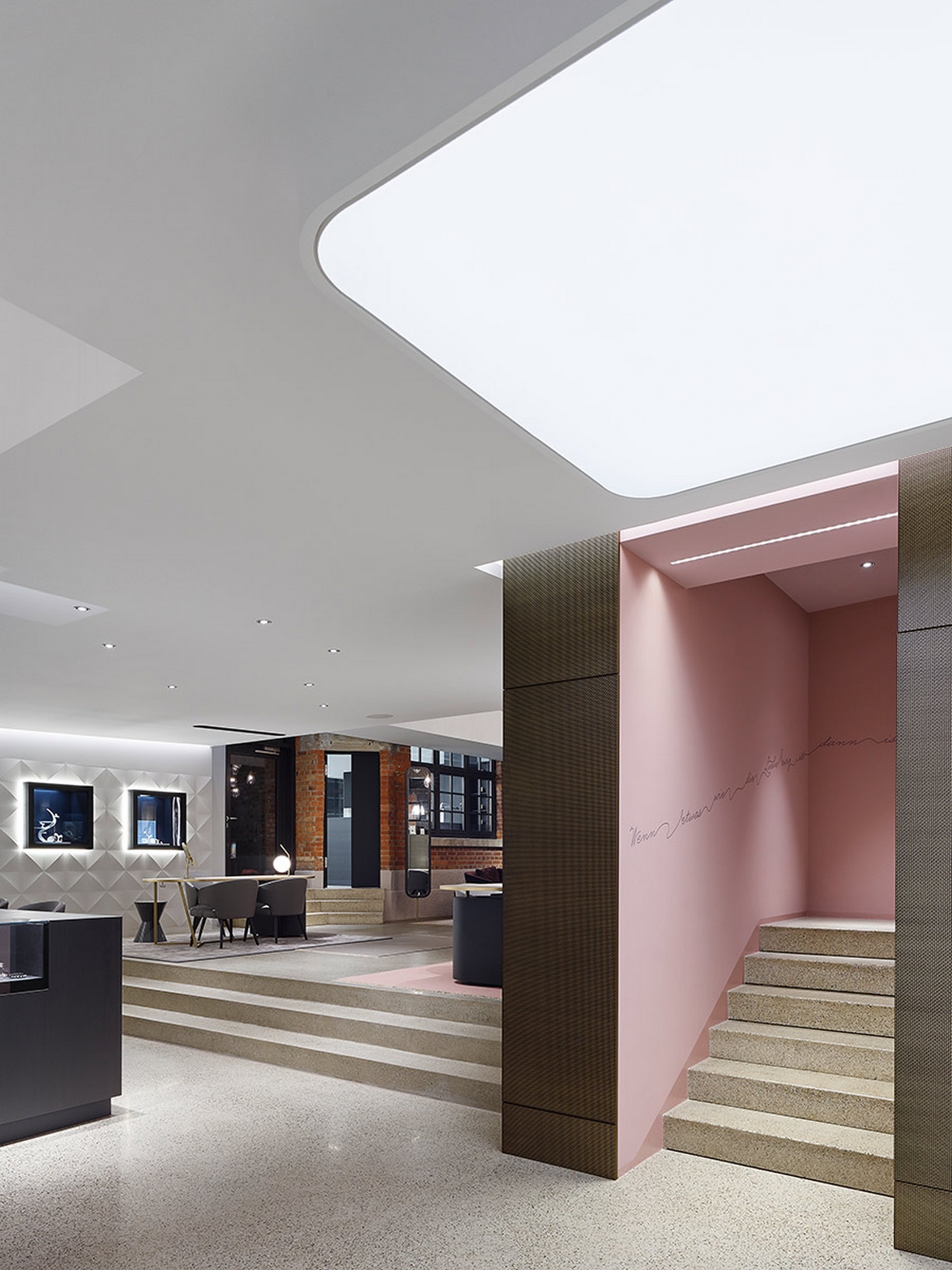
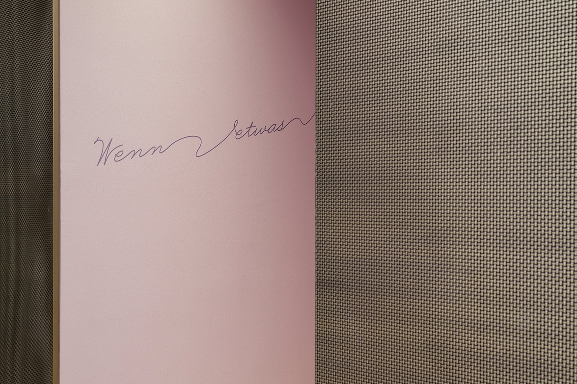
The “wall of love” on the opposing staircase wall accompanies visitors on their way up with name pairs that represent the power of love, regardless of gender or nationality.
The first floor reveals a furnishing concept of respectful contrasts. On the one hand, we find black wooden cabinets that were already employed by the purveyor to the court Kiesel in his ancient silversmith shop as well as a dark lapis lazuli toned colour palette. On the other hand, the wedding ring consulting area presents itself in an innocent white colour spectrum.
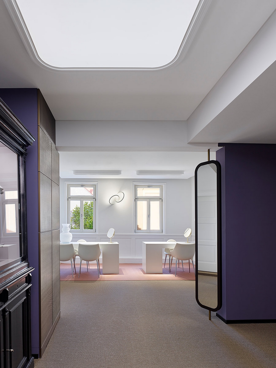
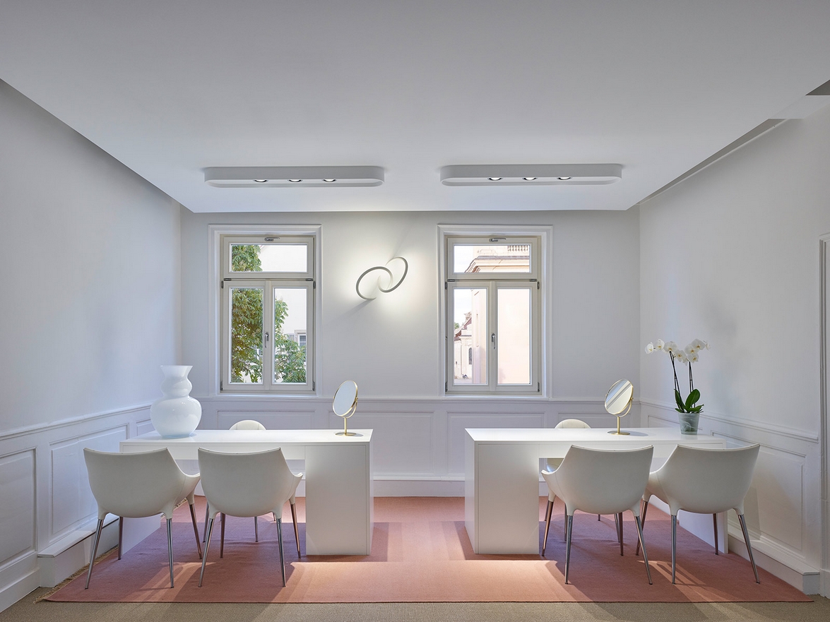
Spatial openings offer a view into the lower level and lend a light atmosphere to the exhibition area despite the low ceilings. This new store is perfectly in line with the Hunke family's philosophy of offering its customers unique jewelry that showcases the owner's personality.
Fashion lovers and individualists appreciate the excellent selection of glasses in Hunke's optician department, which also includes a variety of young and trendy products in the sunglasses division.
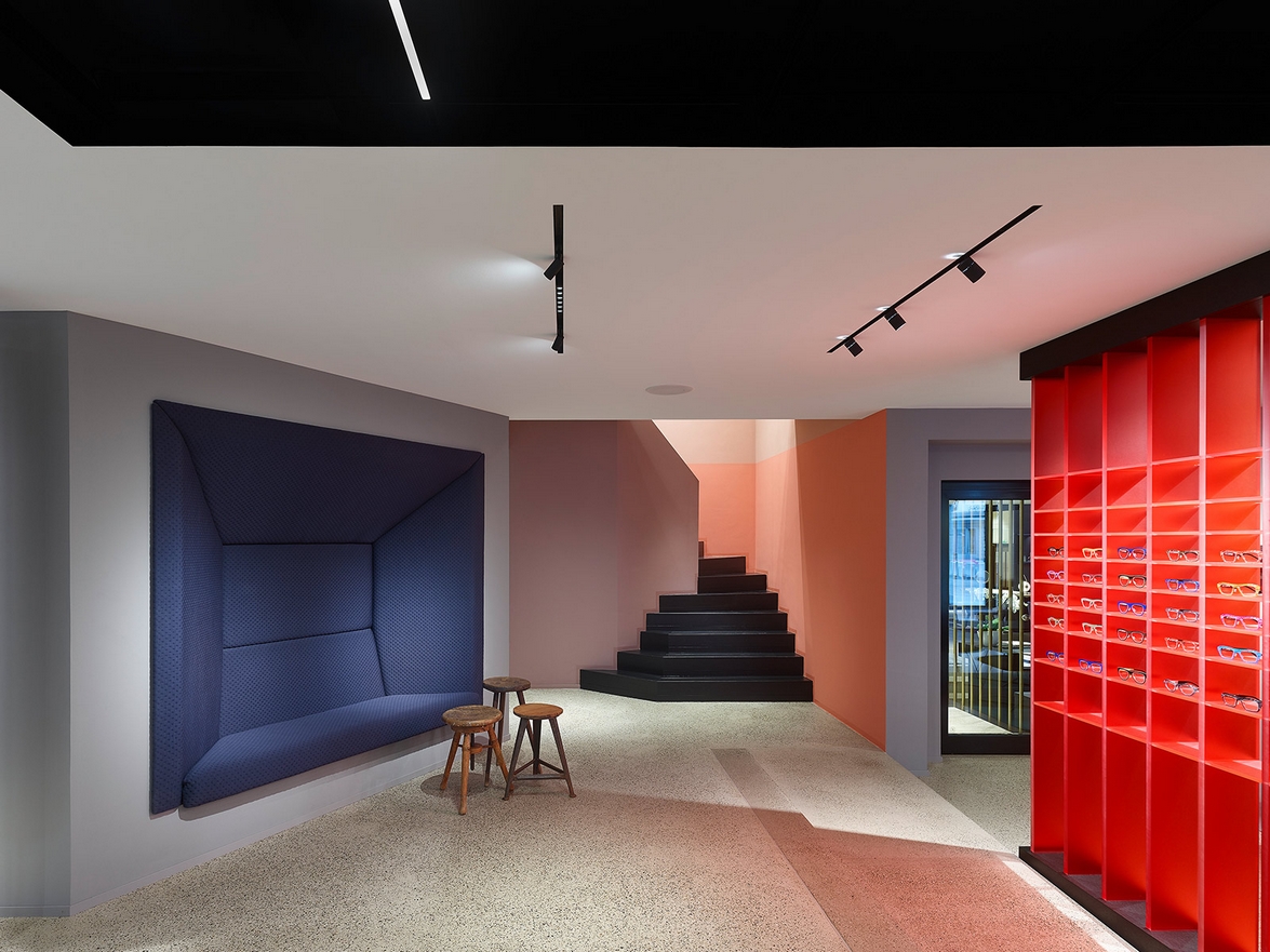
The choice of materials and colours for the optician echoes the appeal of the jewellery and watch department, but also introduces a distinctive and urban identity.
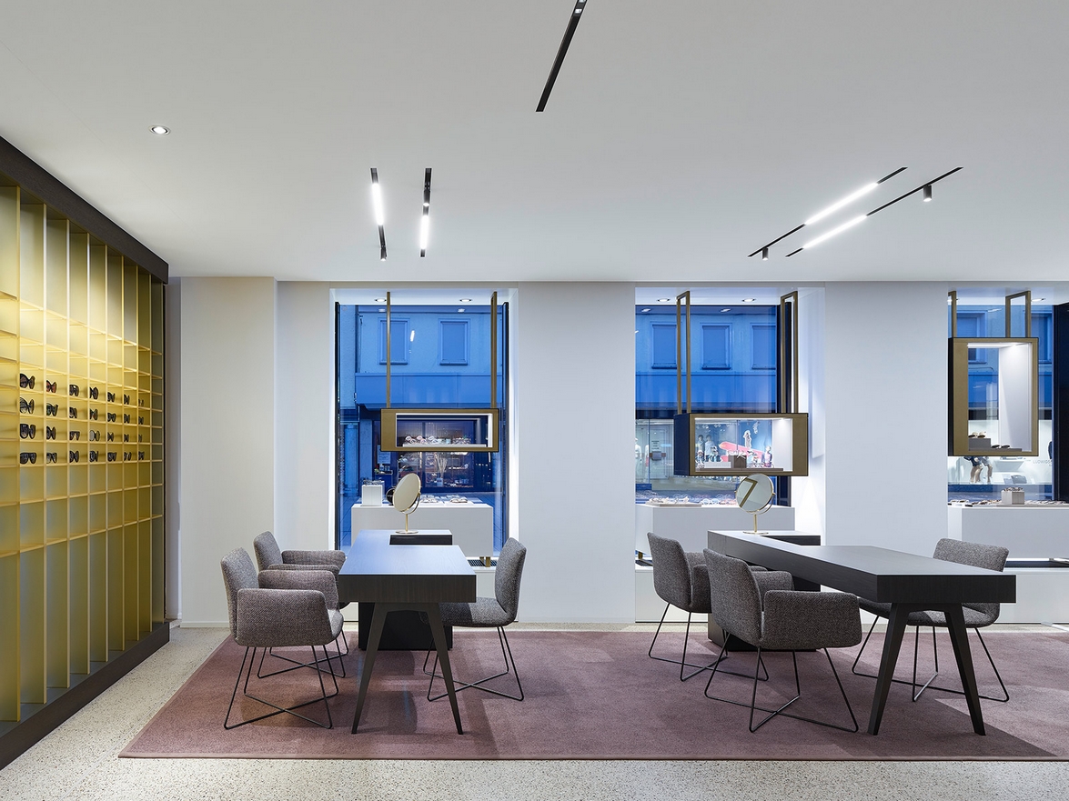
Large windows grant a maximum view into the prestigious shop interior, which in turn becomes part of the shop window itself.
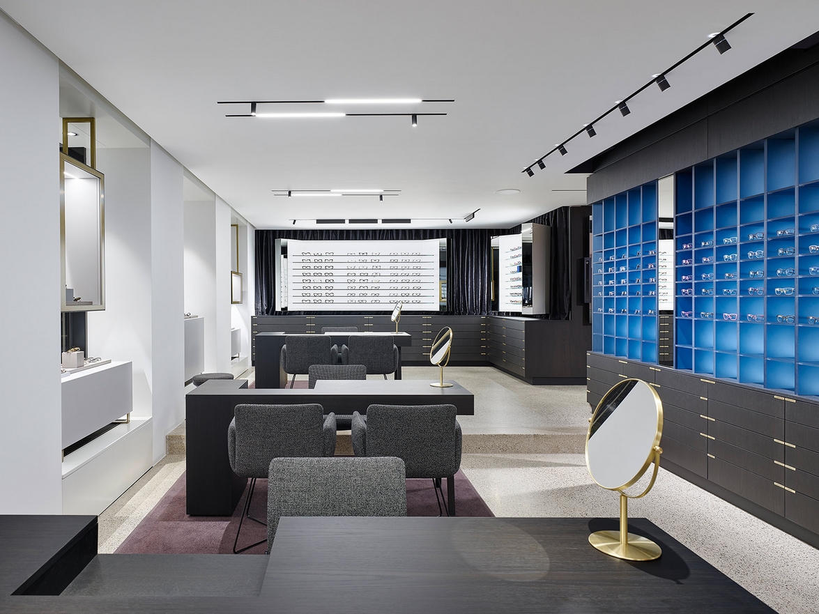
Positioning the service section in the heart of the room emphasises Hunke's customer-friendly philosophy of individual consulting and personal contact. Also, in a relaxed atmosphere like this it is easy to intensify customer relations in a casual manner.
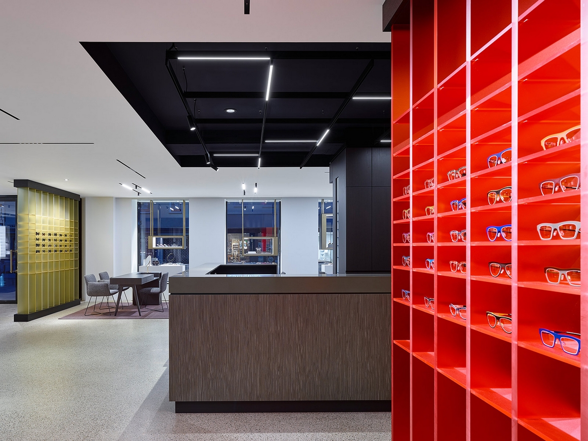
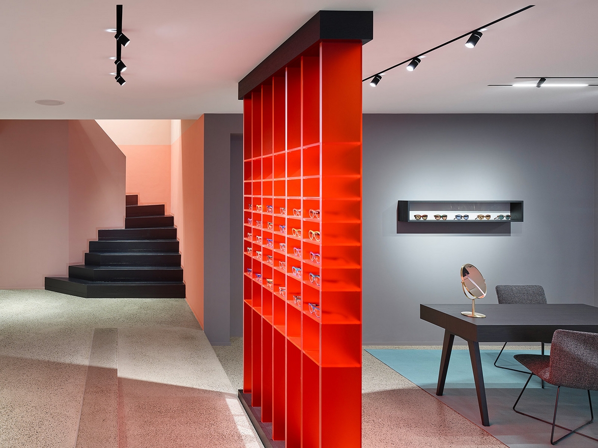
Colourful shelves zone the areas for sunglasses, corrective spectacles and the lounge, whereas bright red shelving marks the transition to the jewellery department and the staircase to the upper level.
Well-illuminated cabinets in front of dark curtains inspire connotations of make-up tables and set a perfect stage to present the glasses. Unobtrusive black cabinets offer plenty of storage space for the wide product range, while the combination of angular shapes, integrated mirrors and soft fabrics creates an ambience of familiarity.
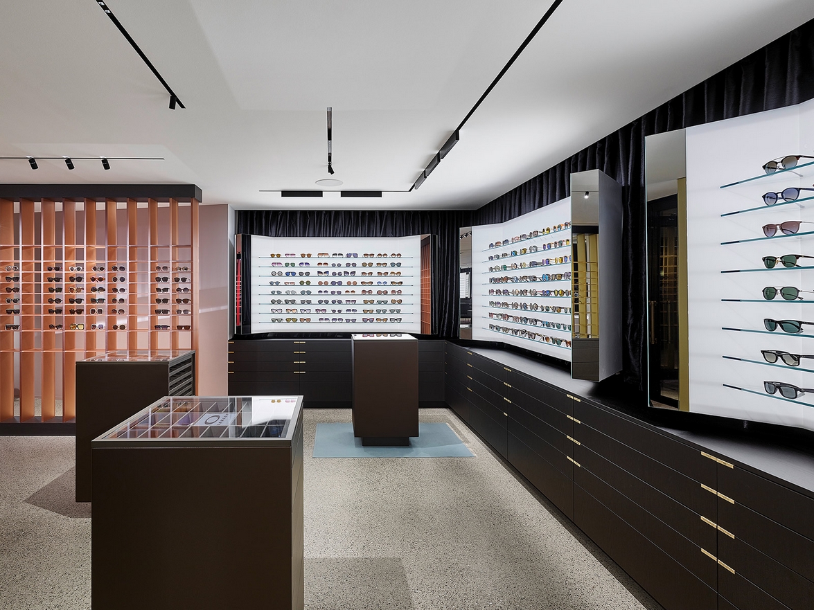
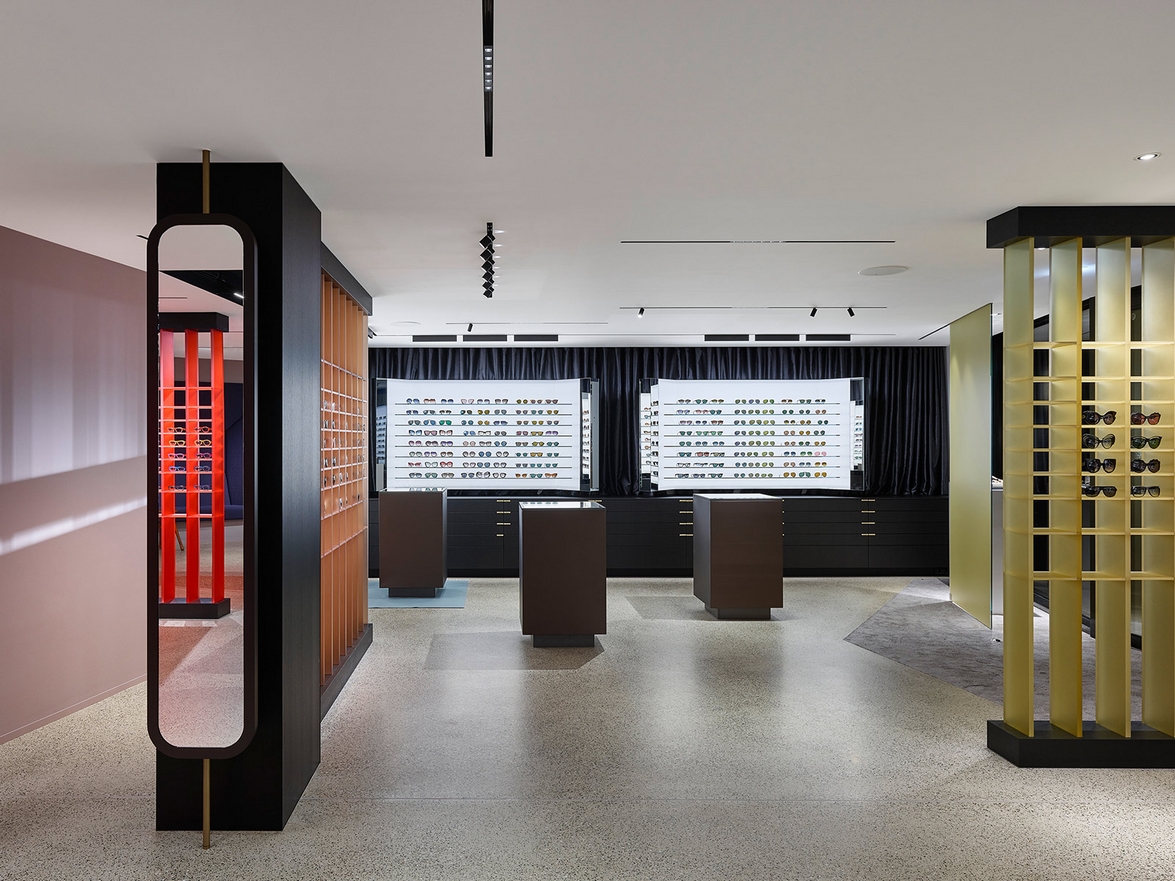
Depending on the desired level of privacy, the shop offers a variety of consulting areas: integrated zones along the façade, separated alcoves or tables at the rear end or the coffee bar are available to customers. In addition, spontaneous buyers can simply ask for professional advice directly at the cabinets.
Loose carpets signal consulting areas and make customers feel at home. Dark wood, lapis lazuli and rose quartz tones contrast with colourful bright perspex and luminous white cabinets, defining the character of the room.
Source: Ippolito Fleitz Group
Photography: Zooey Braun
Visit the Hunke website
Visit the Ippolito Fleitz Group website
News Infurma:
Online Magazine of the International Habitat Portal. Design, Contract, Interior Design, Furniture, Lighting and Decoration
