Las Chicas, Los Chicos y los Maniquís, the singular restaurant of the Axel Hotel Madrid designed by El Equipo Creativo
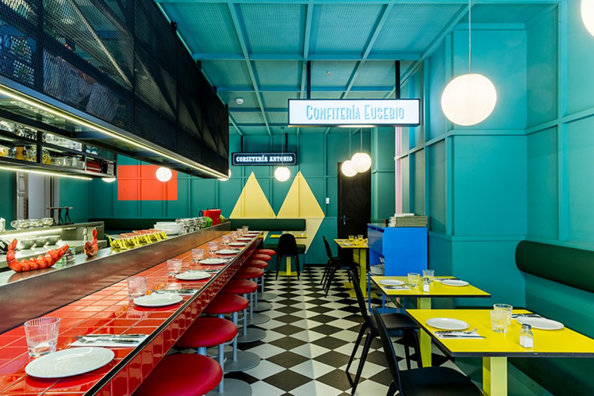
A few days ago we published the interior design project that El Equipo Creativo had carried out in the Axel Hotel Madrid, and we already told you that one of the offers of the hotel was the Las Chicas, Los Chicos y los Maniquís restaurant. In today's post the multidisciplinary and award winning studio shows us its points of reference and inspirations that led them to create this unique space.
As they commented in the previous post about the Axel Hotel Madrid, the objective of the design was to create an atmosphere of liberty and diversion with a certain disruptive touch, which invited a varied clientele to enter the public areas of the hotel to enjoy the gastronomical offer.
In order to achieve this atmosphere, the most important strategy in the design is the use of color, an element which accompanies us throughout all the areas of the hotel, which is applied with different character and material nature in each zone.
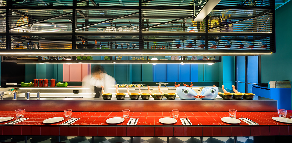
What was originally the entrance to the building for the horse-drawn carriages is today the entrance to the hotel and divides the most public part of the restaurant into two rooms. Both spaces are designed under the same concept: a carefree atmosphere with a distinctly colorful character employing large graphic elements of color with references to the ”Movida Madrileña” and the visual universe created by Almodovar, the well-known Spanish movie director.
The name of the restaurant “Las Chicas, Los Chicos y Los Maniquies” was precisely the title of one of the songs which accompanied the ”Movida Madrileña” and whose lyrics are still part of our popular culture today.
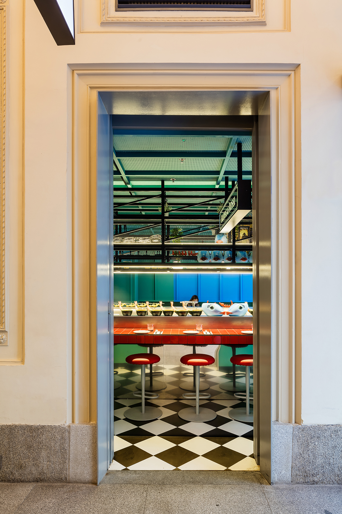
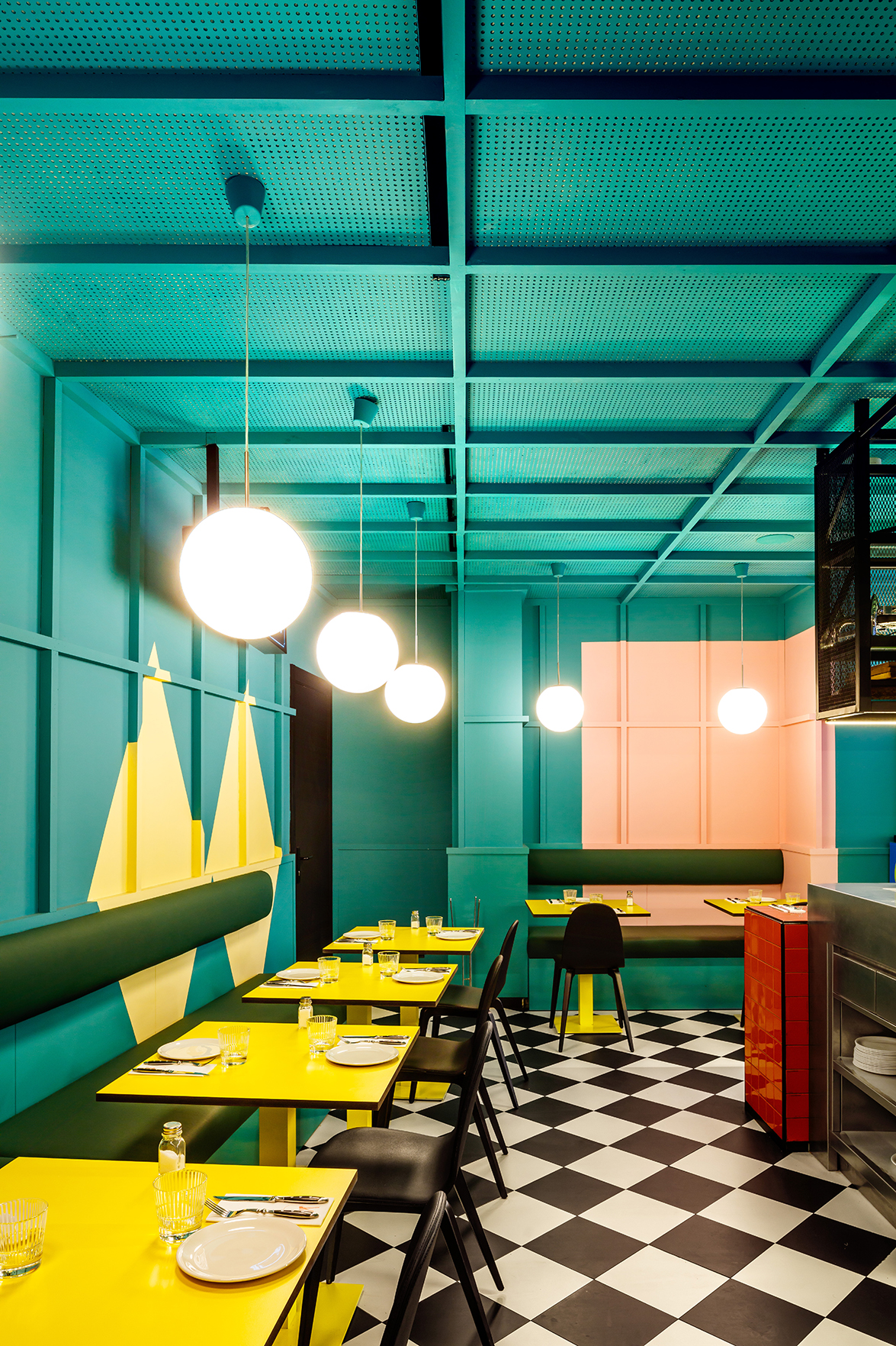
The main characters of this colorful universe are the two large red bars presiding over the two rooms. All morning they function as buffet tables for breakfast and as snack and beer bars — in the purest Madrid style — during the remainder of the day.
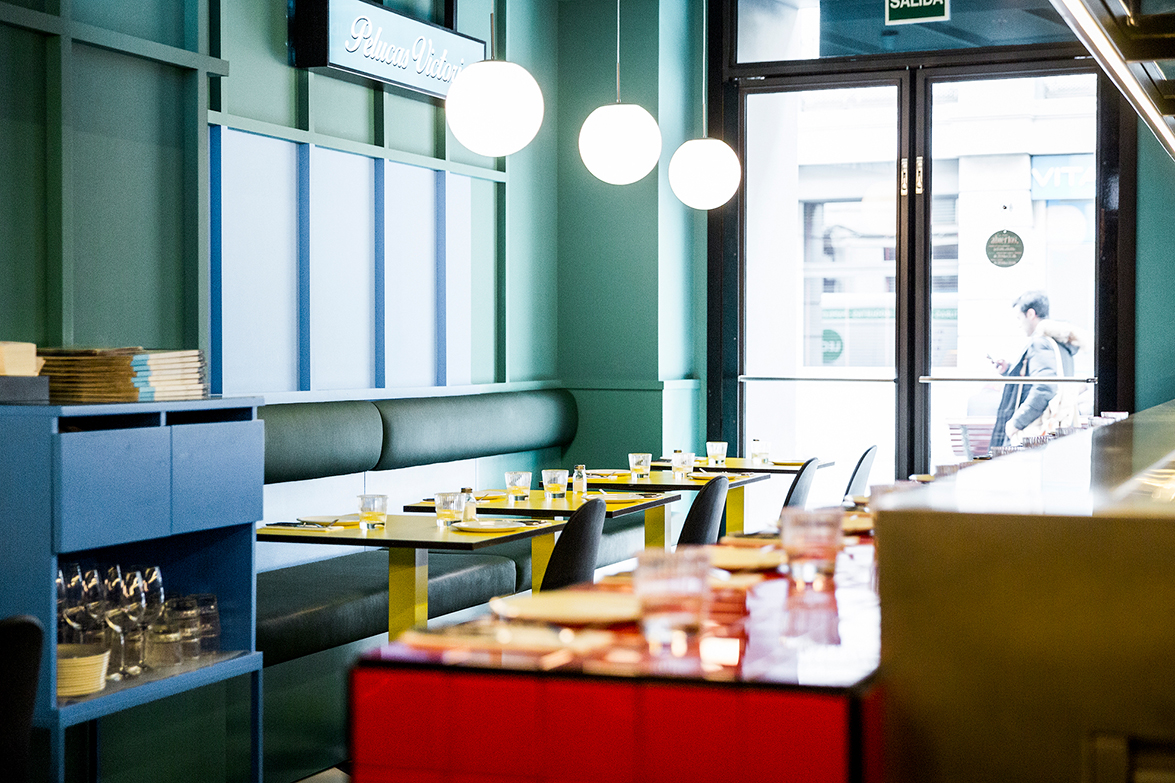
Another important element of the popular culture of Madrid is the classic neighborhood stores with their large window advertisements, attractive names and incredible offers. Sashes, hats and elaborate mannequins fill some of the scarce shop windows still left in this part of the city. Strange as it may seem, Atocha Street has managed to keep intact some of its more classic shops, to which our design wanted to pay sincere homage filling the space with large luminous posters with attractive commercial names.
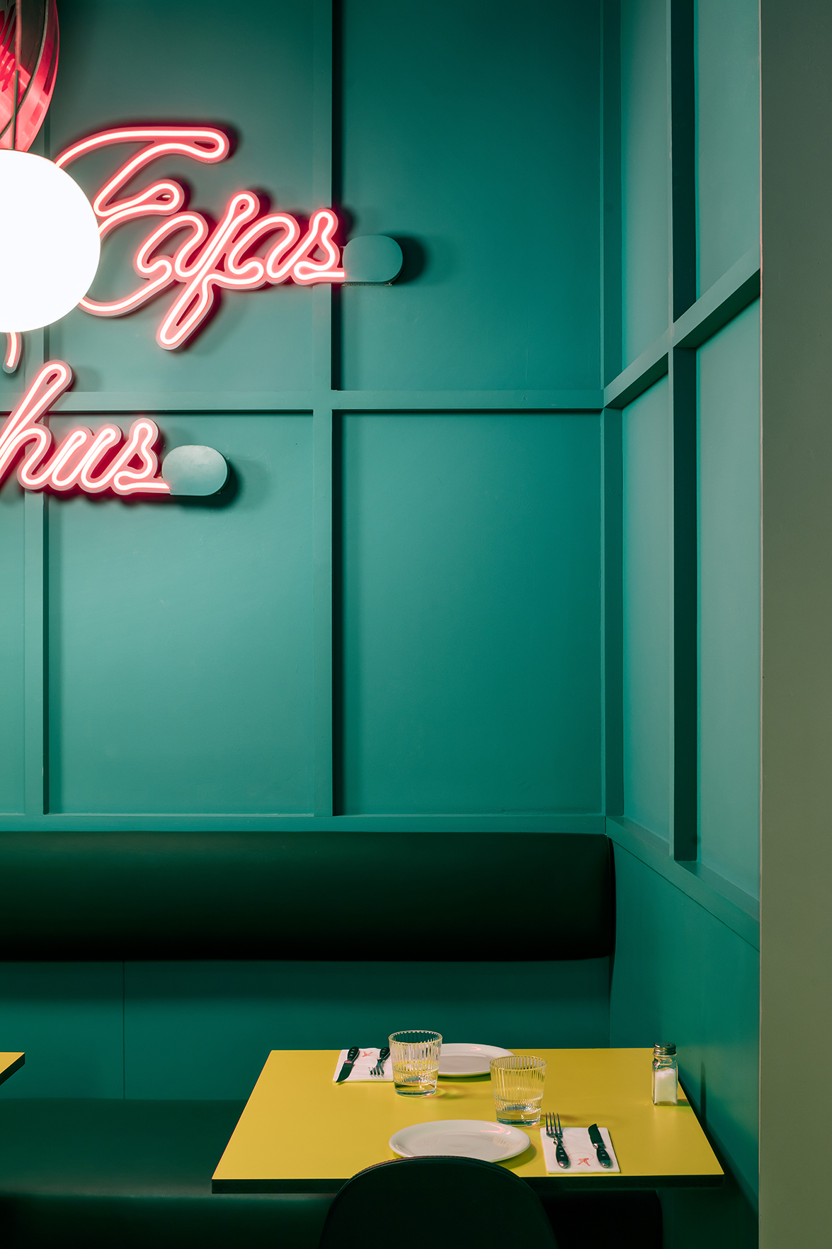
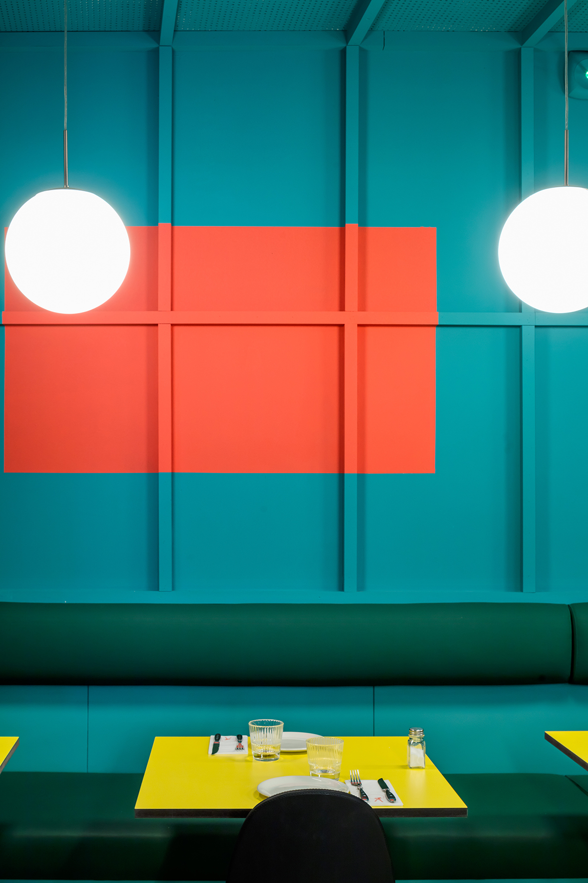

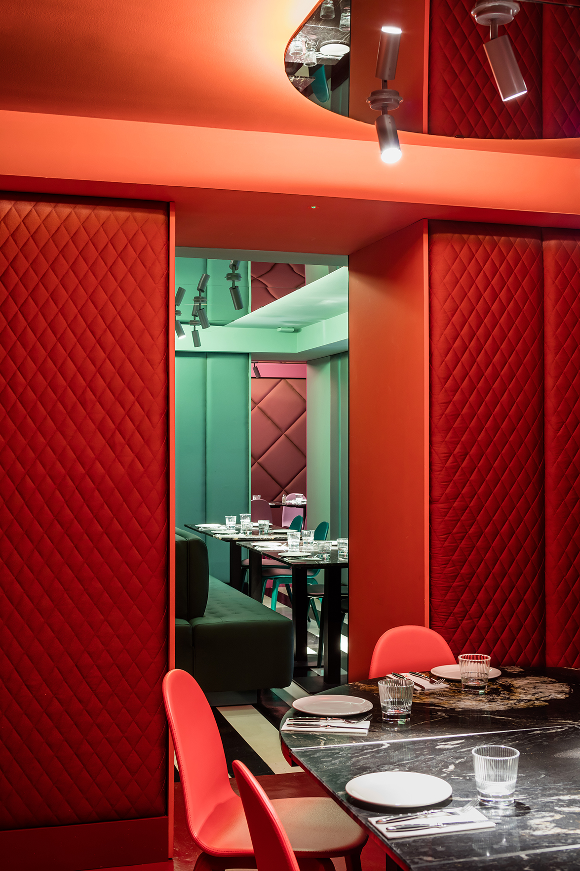
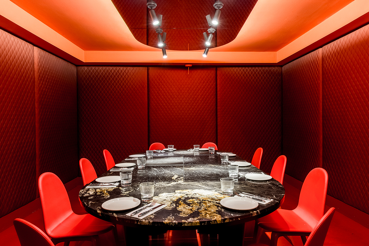
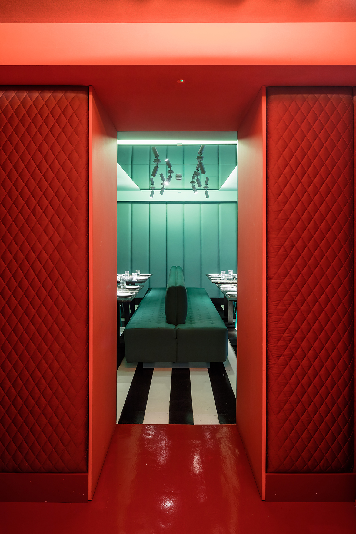
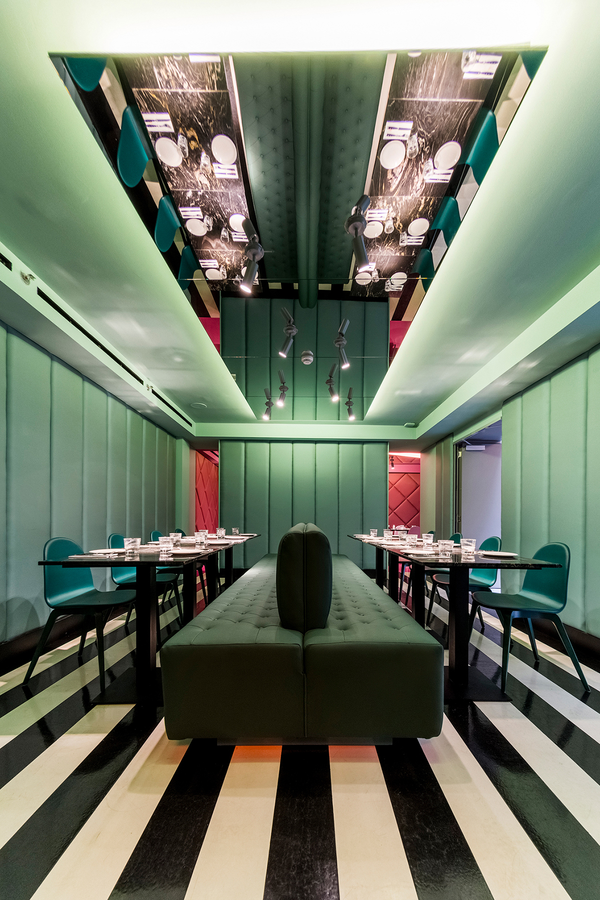
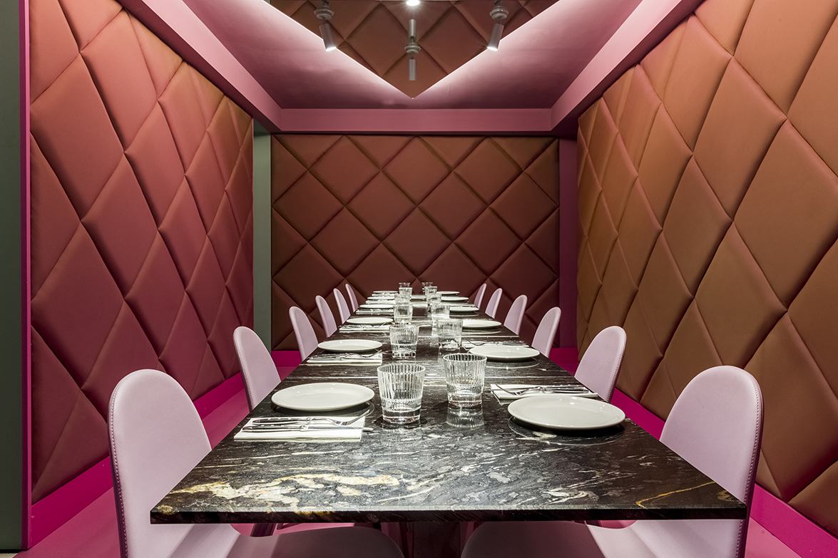
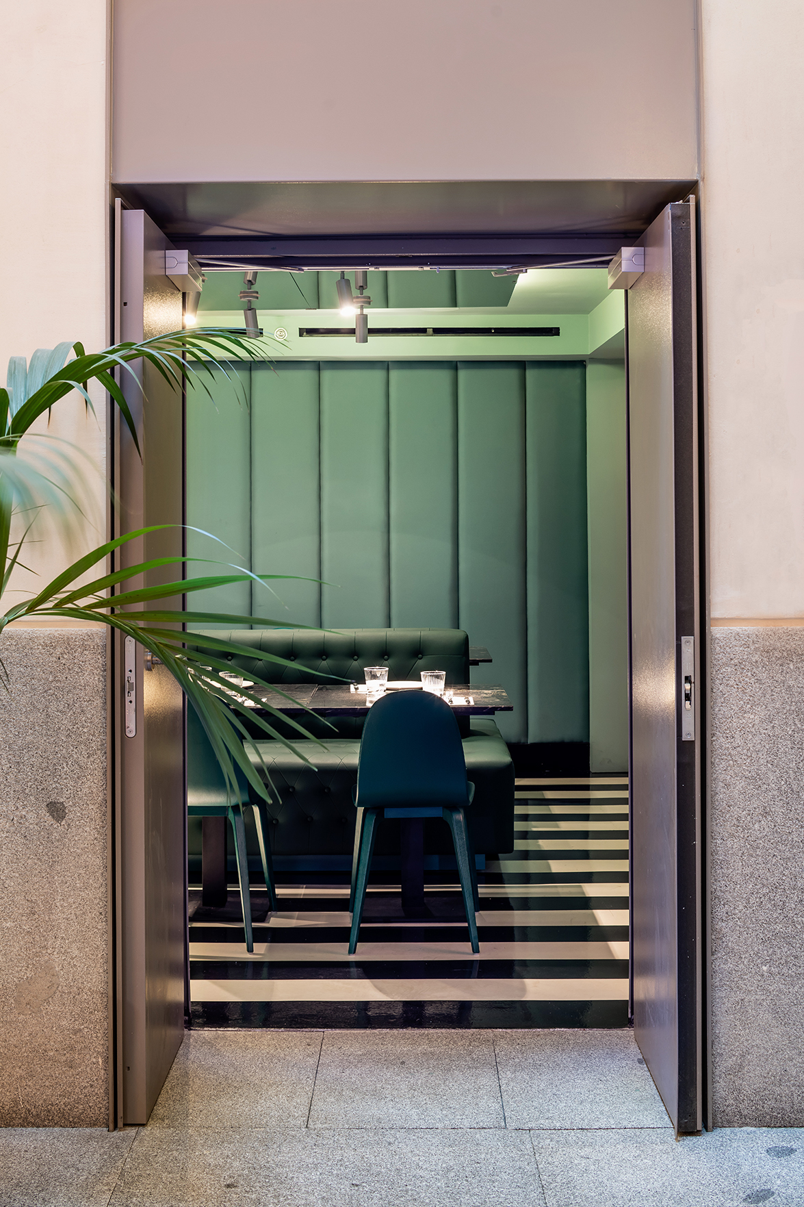
In the lower part of the hotel, the restaurant has three small interconnected dining rooms where, once again, color is the indisputable principal element. Each room achieves its own personality by use of a single color: red, greenish and pink. Their walls covered in textiles as well as the chromatic choices seek to reference the noble rooms of 19th Century palatial homes.
EL EQUIPO CREATIVO _ Oliver Franz Schmidt + Natali Canas del Pozo + Lucas Echeveste Lacy
Source: El Equipo Creativo
Read more news related El Equipo Creativo published at Infurma
Visit the El Equipo Creativo website
News Infurma:
Online Magazine of the International Habitat Portal. Design, Contract, Interior Design, Furniture, Lighting and Decoration
